
This post will outline how the S&P 500 Index and the SPX:VIX Ratio performed throughout 2016 and how they ended the year. It will also take a look at where the US Dollar Futures Index finished up.
S&P 500 Index
The following four charts of the S&P 500 Index will depict how 2016 ended, on a yearly, quarterly, monthly, and weekly basis.
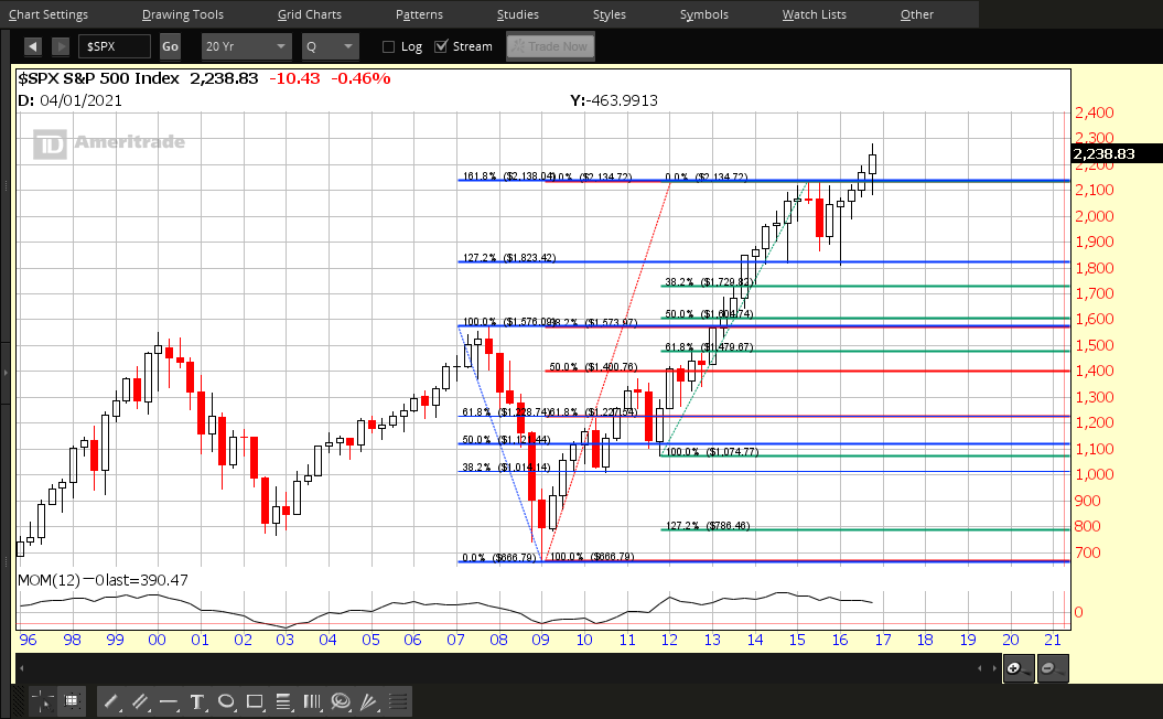
Each candle on Chart #1 represents a period of one year.
After breaking out to all-time highs and above major resistance, the 2016 candle closed near its high, after re-testing last year’s low and the close and open of the 2013 and 2014 candles, respectively. It would appear that, after shaking out short-sellers, the bulls are firmly in control of upward momentum. We’ll see if the Momentum indicator makes a new high on the 2017 candle…a distinct possibility, if price can remain above major support at 2100. If price drops to that level, we’ll see a rise in volatility, and, if price drops and holds below that level, volatility will rise drastically.
 |
|
Chart #1 SPX Yearly |
Each candle on Chart #2 represents a period of one quarter.
The Q4 candle closed in its upper 1/4, after re-testing the lows of Q3, as well as, what was major resistance, now major support. I’d like to see the Momentum indicator begin to reverse its current downward drift, if price moves higher…otherwise, we could see weakness and an increase in volatility in the first quarter of 2017.
 |
|
Chart #2 SPX Quarterly |
Each candle on Chart #3 represents a period of one month.
The December candle closed in its upper 1/3, after re-testing November’s close and highs. The Momentum indicator broke its downtrend (which began in 2014), but has failed to make a new swing high. This signals that we’ll likely see an increase in volatility in the medium term, until a new swing high is made on MOM.
 |
|
Chart #3 SPX Monthly |
Each candle on Chart #4 represents a period of one week.
The last week closed on a bearish engulfing candle, after re-testing the top Bollinger Band and prior all-time highs, once again. The Momentum indicator has broken slightly above its 2016 downtrend, but has yet to make a new swing high. This signals that we’ll likely see an increase in volatility in the short term and lower prices down to and on either side of 2200, until serious buying resumes and a new swing high is made on MOM.
 |
|
Chart #4 SPX Weekly |
SPX:VIX Ratio
The following four charts of the SPX:VIX Ratio will depict how 2016 ended, on a yearly, quarterly, monthly, and weekly basis.
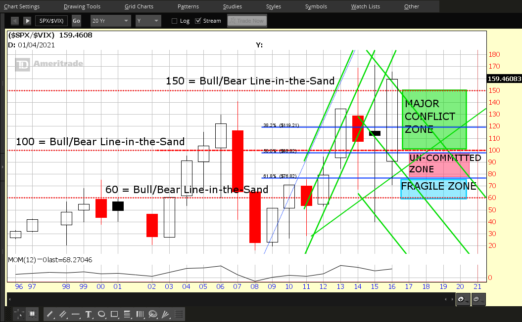
Each candle on Chart #5 represents a period of one year.
Price on this ratio closed near its all-time high and above major resistance at 150 on a massive bullish engulfing candle, after a hefty retreat down into the “Fragile Zone” this year. Volatility was enormous in 2016 and the Momentum indicator drifted slightly upwards, but has yet to make a new swing high. We’ll see if the Momentum indicator makes a new high on the 2017 candle…a distinct possibility, if price can remain above major support at 150. If price drops to that level, we’ll see a rise in volatility, and, if price drops and holds below 140, volatility will rise drastically.
 |
|
Chart #5 SPX:VIX Yearly |
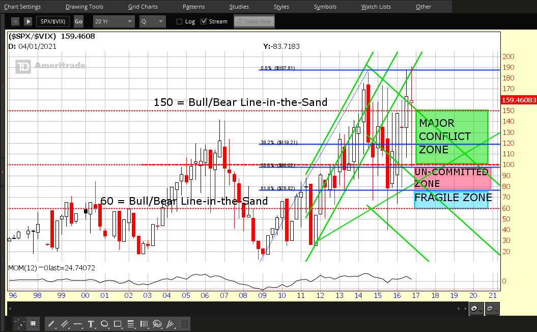
Each candle on Chart #6 represents a period of one quarter.
The Q4 candle closed in its top 1/3 on a massive high wave candle. Although price was plagued by uncertainty, it finished relatively strong on this timeframe. Although the Momentum indicator drifted higher in 2016 from its lows in mid-2015, it has yet to make a higher swing high and dipped by the end of the year.
 |
|
Chart #6 SPX:VIX Quarterly |
Each candle on Chart #7 represents a period of one month.
The December candle closed near its low after briefly breaking out to new highs and is high-basing in the upper 1/3 of this year’s candles. While the Momentum indicator broke out to a new swing high several months ago, it has yet to confirm December’s brief (and failed) breakout.
 |
|
Chart #7 SPX:VIX Monthly |
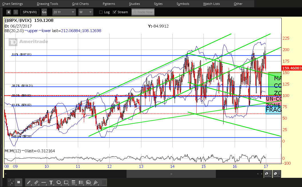
Each candle on Chart #8 represents a period of one week.
The last week closed near the bottom of its large bearish candle, after briefly breaking out (and back into a long-term uptrending channel from the 2011 lows) the week before. Bollinger bands are tightening and the Momentum indicator has been making a series of lower highs this year on this timeframe…suggesting that serious longer-term, committed new buying has yet to make its way into the S&P 500 Index. Until it does, I think we’ll see a rise in volatility, particularly if this ratio drops and holds below 150, and, especially, 140. Bulls will need to come out in full force to see it rally back into the rising channel above the 200 level…and be confirmed by a new MOM swing high on this short-term timeframe.
 |
|
Chart #8 SPX:VIX Weekly |
US Dollar Futures Index
Each candle on Chart #9 represents a period of one month.
The December candle closed in its upper 1/3 on a high wave candle…although, it’s, technically, a bullish candle and closed higher than the prior month, it still represents indecision on this timeframe, after breaking out to new highs this year. It’s caught in between a 161.8% external Fibonacci retracement level at 100.54 (major support) and a 161.8% Fibonacci extension level at 103.47 (minor resistance). The next Fibonacci resistance level is 107.08 (a 200.0% external Fibonacci retracement level). Bollinger bands are still widening on this timeframe, and, if price can hold above 100.00, then it could very well rally to 107.00. However, it may be influenced by what happens in the S&P 500 Index and the SPX:VIX ratio, so it’s worth monitoring how those behave in the short and longer terms, as outlined above.
 |
|
Chart #9 US Dollar Monthly |
CONCLUSIONS
2016 was a year of major volatility. In my Market Forecast for 2016, I had anticipated an increase of around 5-6% in equities, in general, as well as a rise in volatility. In fact, the S&P 500 Index had increased by 11.14% by mid-December, but closed at 9.54% by the end of the year.
2017 will, no doubt, hold a lot of uncertainty in relation to what happens with a new U.S. political administration and future economic and fiscal policies that may be enacted, what domestic and foreign events and policies develop, and what the Fed decides regarding interest rates. However, if we see general cooperation being maintained among government officials, we could see much less volatility next year (especially since the 2016 U.S. Presidential election is behind us)…and it may be a slower, steadier climb to higher prices in equity markets than we saw in 2016, along with a rising U.S. dollar. The timeframes on the above-referenced instruments are one of many methods that can be used to evaluate the effects from such future influences.
A LOOK INTO THE FUTURE

In closing, I’d mention that my Market Forecast for 2017 can be found at this link…and that my longer-term SPX Outlook to 2020 U.S. Presidential Election can be found at this link.
Of course, I realize that a forecast is, simply, one possibility. However, it can be a useful tool for any serious trader/investor to implement in order to track, assess and learn from one’s future successes and failures on a short, medium and long-term basis. And, it can be modified/updated during its duration, depending on world and domestic influences at the time.
I wish you good fortune with all your endeavours in 2017!
 |
|
Happy New Year 2017! |
And, a hearty “Thank you!” to Tim for posting my articles this year…may all your dreams come true! xo, SB
