This post will outline how the S&P 500 Index and the SPX:VIX Ratio performed throughout 2016 and how they ended the year. It will also take a look at where the US Dollar Futures Index finished up.
S&P 500 Index
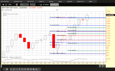
The following four charts of the S&P 500 Index will depict how 2016 ended, on a yearly, quarterly, monthly, and weekly basis.
Each candle on Chart #1 represents a period of one year.
After breaking out to all-time highs and above major resistance, the 2016 candle closed near its high, after re-testing last year’s low and the close and open of the 2013 and 2014 candles, respectively. It would appear that, after shaking out short-sellers, the bulls are firmly in control of upward momentum. We’ll see if the Momentum indicator makes a new high on the 2017 candle…a distinct possibility, if price can remain above major support at 2100. If price drops to that level, we’ll see a rise in volatility, and, if price drops and holds below that level, volatility will rise drastically.
 |
|
Chart #1 SPX Yearly |

