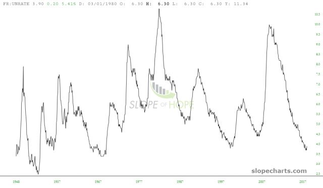
On this quiet market holiday, I thought I’d share a few economic- and rate-related SlopeCharts for a change. We begin with the unemployment rate which, as you can plainly see, has been on an incredibly powerful and consistent slide downward, far more impressive than any other time in this data stream’s history.

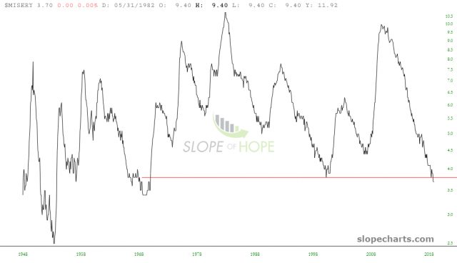
The superset of this – which, understandably, looks very similar – is the so-called Misery Index, which tracks both unemployment as well as inflation. I’ve draw a red line there, anchoring it to its lowest level in 2000 (which we’ve actually cut beneath). Historically, when things are this “un-miserable”, recession has invariably followed.

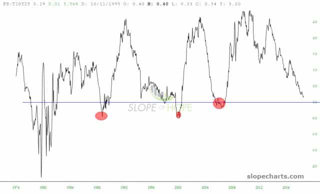
Another “things are so good, they’re bad” chart is the spread chart between the 10-year and 2-year interest rates. This spread has been shrinking for years, and we’re getting awfully close to a level (at the zero-line) when the economy goes south. I’ve highlighted the past three instances of recessions so you can get a sense as to how closely economic downturns correspond to this line chart reaching a nadir.

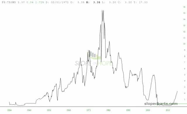
There has been plenty of speculation in recent years about just how high interest rates could go before they’re beaten back down again. One look at your mortgage statement will prove just how much rates have increased in the past few years, but the jury is still out as to whether this is sustainable or will even start falling again. Looking at the chart below of the 10-year rate, it seems that each movement higher (and this is the fifth one since the early 1980s peak) has been answered with substantial slippage to another low.

We are at a particularly important juncture in the market right now. In the span of just a little over three weeks, the psychology has shifted from fear and panic to one of greed and complacency. Fear Of Missing Out has taken equities by storm, and the rallies have been feeding on themselves. I, for one, hope we are finally past that nonsense, but we shall see on Tuesday.

