Once again, allow me to self-congratulate the post title. C’mon, that’s a good one!
Anyway.
SlopeCharts has another new study.
(more…)Slope initially began as a blog, so this is where most of the website’s content resides. Here we have tens of thousands of posts dating back over a decade. These are listed in reverse chronological order. Click on any category icon below to see posts tagged with that particular subject, or click on a word in the category cloud on the right side of the screen for more specific choices.
Once again, allow me to self-congratulate the post title. C’mon, that’s a good one!
Anyway.
SlopeCharts has another new study.
(more…)Having endured the nonsensical rally from yesterday, I was pleased to see us sink again today, because the broken trendlines are absolutely picture perfect in form. It’s because of these trendline failures that I was comfortable pushing into more short positions during the strength.
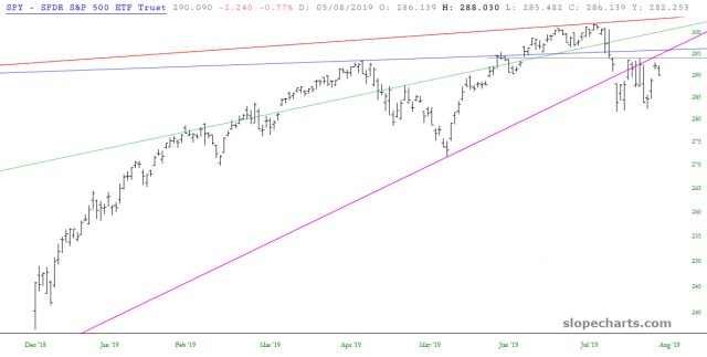
Interesting how the overall market, represented here by SPY, is so cleanly range-bound by its moving averages. The 50/100/200 are shown below, and with a lack of major news to jolt the market up or down, we’ve been spending the past few weeks bouncing with eerie predictability.

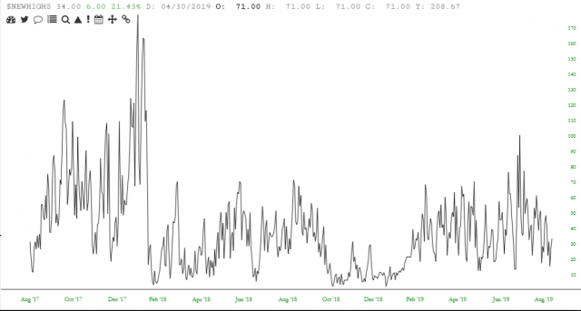
They’re not ready yet, but quite soon now, we’re going to have an entire phalanx of “new highs” and “new lows” indicators in SlopeCharts. We’ve never had this information before, or even access to it, but we’re creating and managing our own data now. Here’s a sneak peek of new highs: