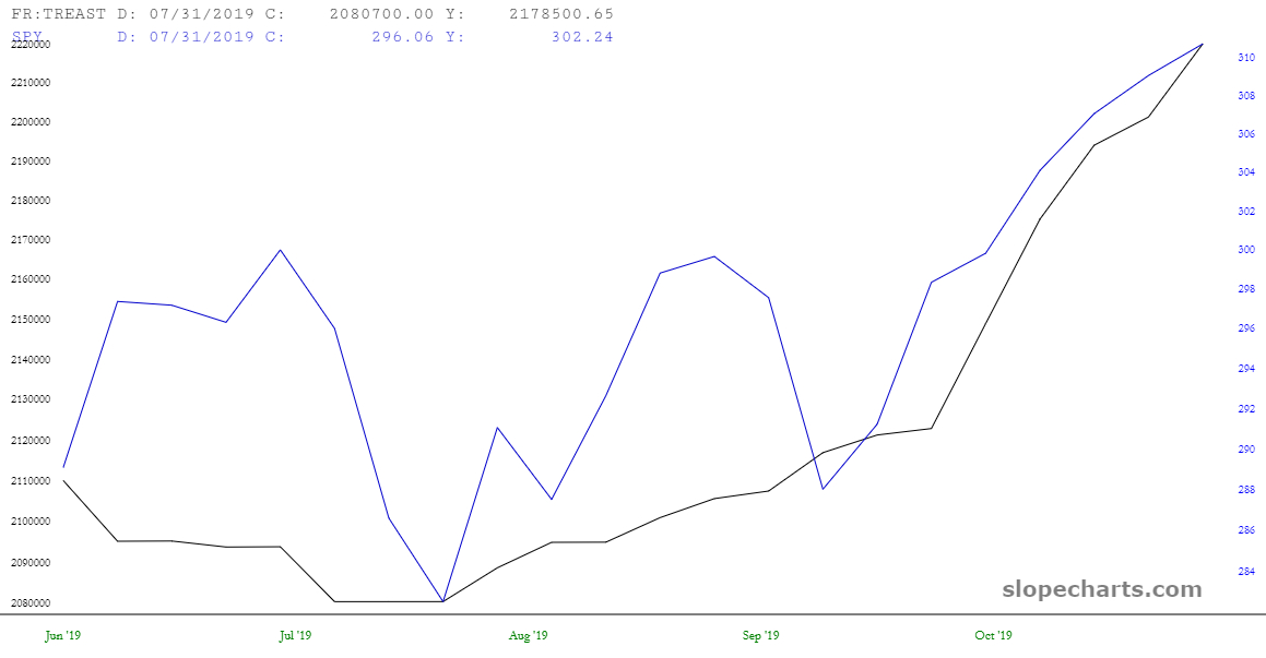
Although I doubt anyone here dismisses the notion that Jerome Powell’s welfare program known as QE4 isn’t the sole reason for the explosion in equity prices recently, I’d like to take advantage of SlopeChart’s comparison feature to show this:
Slope initially began as a blog, so this is where most of the website’s content resides. Here we have tens of thousands of posts dating back over a decade. These are listed in reverse chronological order. Click on any category icon below to see posts tagged with that particular subject, or click on a word in the category cloud on the right side of the screen for more specific choices.
Although I doubt anyone here dismisses the notion that Jerome Powell’s welfare program known as QE4 isn’t the sole reason for the explosion in equity prices recently, I’d like to take advantage of SlopeChart’s comparison feature to show this:
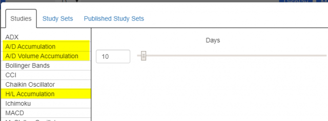
I’ve received plenty of positive feedback from our introduction of the new “accumulation” data of the Statistics data panel. We have rolled this exact same information into the technical studies menu in SlopeCharts:
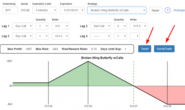
Happy pre-Thanksgiving to Slopers. To be clear, today is a full trading day, and Friday is a shortened day, closing three hours before normal.
I wanted to thumb through a few big cash index charts. In most of these cases, they have blown right past their Fibonacci extension targets (thanks to Powell’s QE4). These extensions are based on major high/low anchor points, and are represented by horizontal lines. Here is the Dow Composite:
(more…)