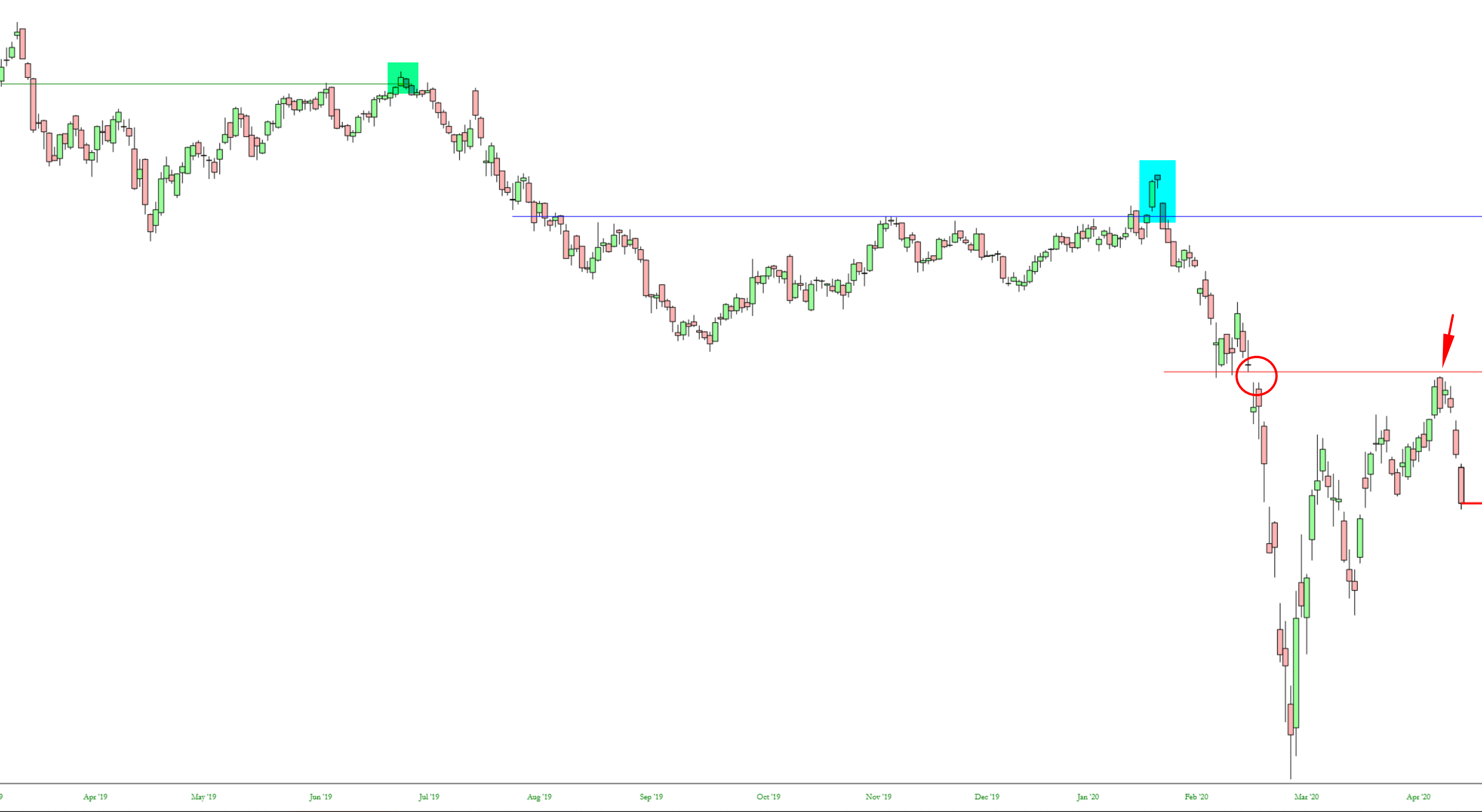
When I glanced at the chart of LYFT today, I noticed three interesting examples of charting phenomenon I wanted to point out:
Slope initially began as a blog, so this is where most of the website’s content resides. Here we have tens of thousands of posts dating back over a decade. These are listed in reverse chronological order. Click on any category icon below to see posts tagged with that particular subject, or click on a word in the category cloud on the right side of the screen for more specific choices.
When I glanced at the chart of LYFT today, I noticed three interesting examples of charting phenomenon I wanted to point out:
OK, I’ve totally nerded out on this one. I don’t think I’ll leave it up, but……….
Should the insurance sector be left for dead, or is there any semblance of value beneath the multi-layered COVID-19 ruble?
No sectors were immune from the March 2020 left-tail quickening that brought global equities to their knees in a snap reaction to the “Chinese virus” (POTUS’s term), COVID-19’s seemingly inevitable global roll-out, still underway.
(more…)Time for another anti-government rant that’s bound to garner me more love and fans from the public service union mob.
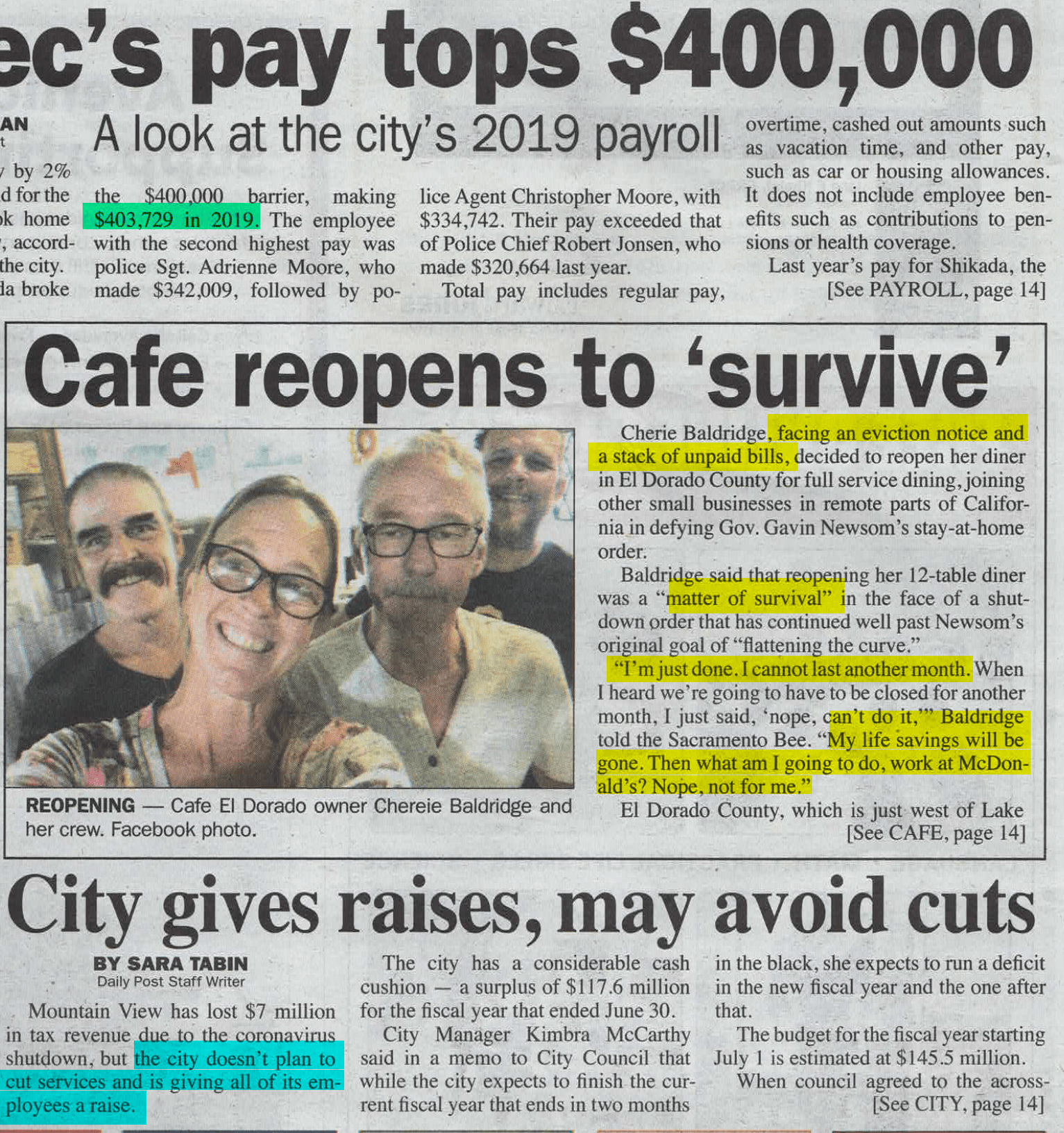
Here are three adjacent stories that greeted me on the front page of this morning’s local paper: