We are pleased to let you know of yet another addition to the SlopeCharts technical library, which is the Donchian Channel study:

Slope initially began as a blog, so this is where most of the website’s content resides. Here we have tens of thousands of posts dating back over a decade. These are listed in reverse chronological order. Click on any category icon below to see posts tagged with that particular subject, or click on a word in the category cloud on the right side of the screen for more specific choices.
We are pleased to let you know of yet another addition to the SlopeCharts technical library, which is the Donchian Channel study:
Warning: Honesty dead ahead. The stuff you don’t see on any other financial site. Because they have too much good sense to be truthful.
Days like today are enough to make me want to curl into the fetal position and just rock back and forth………
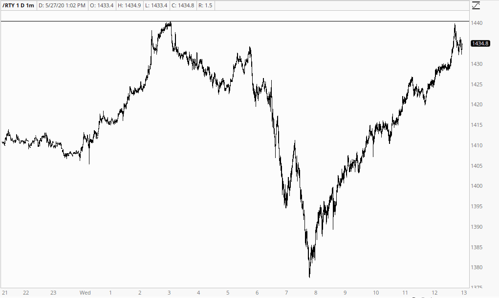
SPX gapped up over 3000 this week and has been sustaining trade above it, with retracements. My working assumption is that SPX is on a path to reach my 3100 target area. So how is that looking on the SPX hourly chart?
Well I drew in two high quality possible rising wedge resistance trendlines on my SPX chart a couple of weeks ago and the first was resistance last week and then was gapped over at the weekend. I’m looking at the next one higher and if that was to be hit in the 3100 area, that would likely be towards the end of next week. There is already a possible hourly RSI 14 sell signal brewing but I’d expect SPX to need to go at least a bit higher to deliver a decently formed divergence. Main rising channel support is now in the 2900 area.
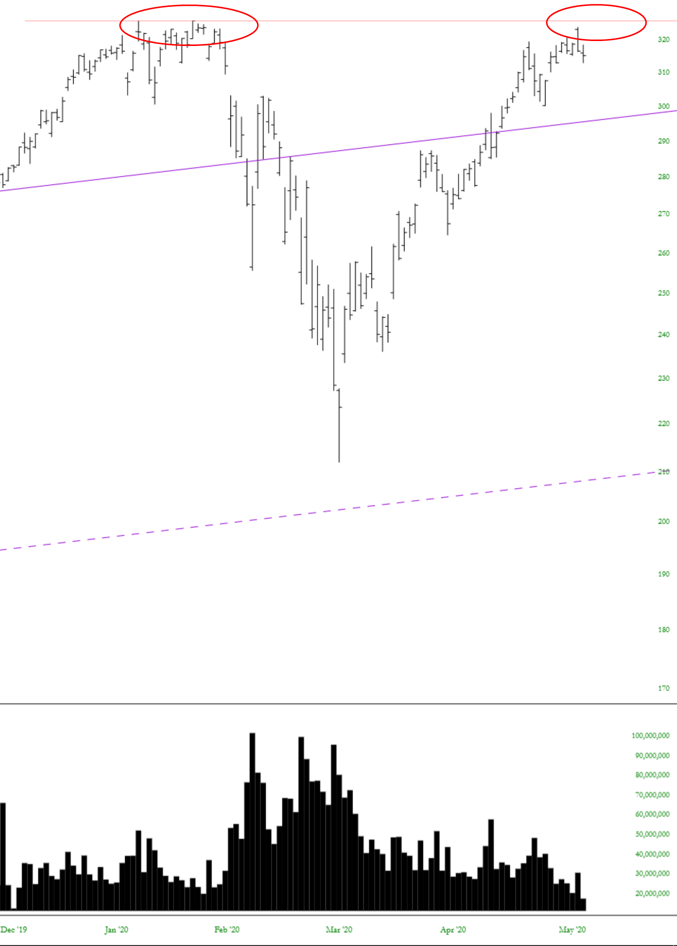
(more…)I know that Apple (AAPL) is the holiest of holies when it comes to stocks, but I’d at least like to point out what’s going on not only with the price but also with the dwindling volume.
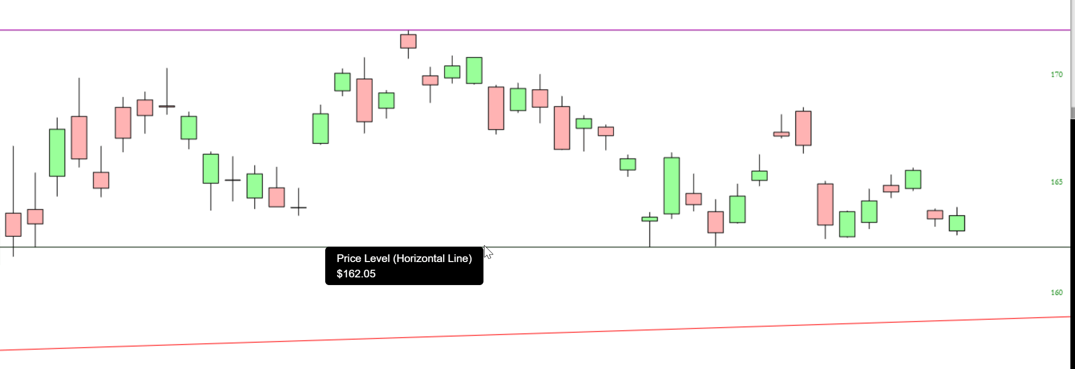
The TLT is an interesting little pattern worth watching. It has been range-bound for many weeks.