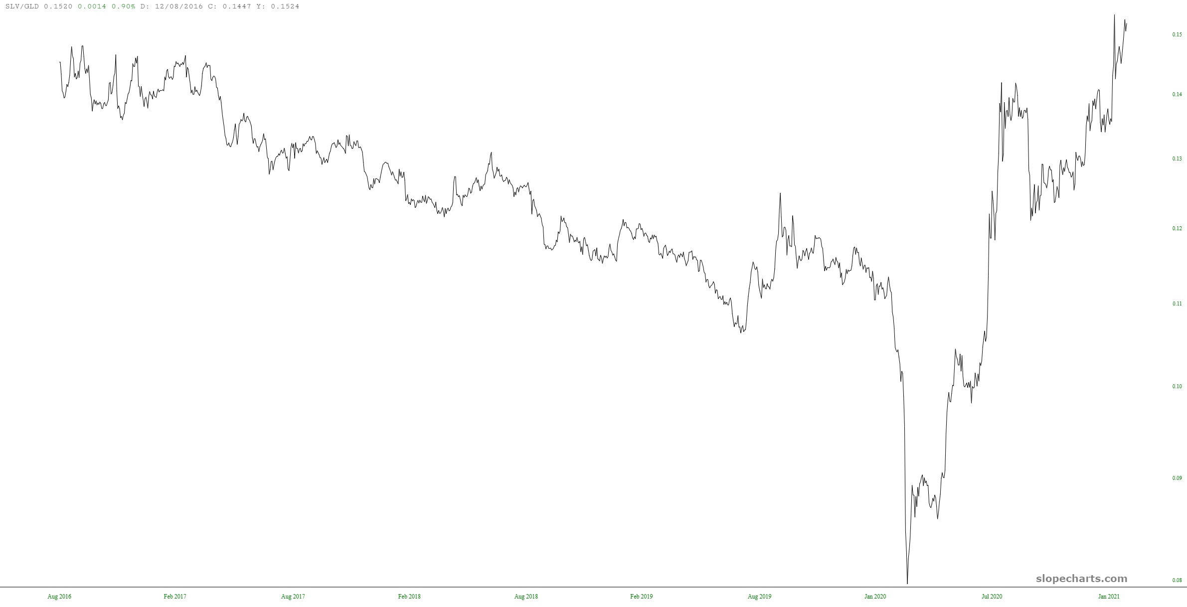
As poorly as precious metals have done since August 6th, silver has remained relatively frisky. Compared to gold, it has been doing great lately. Here is the SLV/GLD ratio chart.
Slope initially began as a blog, so this is where most of the website’s content resides. Here we have tens of thousands of posts dating back over a decade. These are listed in reverse chronological order. Click on any category icon below to see posts tagged with that particular subject, or click on a word in the category cloud on the right side of the screen for more specific choices.
As poorly as precious metals have done since August 6th, silver has remained relatively frisky. Compared to gold, it has been doing great lately. Here is the SLV/GLD ratio chart.
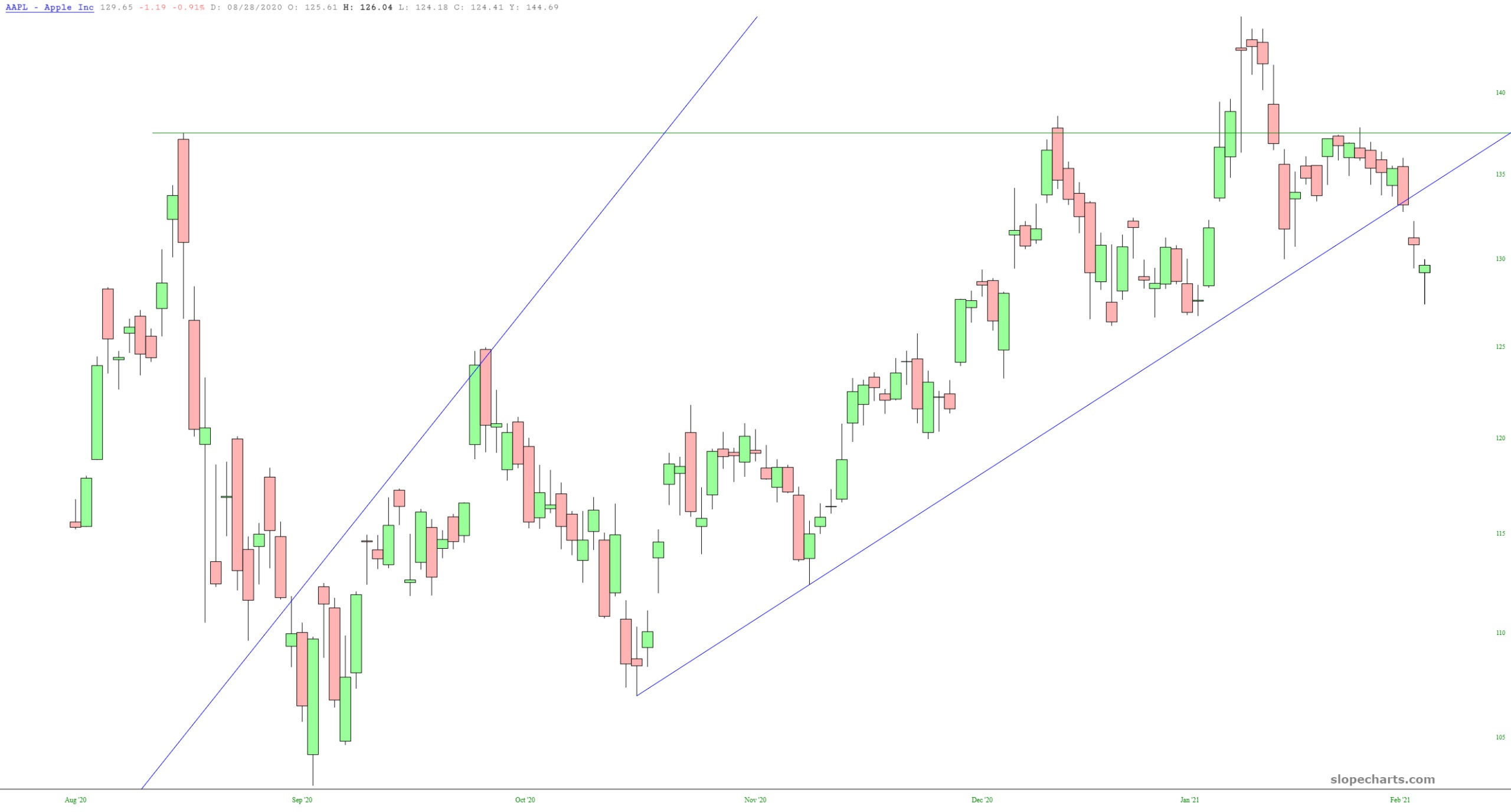
Only a few days ago, I wrote of Apple “As the world’s largest company, I would say that Apple is a very important canary which is worth watching closely. Take note of two things about recent activity: (1) its bullish breakout has completely flopped (2) it is even breaking below its supporting trendline of the right triangle pattern.” When I wrote those words, AAPL had just barely breached its trendline. It is clear that this modest violation presaged a clear-cut failure.