Slope of Hope Blog Posts

Slope initially began as a blog, so this is where most of the website’s content resides. Here we have tens of thousands of posts dating back over a decade. These are listed in reverse chronological order. Click on any category icon below to see posts tagged with that particular subject, or click on a word in the category cloud on the right side of the screen for more specific choices.

The Last Bastion

By -

I am surprised at myself, at how long it took for me to get really interested in the crypto scene. Bruno (BDI) and I were actually in the throes of starting a gold crypto company called Luster, and had he lived, it probably would have been a fairly cool enterprise.

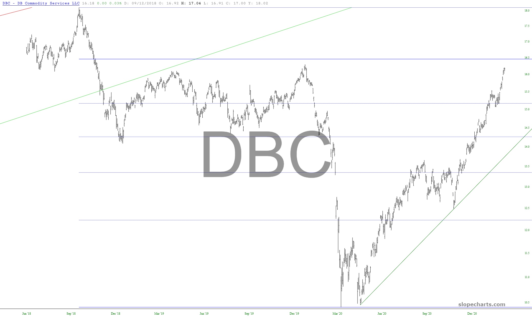
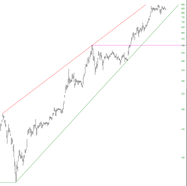
The principle reason I find crypto so fascinating is that it seems to be the last honest market on the planet. Supply. Demand. That’s it. Just like the old days for stocks. A true organic market which can be studied earnestly by way of charts and classic technical analysis.

I have taken the time and trouble to pluck out fifteen crypto charts I thought you would find of interest, and which I believe are representative of the kind of clean charting to which I am referring. These were all created, naturally, with my beloved SlopeCharts. You’re going to think I’ve lost my marbles, but I think every single one of them is long-term bullilsh.

(more…)

Exchange Traded Funs

By -

Let’s stroll through the market by way of ten ETF charts. I have a few remarks about each of them, and I am presenting them in alphabetical order based on ticker symbol. As always, clicking on a chart will make it much larger, assuming your screen is big.

We begin with commodities, which are approaching their 78.6% retracement level as well as their pre-Covid peak. I daresay the momentum of this inflationary lift is just about done.

slopechart DBC
(more…)

Tesla Alert!

By -

Editor’s note: I composed this post before Tesla began its free-fall, so it’s actually quite timely……..

I’d like to drive home the value of our new chart-based alert system with a real life example. How about we pick on a company which, over its history, has lost about $10 billion yet has managed to score a market cap approaching $900 billion: Tesla. Here is the precarious chart:

(more…)