Let’s stroll through the market by way of ten ETF charts. I have a few remarks about each of them, and I am presenting them in alphabetical order based on ticker symbol. As always, clicking on a chart will make it much larger, assuming your screen is big.
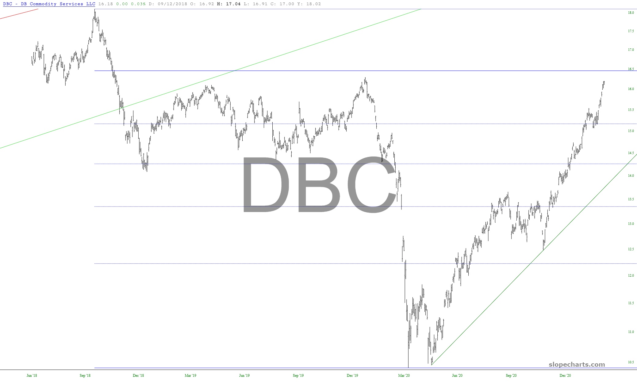
We begin with commodities, which are approaching their 78.6% retracement level as well as their pre-Covid peak. I daresay the momentum of this inflationary lift is just about done.
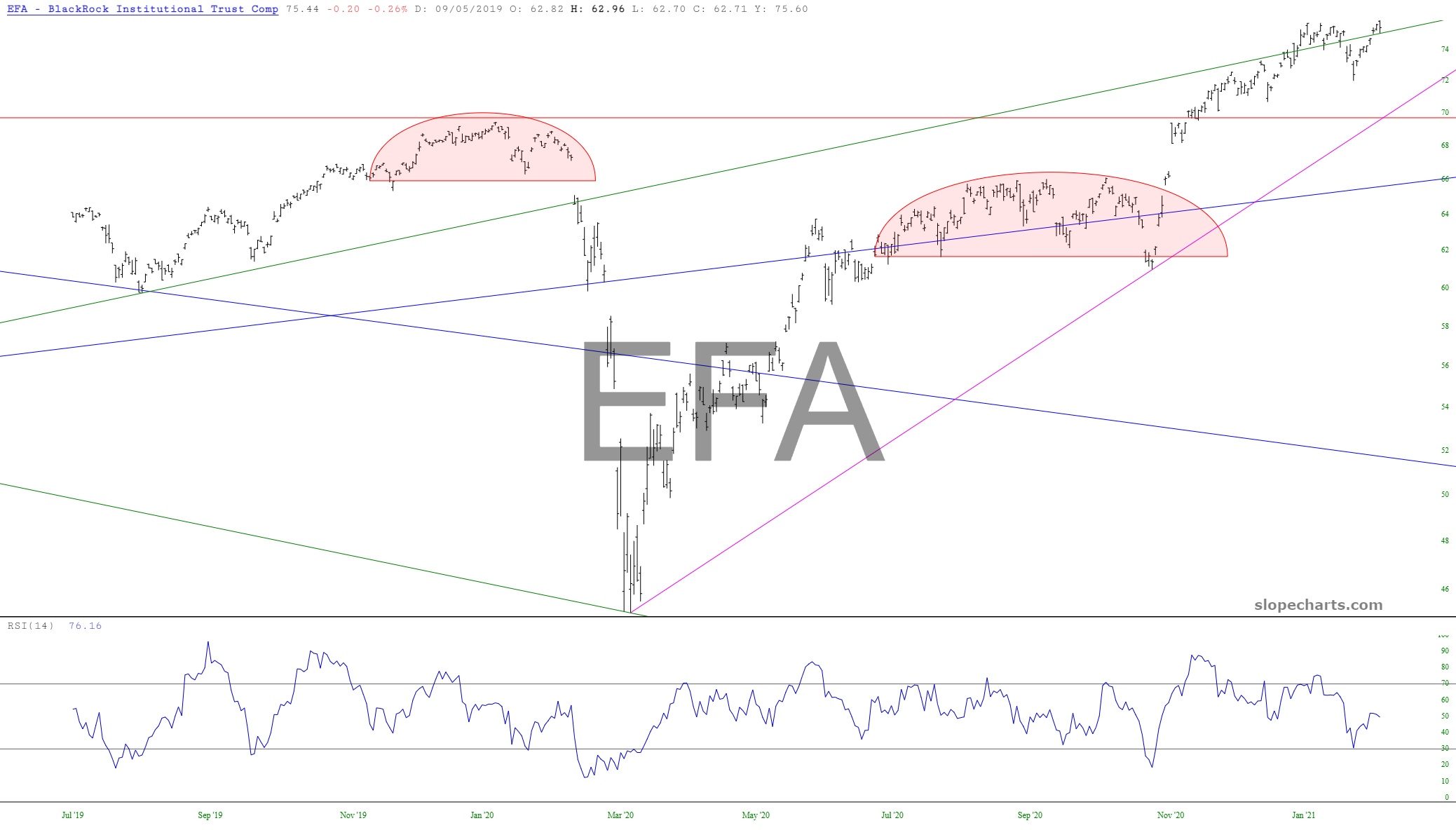
European stocks have, as with stocks worldwide, been on an absolute tear, but my view is that they are double topping.
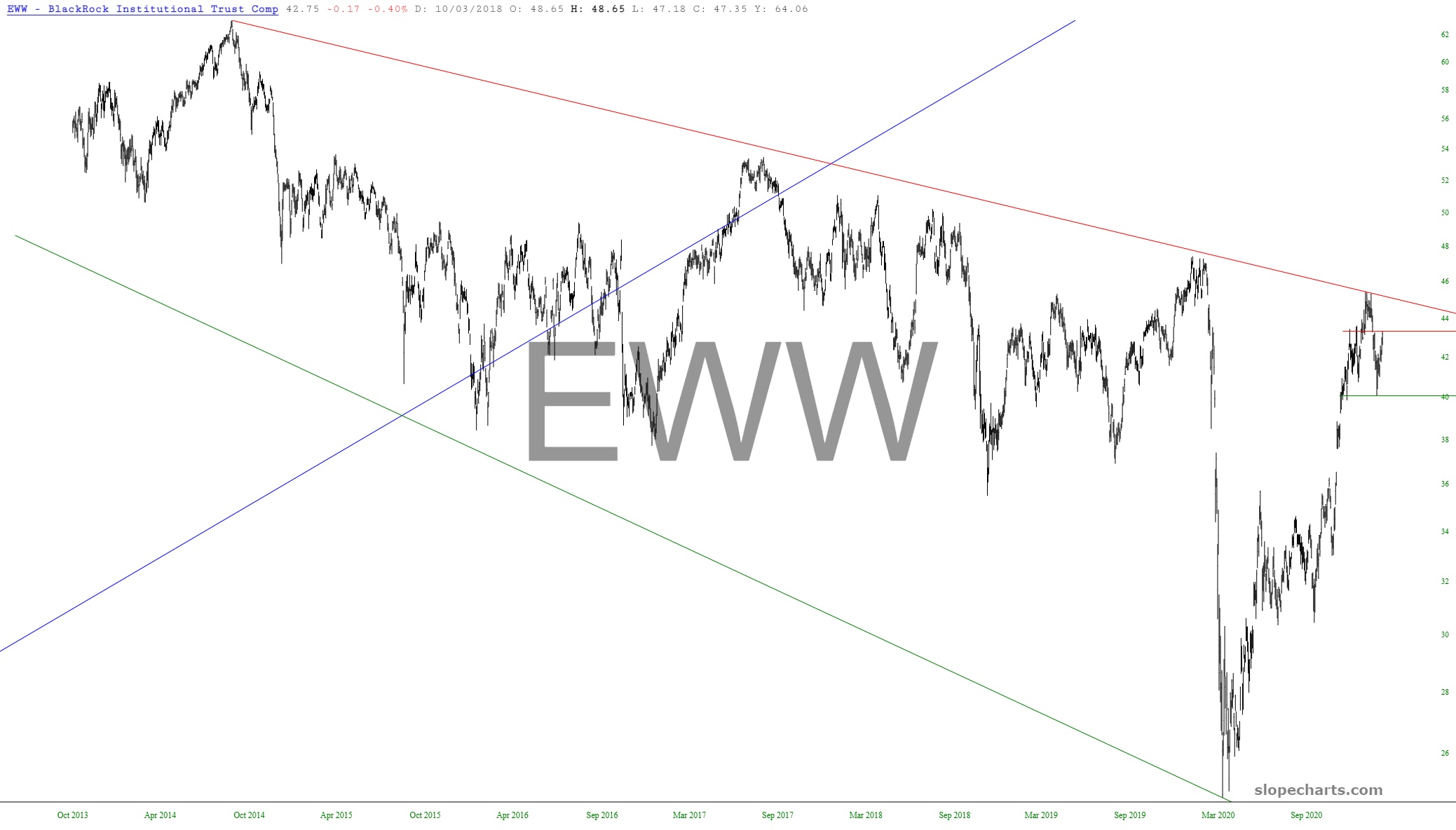
Looking overseas, there are a couple of countries which seem particularly liable to future weakness. One of them is Mexico, which actually peak in price over a dozen years ago.
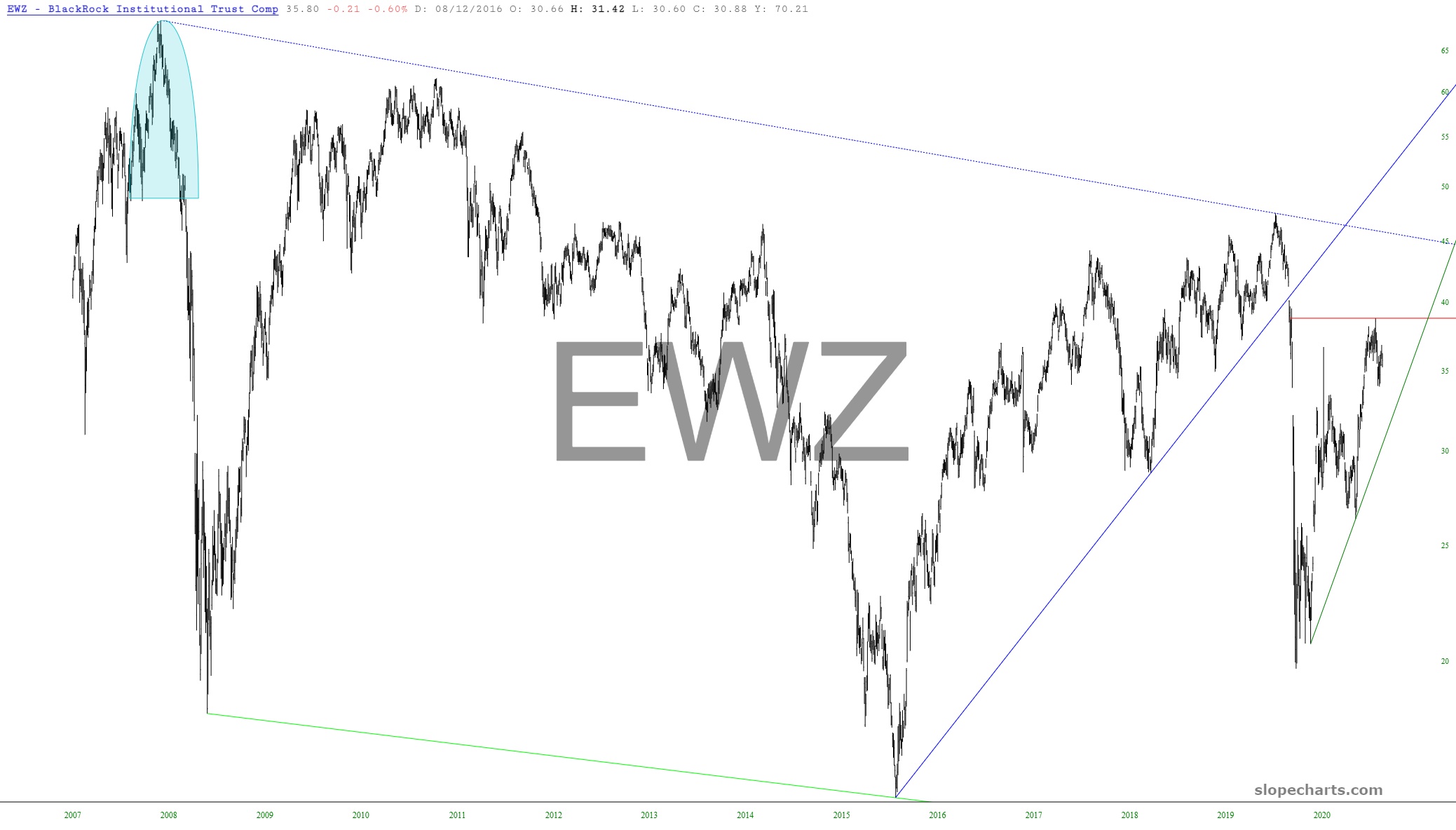
The other is Brazil, which likewise peaked a very long time ago.
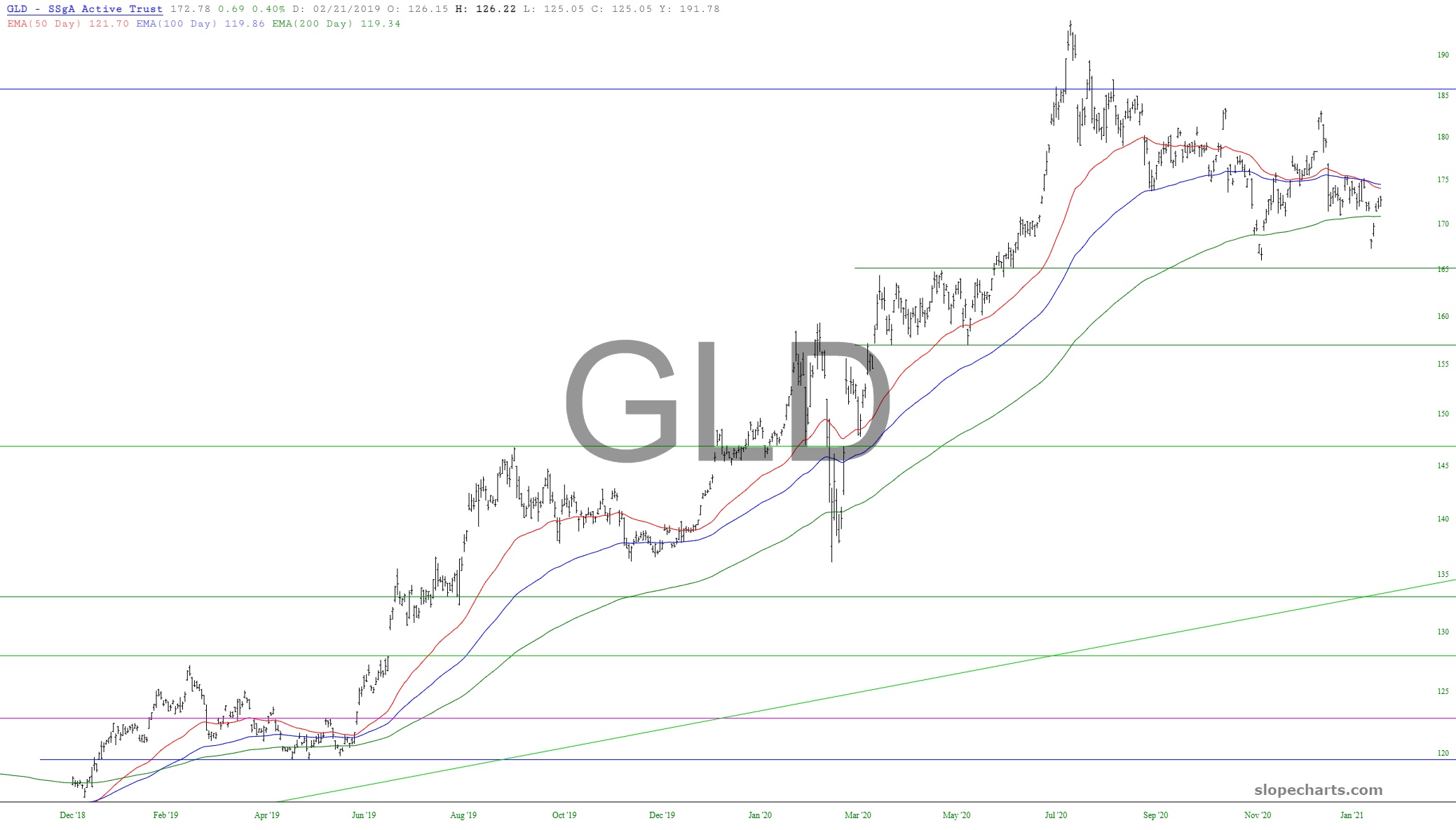
I actually was toying with the idea of getting more physical gold, but a glance at the three exponential moving averages threw cold water all over that idea. Take note of the bearish crossovers.
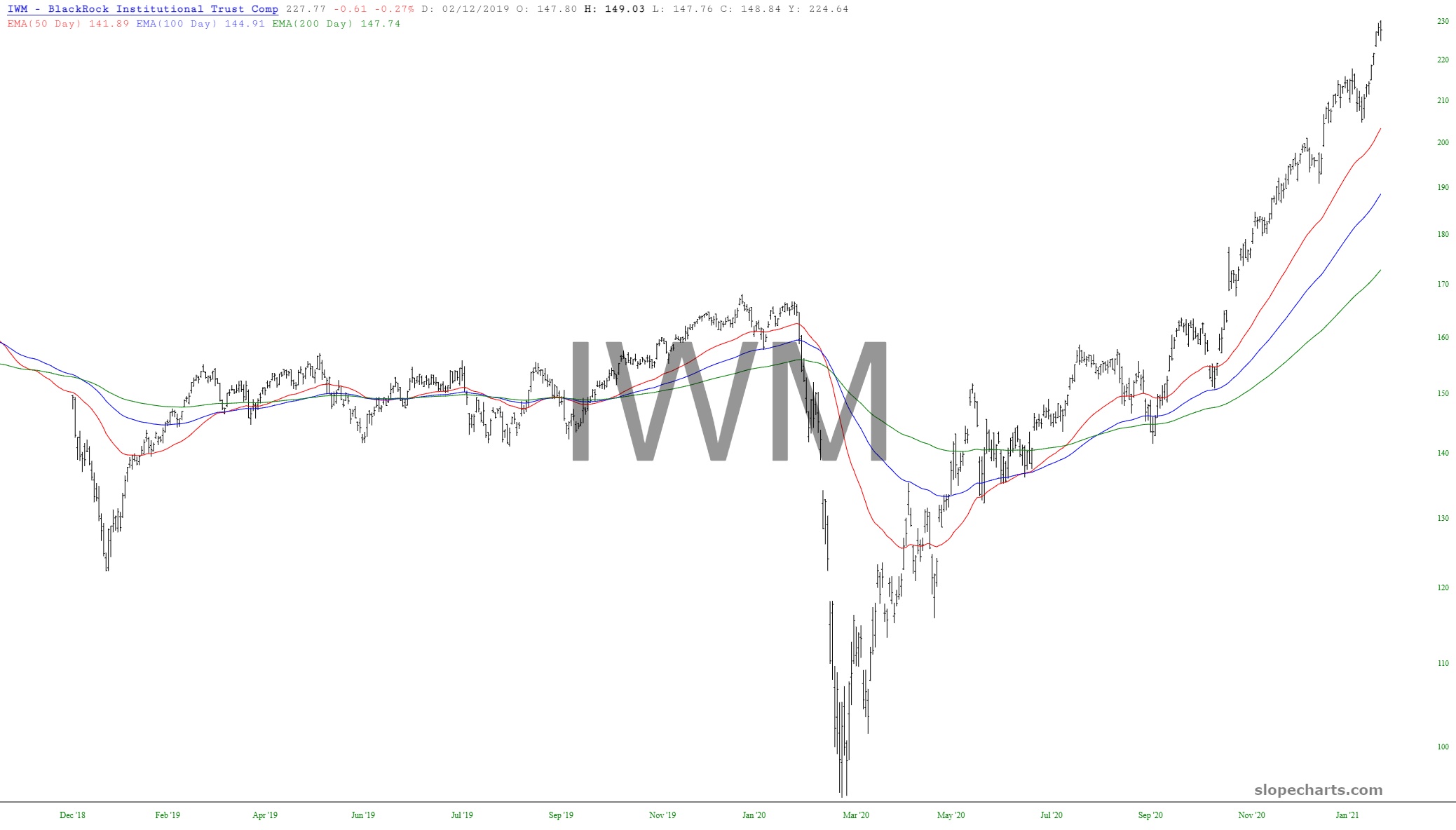
And the craziest of them all – – the looniest of the loony – – are the small caps. Just look at those moving averages and how far above present price levels are. I would also note, as an aside that the P/E ratio of the Russell 2000 as a whole cannot be presented, because the collective earnings of all those companies doesn’t exist. It’s a loss. The P/E is, in other words, infinite.
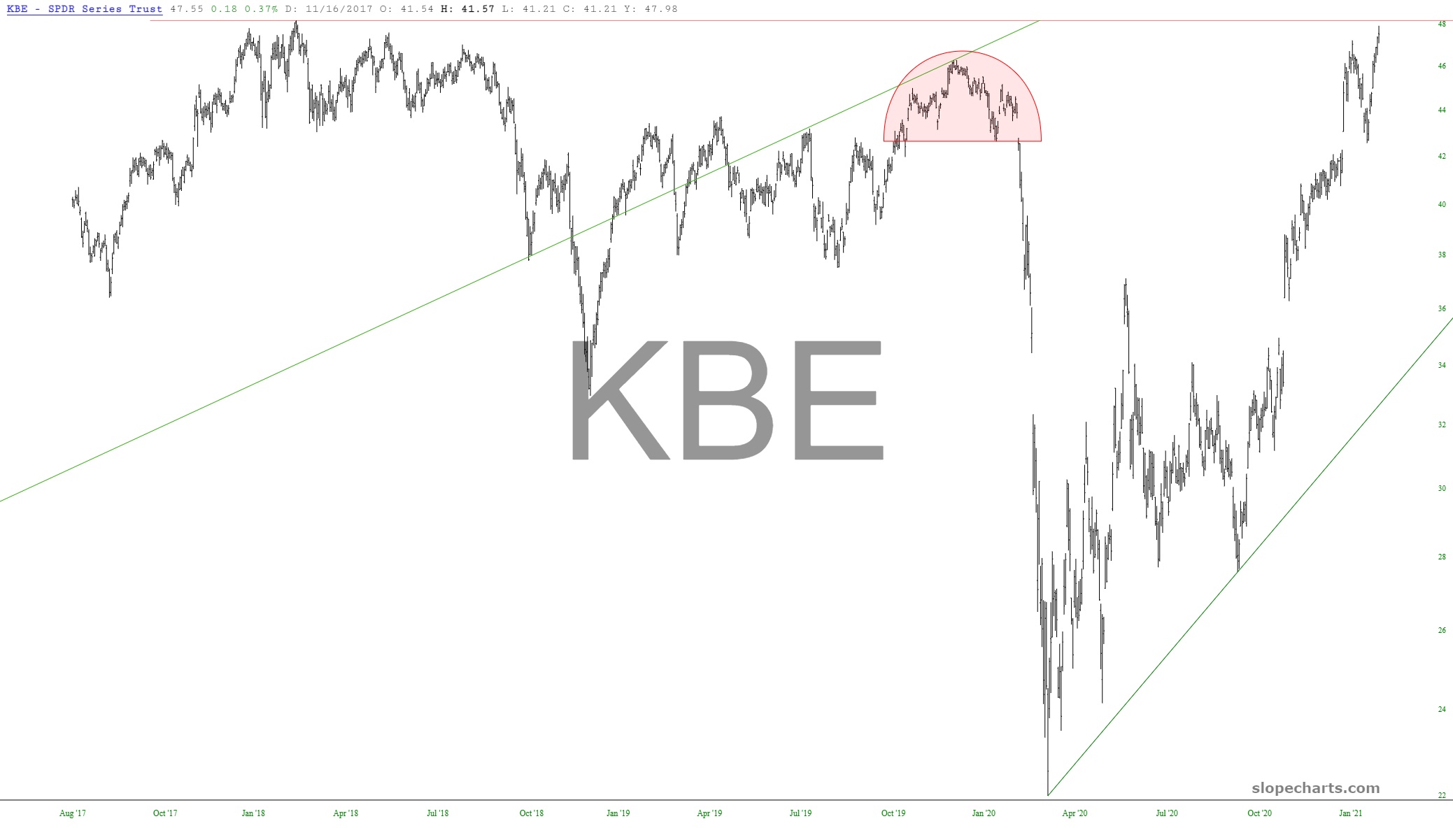
The bank sector is approaching its lifetime high, and possibly a triple-top.
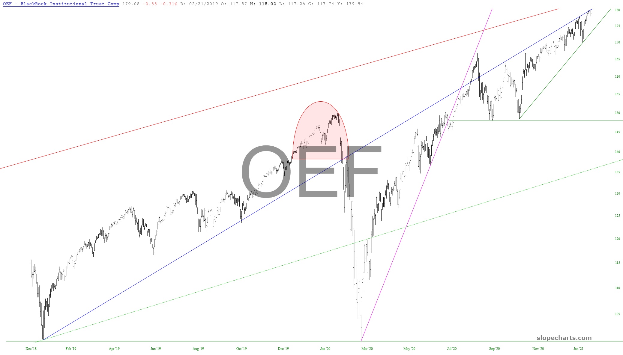
The S&P 100 is mushed right up against the underside of its broken ascending trendline, as it has been for many, many weeks.
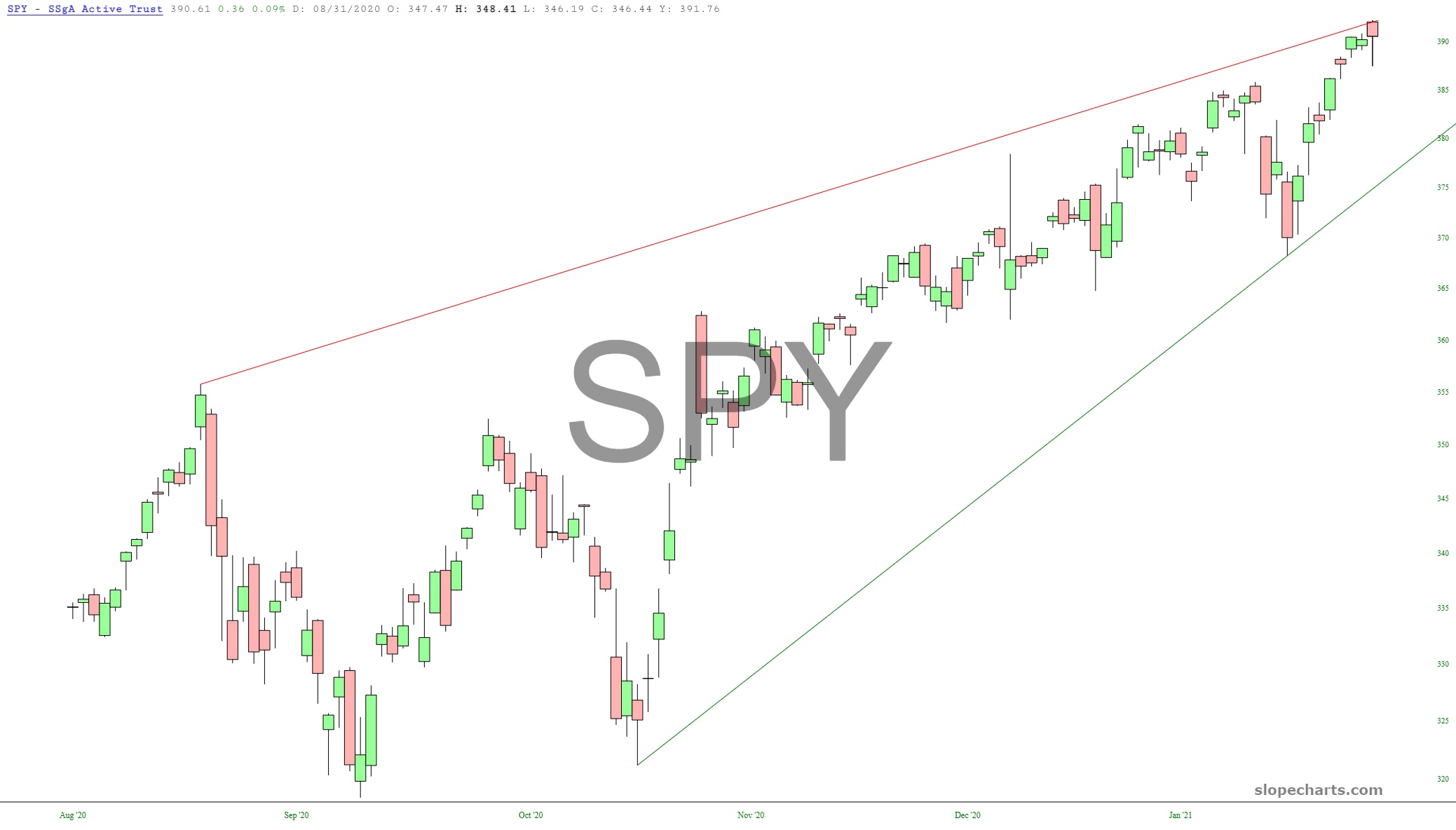
Its big brother, the S&P 500, is still banging around its ascending wedge pattern.
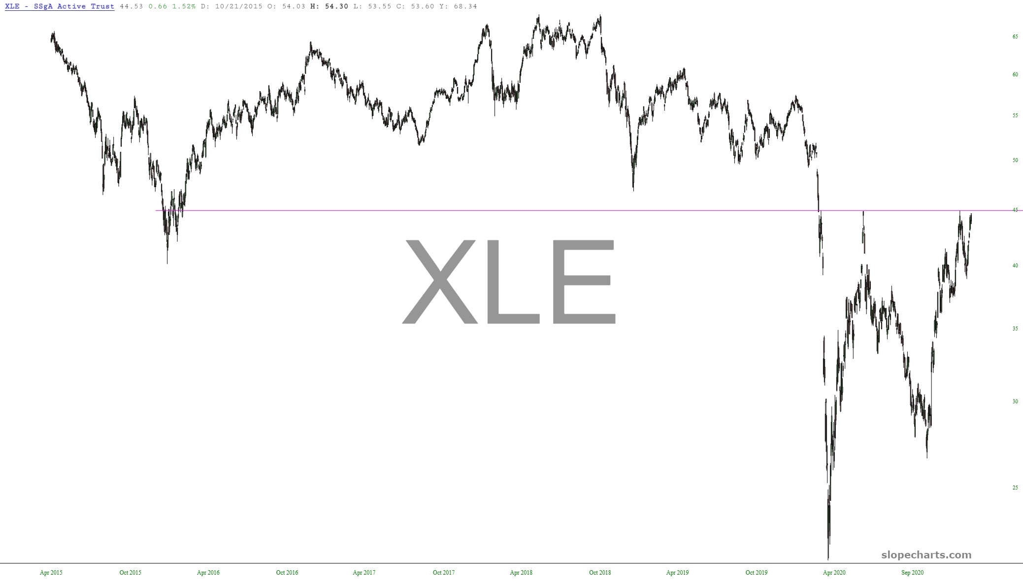
Lastly, energy – -which is closely related to DBC, the first chart I presented – – is pushing up against a very important resistance line, which defines the massive topping pattern above it.