It’s never easy to dream up content on weekends, and it’s 50% harder on long weekends. I pulled ten ETF charts that were kind of interesting, and instead of breaking them up into, say, three or four separate posts, I’m just going to do this one big post and leave it up all day. I’ve got a few things to say about each ETF chart.
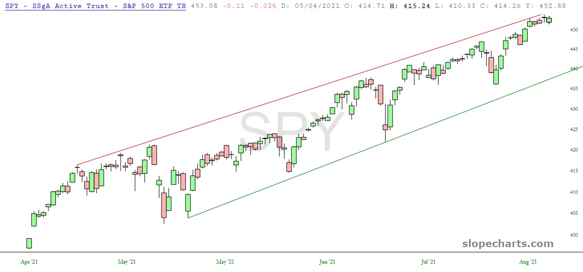
The firs tone, and by far the most dull, is the good ol’ S&P 500 “spyder”. You may remember my suggestion that placing a butter knife on the screen will hide every pixel. Well, it’s still true. I think Jerome Powell has the chart of this thing mapped out for years to come.