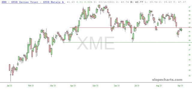
Here is the metals and mining ETF, which has demonstrated its overhead supply by way of that upper horizontal line:

Slope initially began as a blog, so this is where most of the website’s content resides. Here we have tens of thousands of posts dating back over a decade. These are listed in reverse chronological order. Click on any category icon below to see posts tagged with that particular subject, or click on a word in the category cloud on the right side of the screen for more specific choices.
Here is the metals and mining ETF, which has demonstrated its overhead supply by way of that upper horizontal line:
