
Well, it’s Super Bowl Sunday, which means I’ll be spending precisely ten times as much energy on football watching and discussion as I normally do. I’ll also be doing 1/20th the same amount at the same time. It’s kind of a paradox.
More importantly, I am delighted to tell you of some very cool new improvements in SlopeCharts as follows………..
There are a variety of elements in SlopeCharts which can be turned on and off (or, if you fancy, “toggled”). You can change these based on your own preferences about how information is displayed, and by hiding certain elements, you can simplify or clean up a chart presentation without losing anything valuable. To access these toggle functions, use the Hide/Show menu:
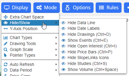
Many of these functions also have keyboard equivalents for easy, instant access. For example, by pressing Ctrl and then the spacebar on the keyboard you can toggle the volume pane on a chart on and off. The toggles available (whose first word in the menu will be “Hide” or “Show” depending on its present state) are:
- Data Line – this is the lone line of information that appears at the top of the chart showing the symbol, name, date, open, high, low, close, and other information.
- Date Labels – this is the x-axis label at the bottom of the chart. Hiding this frees up more room for the price bar presentation.
- Drawings (Ctrl+D) – this will hide or show all of the drawn objects you have put on any chart.
- Events (Ctrl+E) – when you are looking at a stock chart, you can see the dividends (icon “D”), earnings events (icon “E”) and stock splits (icon “S”) placed at the points where they took place. You can hide or show these icons via Events.
- Open Interest (Ctrl-I) – this is the open interest line graph in commodity charts.
- Price Bars (Ctrl-P) – these are the price bars themselves. It may seem crazy to hide these, but if you want to focus on, for example, technical studies purely by themselves, this is invaluable.
- SlopeLinks Icons – these are the little icons that appear beneath the data line. Hiding these will free up that space for the price bar presentation and will also make the chart look cleaner.
- Studies (Ctrl+S) – this controls whether the technical studies you are using will be shown or not.
- Volume (Ctrl+Space) – this is the volume pane, which is an independent portion of the chart that shows the volume bars.
There is one visual element not mentioned here, which is the y-axis label, which is the means by which price values are displayed. We have a power feature related to the display of this, which controls where it is on the chart you would like it displayed. To access this control, choose this item from the Display menu:

Once you do this, a slider bar will appear on your chart which will let you position the y-axis labels on the extreme left, the right extreme, or anywhere else in between. As you move the slider bar, you can see precisely where your labels will come to rest if you release the mouse button.
Enjoy! And email me any issues you encounter.
