Yes, we’ve added something totally new to the Slope of Hope: our yield curve tool. Read what I’ve written below, and if you’d like to see any other features in this tool, which is already the best one on the entire web, you can email me.
Understanding the yield curve and its meaning is helpful and important for investors. The web has no shortage of explanations, some of which include eye-watering formulae such as these:


That’s fine for finance PhD candidates, but for our purposes, it’s much easier to understand than you might think. We are going to focus on debt instruments of the United States government, since that is the most relevant to us as investors.
Different Maturities, Different Rates
The U.S. offers debt with maturities ranging from as little as one month to as long as thirty years. Normally, the longer a buyer is required to hold the debt, the more they expect to get paid. That makes sense, because if a person is willing to tie up their money for just one month, they might be happy with a 2% rate, whereas the same person tying up the same capital for thirty years – – literally 360 times as long – – would almost certainly demand a higher rate, such as 4%. Therefore, in healthy, normal economic times, the yield curve slopes gently upward, indicating higher interest rates associated with those instruments, with short-term debt on the left and long-term debt on the right.
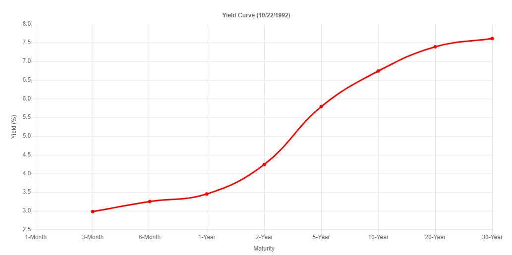
Here, for example, is the yield curve in the autumn of 1992, just before an economic expansion and tremendous stock market rally that would last the rest of the decade.
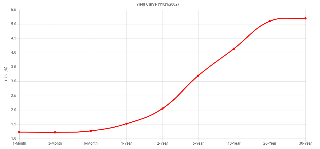
Similarly, here is the yield curve late in 2002, before an economic expansion that would last for five full years.
The Meaning of Flat Curves
There are occasions when the yield “curve” flattens out. The chart below may not look flat to you, but that is only because the y-axis has been scaled in such a way to eliminate useless white space. However, the entire range of yields between highest and lowest is only about 0.50%, which is extremely tiny when dealing with such a wide range of maturity dates.
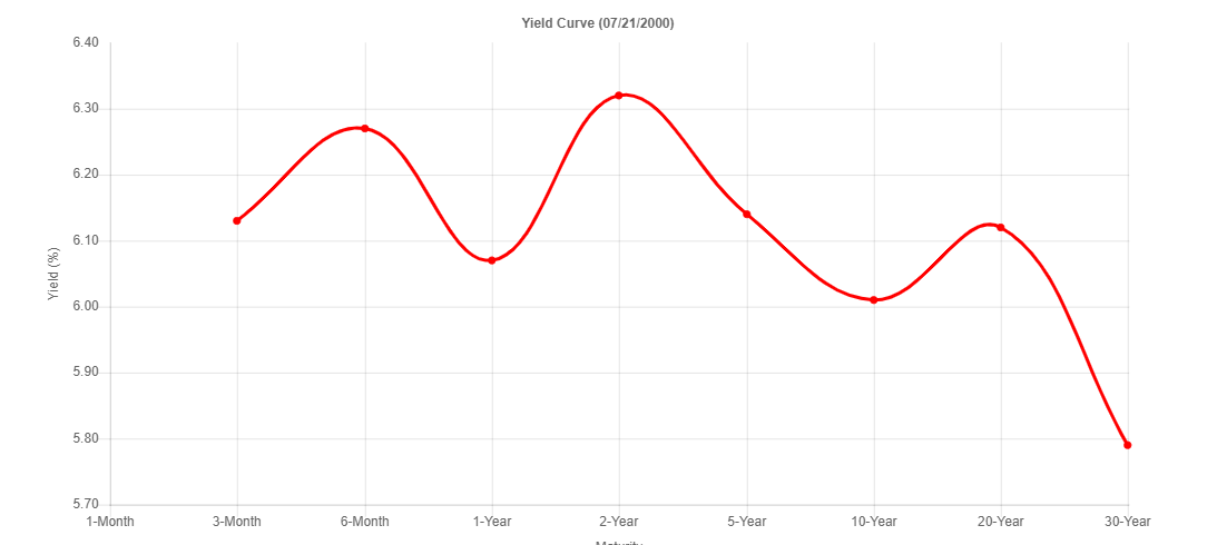
Flat curves are not particularly common, but they suggest uncertainty on the part of the market. The example above was from the summer of 2000, which preceded a monstrous two-year bear market which took the NASDAQ down, for example, by over 80%.
Inverted Curves as Fortune-Tellers
The most famous use of the yield curve is when they are inverted, since historically this has been a very reliable indicator of economic trouble ahead. The reason a curve would invert will vary from instance to instance, but generally speaking, it means people are anticipating economic weakness ahead (and, thus, lower interest rates in the future) or they are so concerned about the short-term that they demand to be paid for their risk on short-term debt instruments.
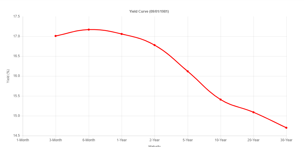
Below is an excellent example of an inverted yield curve from the spring of 1981. This was certainly an excellent predictor of economic trouble ahead, since a substantial recession was about a year away.
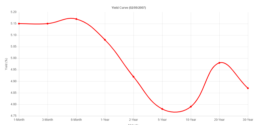
Here is another example, this one from 2007. As before, it predicted a major recession (in fact, the Great Financial Crisis) was coming. Take note that the chart doesn’t have to be smoothly lower with every successive maturity level. On the whole, if longer-term instruments pay less yield than shorter-term ones, it is considered “inverted.”
Using the Yield Curve Tool
Slope of Hope has the most useful and powerful tool for looking at decades of yield curve history. The Yield Curve Tool page has two principal sets of controls. One of them is the buttons:

The functions of these, from left to right, are:
- Play – animates the yield curve, from the start of our history decades ago to the most recent data;
- Stop – ceases the animation. You’ll want to use this button if you’d like to manually explore different points in history without the page forcing the animation to continue;
- Loop – check this box if you want the animation to keep playing continuously;
- Granularity – this is a dropdown which lets you choose the “fineness” of the data used, ranging from Daily to Annually. The finer the data, the slower it will play.
- Download – click this to take the current image you are looking at of the yield curve and save it to a file, perhaps to share on your social media or for your own research;
- Tweet – click this to share the yield curve with others on Twitter.
- Question Mark – Shows help for the page itself.
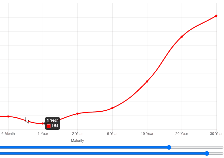
There are also two slider bars: Animation Speed and Historical Data. You can drag either of these left and right on the page itself.

Dragging the Animation Speed slider left will make it play slower, and dragging it right will make it play faster. Dragging the Historical Date slider will let you swiftly move through time to earlier (left side) or later (right side), like this:
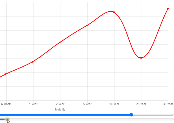
Finally, when you point at the yield curve itself, it will display for you, for each dot, the debt maturity you are observing as well as its percentage yield at that time.