
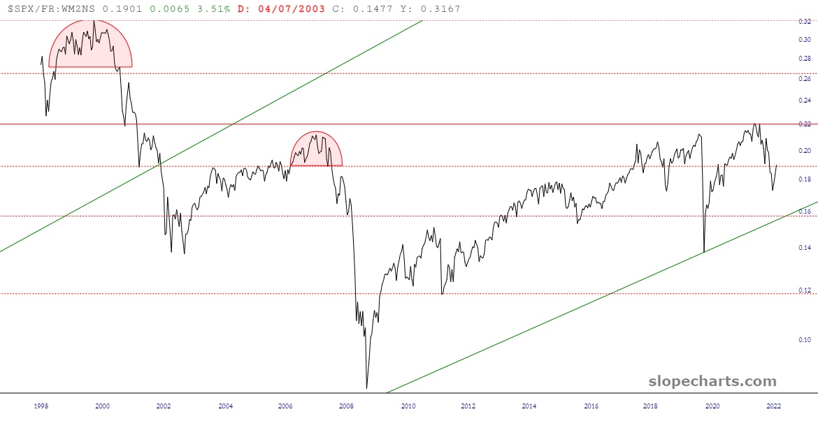
We haven’t looked at this fascinating ratio chart in a while, so let’s dust it off. This is the S&P 500 cash index divided by the M2 money supply. As a reminder, this is, to my way of thinking, a more honest reflection of the market’s value, since it is denominated by a “normalized’ dollar. Take careful note how, even in this laughably over-inflated market, we have never even come close to the peak of the true bullish prosperity of the late 1990s. We’re just been faking it for twenty-two years.

Looking closer, you can see how we are currently beneath a major (and I do mean MAJOR) Fibonacci retracement level, suggesting massive resistance in this zone. Indeed, I’m seeing a setup that is remarkably similar to the 2007 top preceding the financial crisis.
Jerome Hayden Powell………..….let’s dance.
