
I've mentioned before that I have a strong bear bias that I try to ignore as I chart shorter timeframes. Why do I have that bearish bias? A good illustration of the reason was shown in a great chart on Chart of the Day yesterday. Kyle Bass sent out a newsletter to investors and used this chart in that newsletter, while explaining that defaults on sovereign debt in much of the developed world are more or less unavoidable over the next few years, and that current policies of throwing good money after bad in order to delay the problem long enough that it might somehow disappear, are unlikely to be effective over periods of more than a few months. Here's the chart and if you click on it, the link will take you to the full writeup at Chart of the Day:
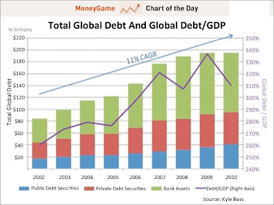
The title reference is of course to the famous story that Nero played a merry tune on his fiddle while while Rome was burning in the great fire in the latter half of his reign. The story may or not be true, but I've wondered in recent years whether this might not have been a misunderstood lesson on effective small government if it is true. Politicians and central bankers always feel the need to take action to combat a crisis, but as this huge debt bubble has expanded over the last twenty years, every step they have taken has thrown yet more good money after bad. If Greenspan and Bernanke particularly had concentrated on improving their musical repertoire over the last twelve years rather than trying ever more desperate measures to delay an inexorable reversion to the mean, then this crisis would already be a receding economic lesson on the importance of fiscal moderation.
What does this mean for the markets? Well it makes them harder to predict over longer timeframes, as the entire system is increasingly built on the sand of dodgy global debts, and sand makes an uncertain foundation. When will the system crash? Hard to say and the trader's role here, as I see it, is to play the short term picture with one eye always on the exit, as sooner or later there's going to be a hell of a crowd trying to escape through it.
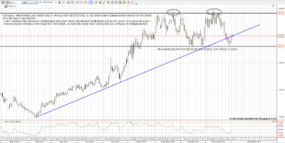
While we wait, the number of markets and instruments that are 'risk off' refuges in any flight to safety is shrinking, as one by one these move into the 'risk on' category. I posted my very bearish long term Yen chart the other day, but the Yen goose isn't quite cooked yet. I also posted a chart of German Bunds, asking the question whether they would rally (risk on), or fall (risk off) with equities on a strong rally. We have our answer this week with German Bunds rallying strongly with equities, so it seems that contagion has now spread to German Bunds, which are therefore no longer a flight to safety trade refuge:
I have been considering the broader trendline picture here to consider where resistance and support lies on the various key markets that determine overall direction. The first one to look at is the biggest remaining flight to safety destination, US Treasuries. For the moment the inverse correlation with equities remains strong and we are approaching an important test or rising support in the 139 area. If that breaks the next big support is at the double-top neckline in the 135 area. On a conviction break of 135 the double-top target would be 123. If we see 135 break with conviction then that would be important confirmation that we are now in a new cyclical bull market for equities:

USD is the other half of the US Treasury flight to safety trade and is therefore strongly correlated with US Treasuries. On there the short term H&S target at 78 was made (more or less) in a single strong spike down from 79.5, and USD has since been consolidating above there. There is decent support and an H&S neckline at 77.8, but if we see 78 break with conviction a better target would be the strong support area (and more potential H&S necklines) in the 76.7 to 77 area, which would fit with a 61.8% retrace of the last move up;

I did a post on XLF yesterday and that's a very important chart to watch in case the bear market is over. Key resistance this year has been at declining resistance from the 2007 high, and I have that in the 13.2 area now. A break above there doesn't mean SPX is in a new bull market, but without that break any rally on equities here is likely to fail fairly soon. Here's the picture on the XLF 30min chart:

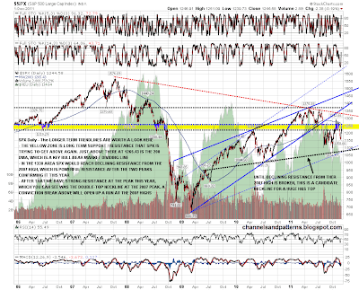
Declining resistance from the 2007 high is also important on the 6yr SPX chart, where I've tried to mark all the key longer term trendlines and levels on SPX that we should be aware of here. I've shown declining resistance from the 2007 high, and that should be hit in the 1320-30 area if SPX gets that far. SPX is currently trying to break up again from the very important 1220-50 support / resistance zone. Just above is the 200 day moving average at 1265.43. That is a key bull/bear market dividing line that needs to be taken and held for the bull case. Slightly above there is declining resistance from the July high in the 1270-5 area. I have that at 1270 dead on ES and that too is important resistance here.If all of these levels are broken, then I have shown on the chart how the high this year on SPX is itself at very important resistance, as it was exactly at the double-top neckline for the 2007 high. I've not seen anyone mention the possibility that we might see a double-top at that level, but I for one am considering it. Only a conviction break above opens up the path to a test of the 2007 highs:
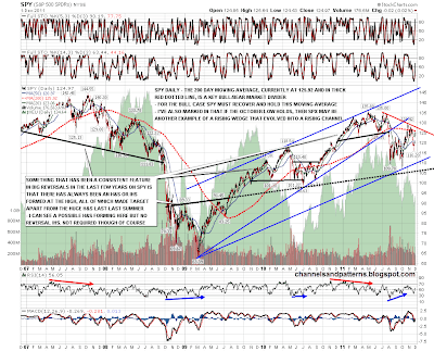
The shorter term trendlines are shown closer up on this SPY daily chart, where I have also illustrated how the SPY rising wedge from the 2009 lows has evolved into a rising channel. Rising channels break all the time of course, but that broken rising wedge has played out to the first obvious target and cannot be relied upon for any further downside. On the bear side I have also marked in the neckline on the huge sloping H&S that may also be forming here:
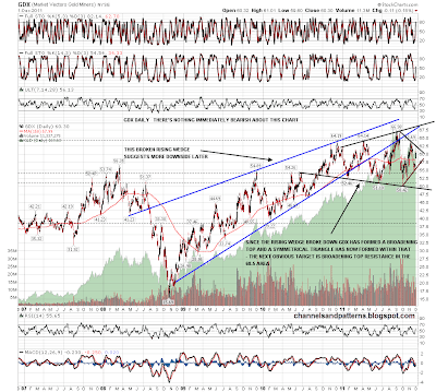
The last chart for today is GDX, which has formed a very interesting pattern structure since the big rising wedge broke down earlt this year. Since that time GDX has been forming a megaphone or broadening top, which despite the name is a direction-neutral pattern, and within that GDX has recently formed a symmetrical triangle. I'm leaning bullish on that triangle, as the next hit due within the larger broadening top is at the upper trendline in the 68.5 area:
There's a lot of information on the charts today so if you want to see the full comments, then click on the chart to see the larger versions. Short term, key resistance is in the 1270 ES area if it gets that far. This is a big news day and direction may well be dominated by that news.
