
Monthly charts show the really big structure in the market. I believe they depict the expansion and contraction of the economy. The markets at this macro view are like a big lumbering beast that is slowly breathing in and out. When the markets are rising, the beast in breathing in and expanding. When the market lets the air out, the beast is going to contract for awhile.
In this post, I will review both the SPX and Gold.
The SPX monthly chart is what I use for my long-term investing (IRA, 401K, RSP). You can see from the chart below that we are in a strong bullish posture as evidenced by the fact that the Heikin Ashi bars for the last 5 months have no lower wicks. That’s a strong trend. You can also see that the market is above the previous high set in 2007. But with the stop 170 points below the month end price, it’s not a trading chart per say. The time frames are not typical of what most people think of when using the wording “trading” since the trends can run for many years. So you have plenty of time to safely build a position and you know where to get out – or where to buy puts. The fact that the stops are far away means you can buy what hedge funds call “units”. These are insanely cheap puts on the SPY, usually sold for pennies, which really ratchet up on a fast down move. As far as building a position, it can be accumulated at the Monthly VWAP over as many months as you want. This is what I meant in my first post when I used the phrase technical investing (based on statistical positioning). I haven’t researched it much, but from what I am seeing from the typical hedge fund manager, I would rather just invest off of these monthly charts!
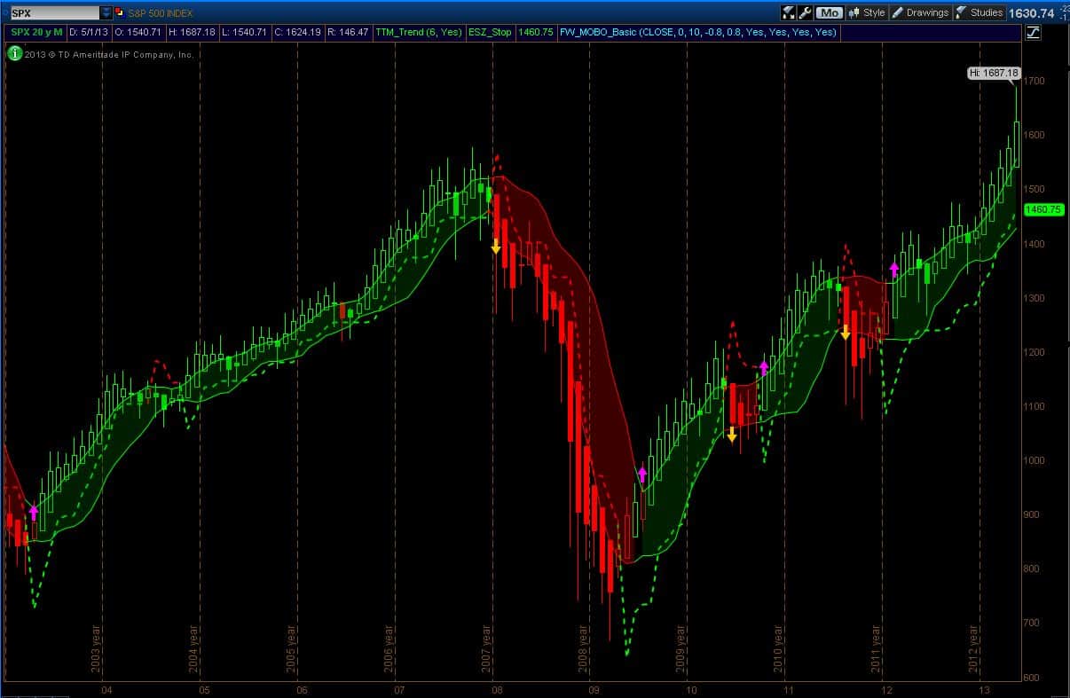
Now the chart below is one that might be anathema to the short term trader but I find it worthy of consideration. It is a chart of the SPX for the last 20 years. You can almost count on two hands the number of trade signals given in that period. It’s not necessarily an easy ride, but it is an investable one. Besides the obvious long trends, the casual observer will note that the market has broken out of trading range lasting more than 15 years. That’s significant. It could be a false break certainly, but for now, we only have the break to work with.

Finally, on to gold. I was sending these charts to family and friends for quite some time and in reviewing those emails, I noted my several warnings. From the double top in the summer of 2011 to the astonishing rapidity in the fall of positive momentum shortly thereafter, I was not happy with price action in gold. It was then that I learned that for some people, gold is something more than a commodity. I was fascinated by some of the comments and ironically, it was one of those staunch gold supporters who helped me make the decision to start showing these charts again (there is a back story here obviously. I will tell it, but at another time). So here is the chart. The Squeeze indicator should give any gold bug pause. Not only has the momentum fallen like a stone, but there is now enough directional volatility (in the negative direction) to fire off the Squeeze indicator – that green dot. The only bullish thing I see in the chart is the possibility of a double bottom in this last two months (much like the double top in August and September of 2011). But for now, the big lumbering gold beast is letting the air out.
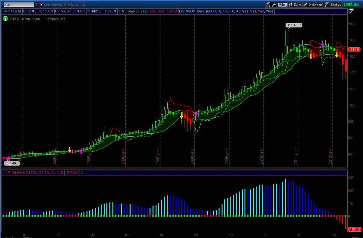
Oh, the other thing worth mentioning about this gold chart is that statistically, gold went nowhere for about a year before the statistically-based breakdown signal. Nowhere. And yet I am pretty sure it was in the news every day during that time.
That’s all for now. I will return on the weekend with the weekly charts.
Good Trading!
-Dr. G
