Although I’ve never owned a penny of any cryptocurrency, I find their charts fascinating. They are much better-behaved than equities these days………….maybe because they are actually – gasp – permitted to go up and down based on natural economic laws instead of trillions of dollars of distortion.
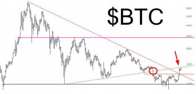
Anyway, Bitcoin is the king of them all, and its chart is particularly intriguing. It broken its symmetric triangle (red circle below) and ground down to under $6000, having peaked at almost $20,000 last December. However, it rallied mightily up to, yep, just underneath that broken trendline. Here we see a textbook example of support magically changing roles to resistance.
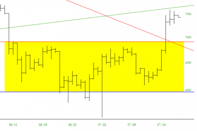
Looking much closer, you can see how a small bullish base was formed, and a few days ago the crypto space exploded higher. It was a one-hit wonder, however, and unless $BTC conquers that trendline, it is at risk of continuing to erode in the weeks and months ahead.


