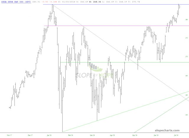
I wanted to mention a subtlety in SlopeCharts that comes up more than any other, and that is about dividends. Our data is adjusted for splits and dividends, as I believe it should be. As an example, here is the chart of SPY, which looks poised for (God forgive me) an explosive breakout higher. It looks “different” than any other chart, because, well, their data is inferior.
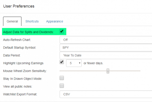
You can adjust this, however. Or at least PLUS users can, I think. Just go to Preferences and you can turn dividend and split adjustments OFF by un-checking the box.
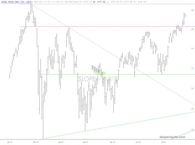
You can see quite clearly what a difference this makes in the chart. The breakout isn’t nearly as close.
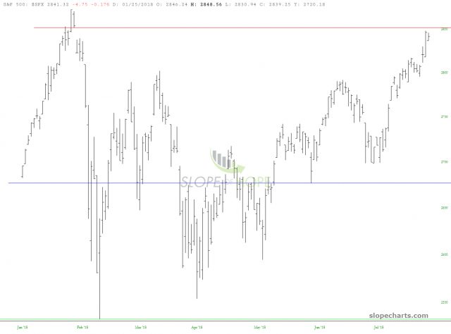
And this agrees better with the S&P 500 cash index itself (which, of course, doesn’t issue dividends). Importantly, we are right close to a price gap, which merits your attention.
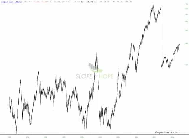
Personally, I suggest you leave it alone, since, for instance, Apple doesn’t really resemble anything like its non-adjusted chart.


