
You are going to LOVE this one. Please note to hit Ctrl-F5 on your SlopeCharts page to try it out (so you get a fresh copy).
SlopeCharts continues to get farther and farther ahead of everyone else, including my (now-deceased) former creation, ProphetCharts, which evidently Ameritrade finally took out behind the barn and shot. (Actually, a Sloper just told me some folks can still get to it, but Ameritrade has said it’s gone for good next month).
We introduced Time Perspective charts only a few days ago. Now we have doubled down on this excellence with a new button, Date Analysis, which you will see at the top of SlopeCharts when you are in Time Perspective mode (as a reminder, this is a premium service, so if you’re not a subscriber yet, there’s no time like the present, especially since I’m about to increase prices on July 1st).

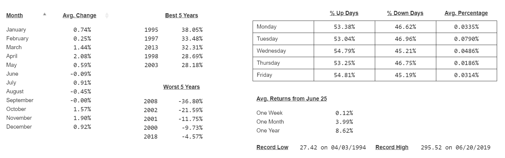
When you click the Date Analysis button, you are presented with a wealth of information:
- What was the average performance for this instrument for each month of all the years it has existed?
- What months are worst and best? (You can sort the columns).
- How does this instrument behave on Monday, Tuesday, Wednesday, Thursday, and Friday?
- What percentage of those days of the week are losers and winners? What’s the average change during each of those days?
- What’s the record high? When did it happen?
- How about the record low?
- What are the best five years, and what were the changes?
- How about the worst five years?
- What is the typical performance for this instrument one week, one month, and one year from now?
Pretty nice, eh? Here’s the SPY for instance (as always, click for better viewing):
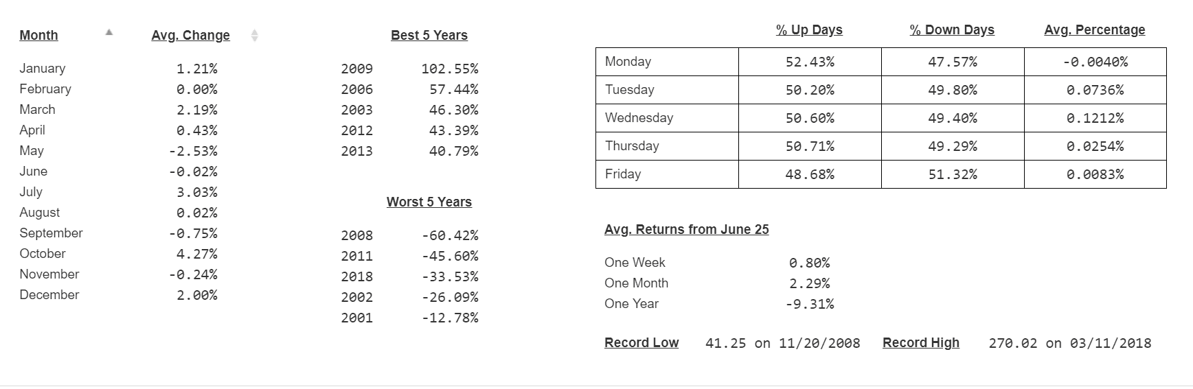
And Goldman Sachs:
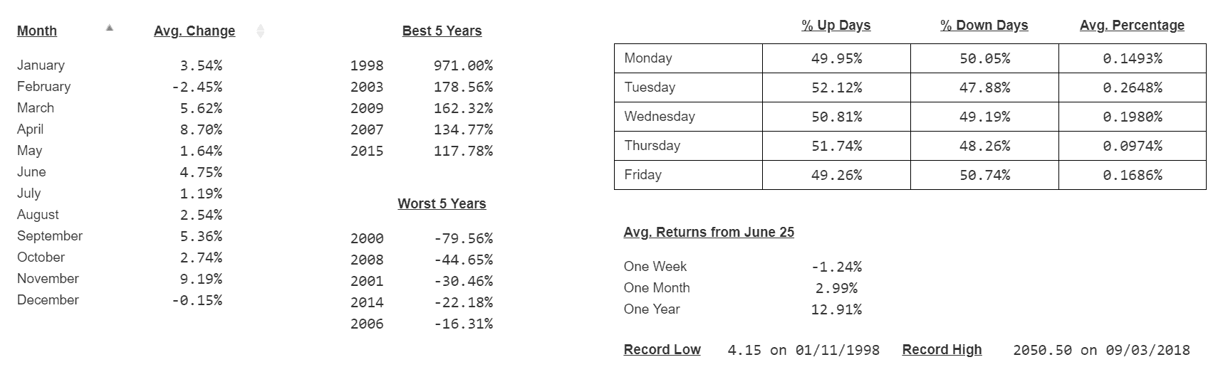
And for some real “extremes”, Amazon:
We can do more! I want to hear your ideas for other kinds of information like this that would be useful! We’re on a roll, and I’m counting on you to help push us so we can all go faster.
