I just finished reading an interview with Jake Bernstein in the latest Technical Analysis magazine (in which Slope has a spiffy new ad – check it out if you subscribe!) When they interviewed Mr. Bernstein, early in April, they asked what he thought was next for the market. He said the biggest rally in history would follow what had just happened, which was the fastest bear market in history. How right he was!
We basically had a bear market that would normally span 18-24 months transpire over just four weeks. The rapid recovery from that has been agonizing for your humble narrator, although mercifully I have had the distraction of Slope development to keep me constructively distracted.
What I wanted to present in this post was a series of important index charts. They are all fundamentally unbroken. No matter what the world hurls at the market, the Powell Printer is more than a match. That’s why I have to roll my eyes each morning when I see ZH yammering on about Covid Cases this and Record Deaths that. None of it matters. It’s all just noise.
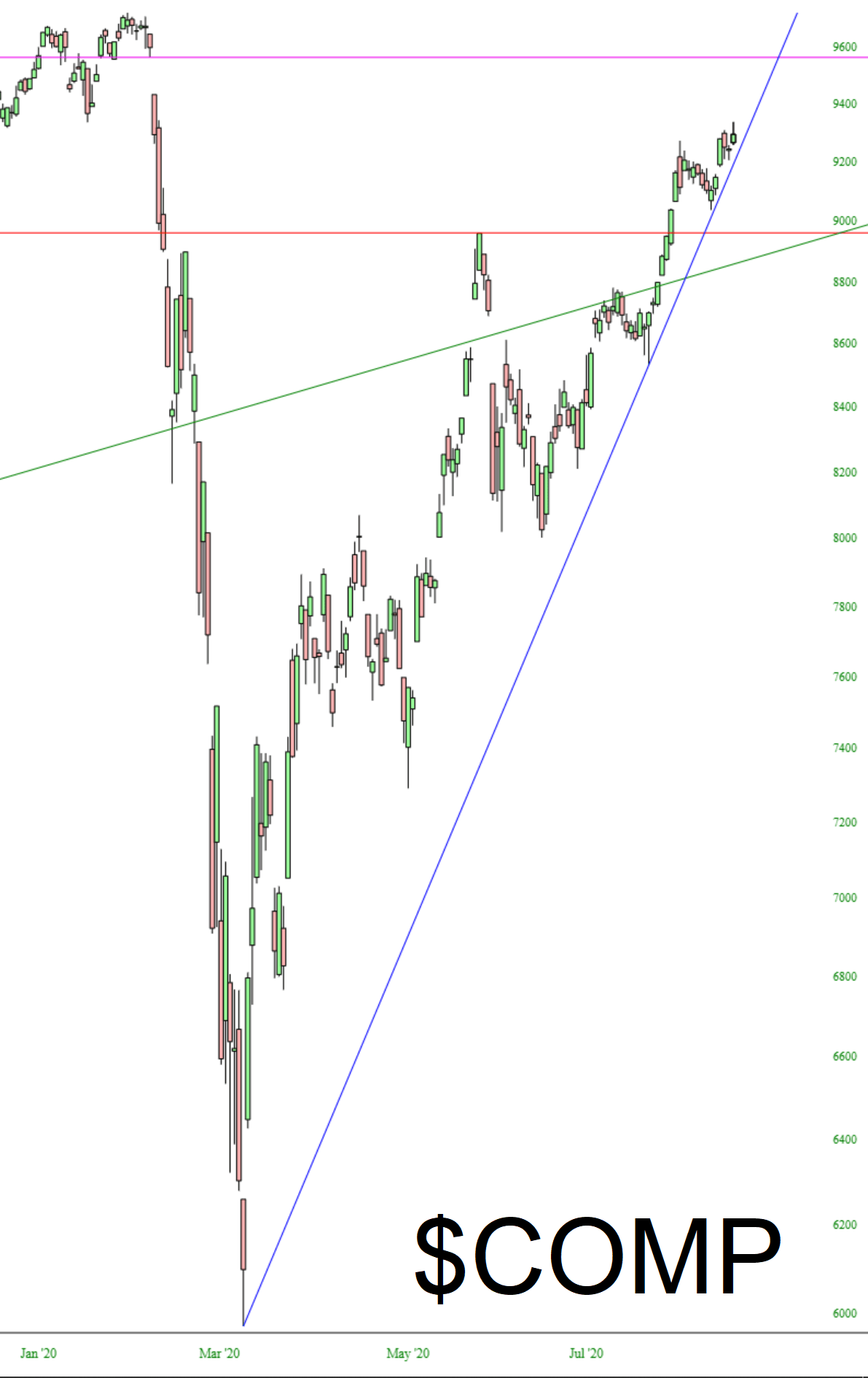
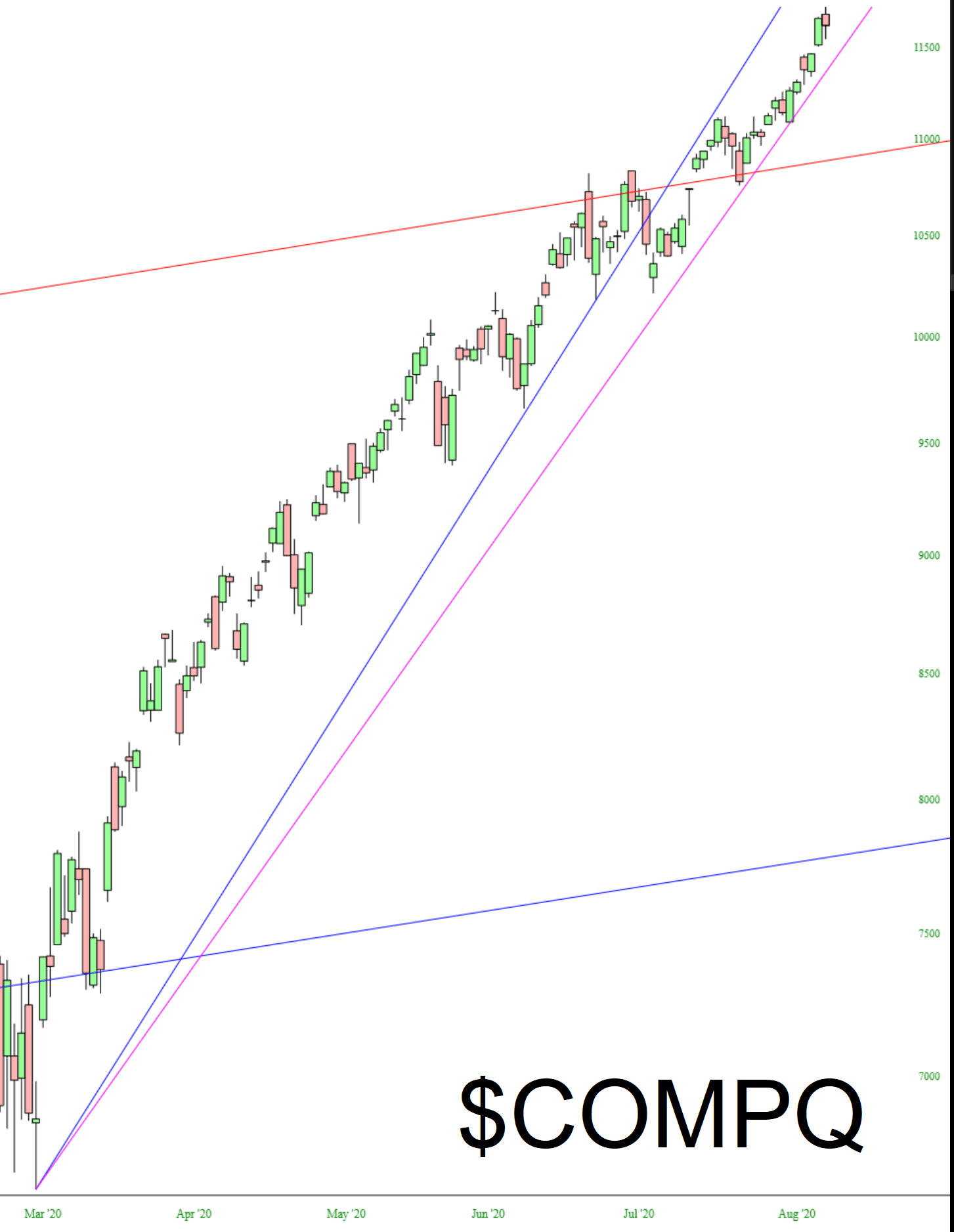
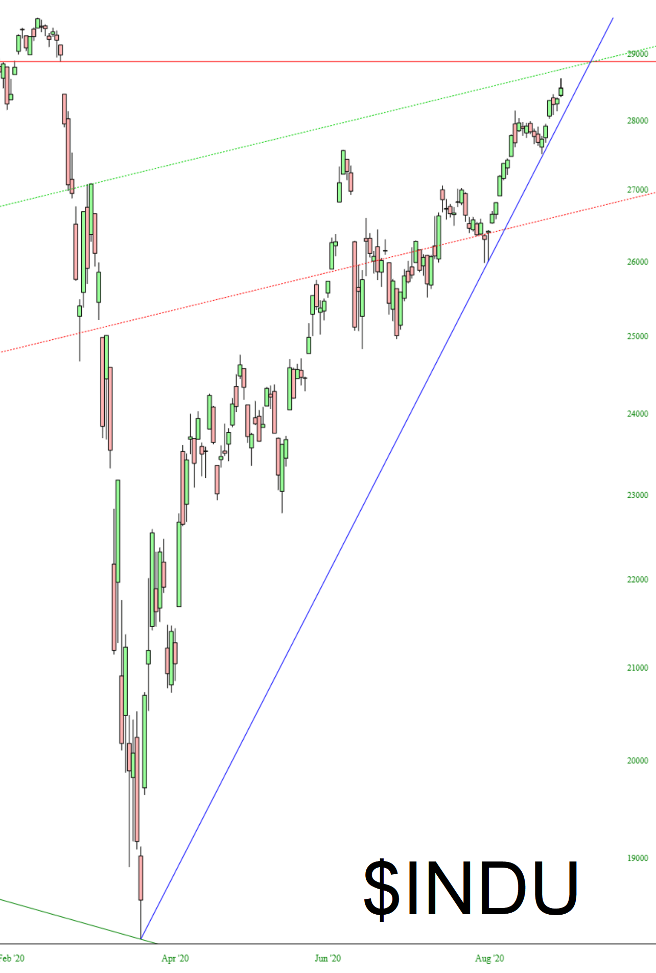
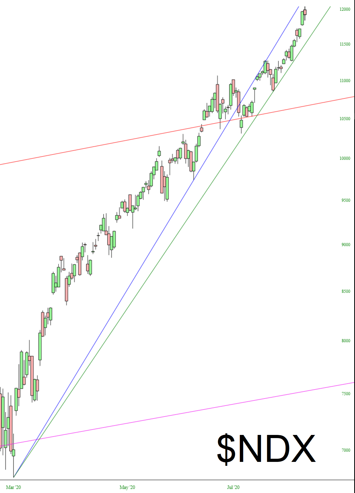
Having said that, let’s walk through these charts. I’ll say just a few words about each in the caption area. As usual, click on any chart for an oh-my-God huge version of it.
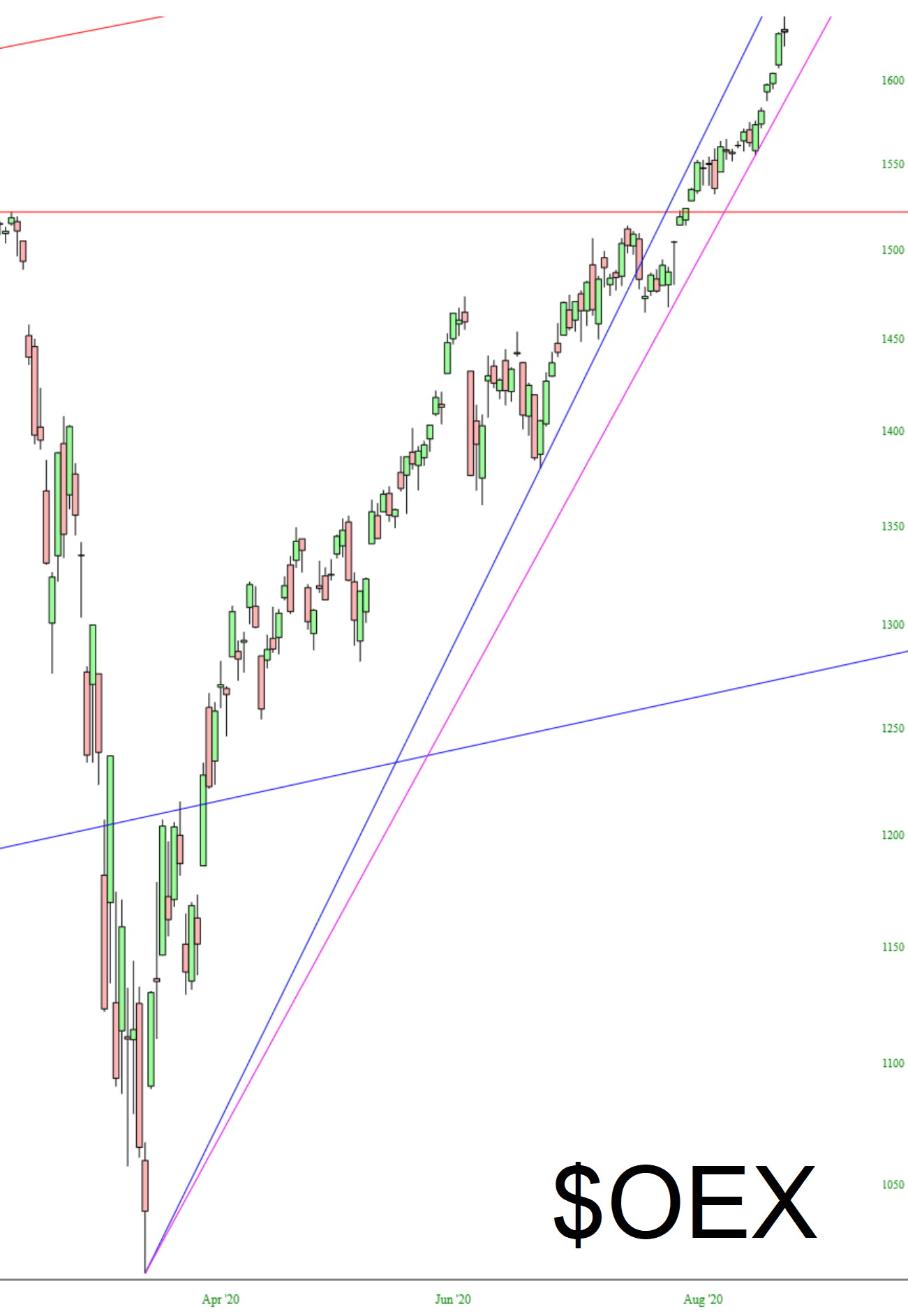
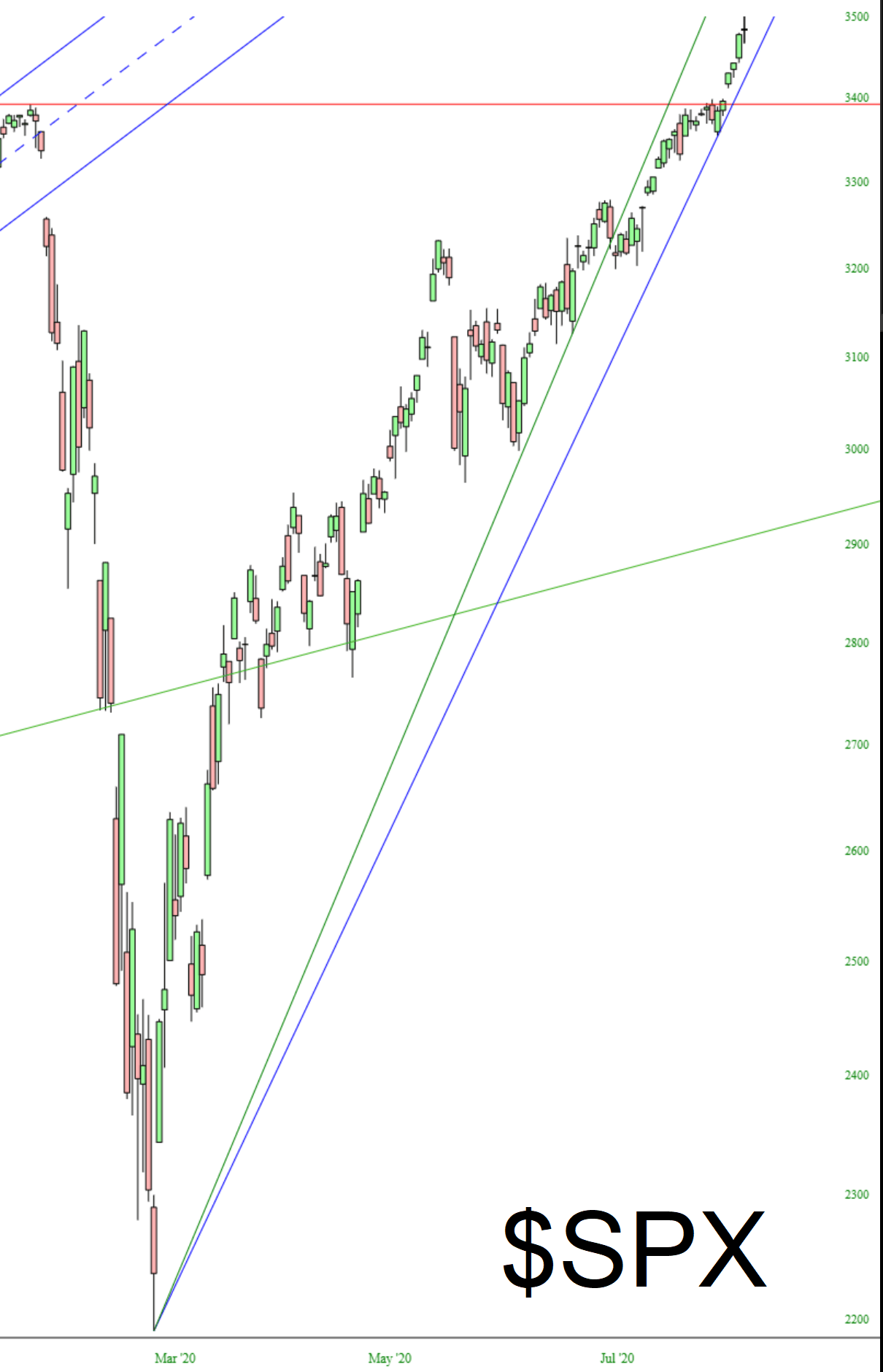
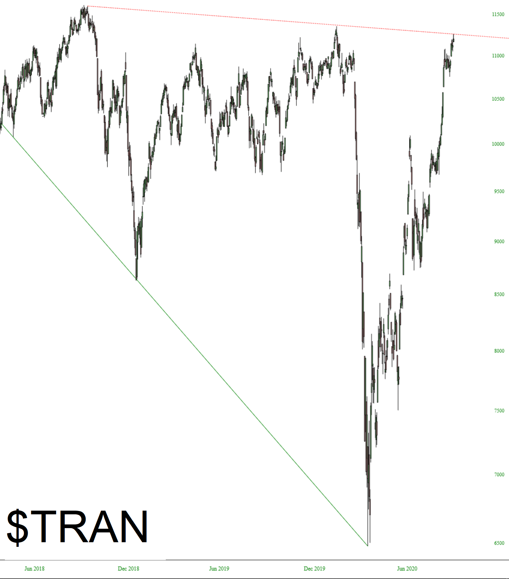
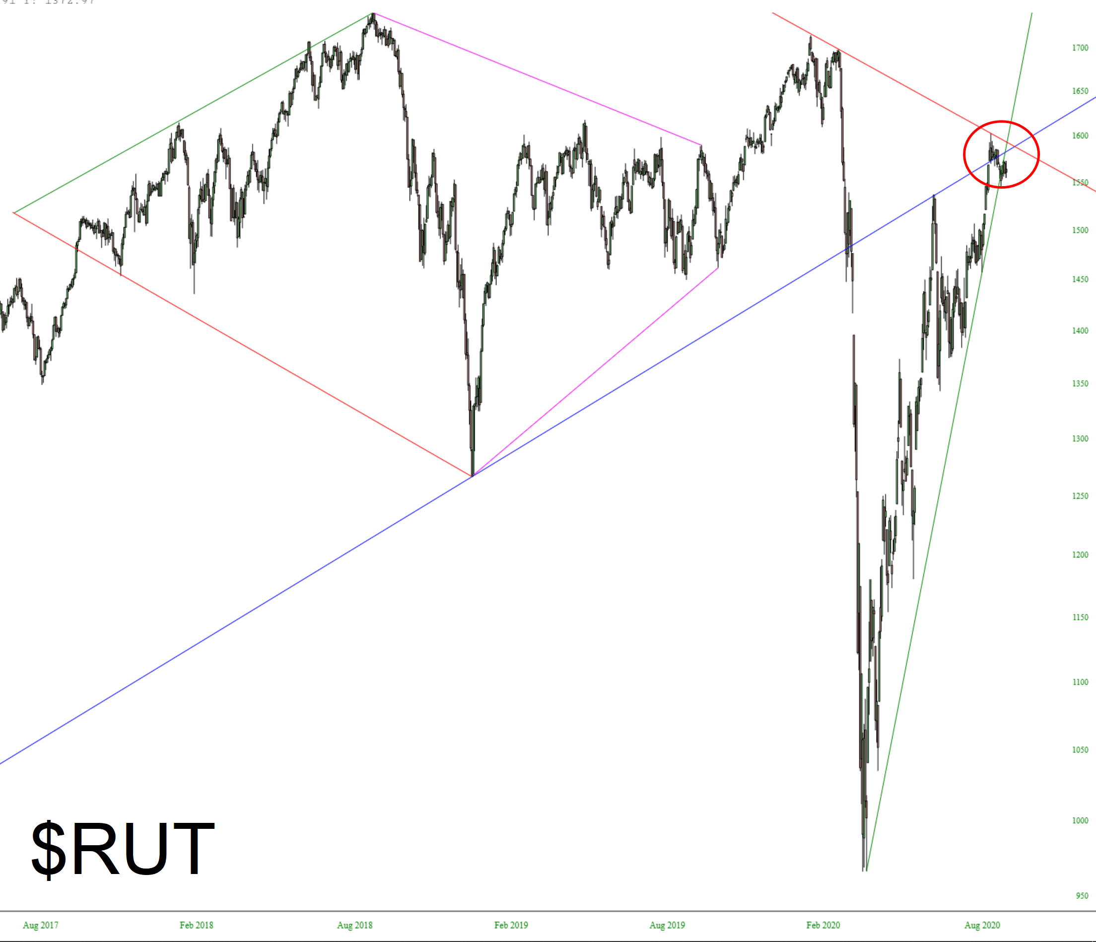
Dow Jones Composite cut above its red horizontal (former high in June) but is still below the February price gap.NASDAQ Composite has been making intraday highs virtually every day, today included. I’ve drawn two trendlines to accommodate the fact that the recent ascent has been a little less sleep than the one before.The Dow 30 paints a similar picture to its superset, the Dow Composite (note Feb 21-24 price gap)The NASDAQ 100 is very similar to the Composite, in that it has two supporting trendlines and has been confined within them for weeks nowThe S&P 100 has a lifetime intraday high today. It’s a minor feature, but today has a “spinning top” candlestick, suggesting uncertainty.The S&P 500 has the identical features of its little brother, the 100.Although it is, unfortunately, much less tradeable than other indexes, the Transports has one of the most fascinating charts, and has a clean series of lower highs.Finally, by far the most interesting chart to me is the small caps – the Russell 2000. These have been treading water for the past couple of weeks. The prices are completely imprisoned by the confluence of major trendlines I have drawn.