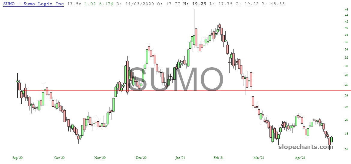
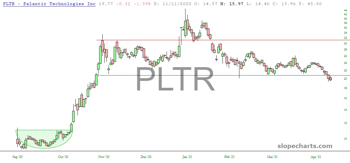
Beneath the surface of major equity indexes hitting lifetime highs day after day, there is rot. You don’t have to look very hard for it, either. I have gathered up some charts below to illustrate how some very well-known names have breached important levels of support, and having pretty much nothing but air holding them up above $0. I am just showing three to everyone, but the other ten for all paying members. Look out below!