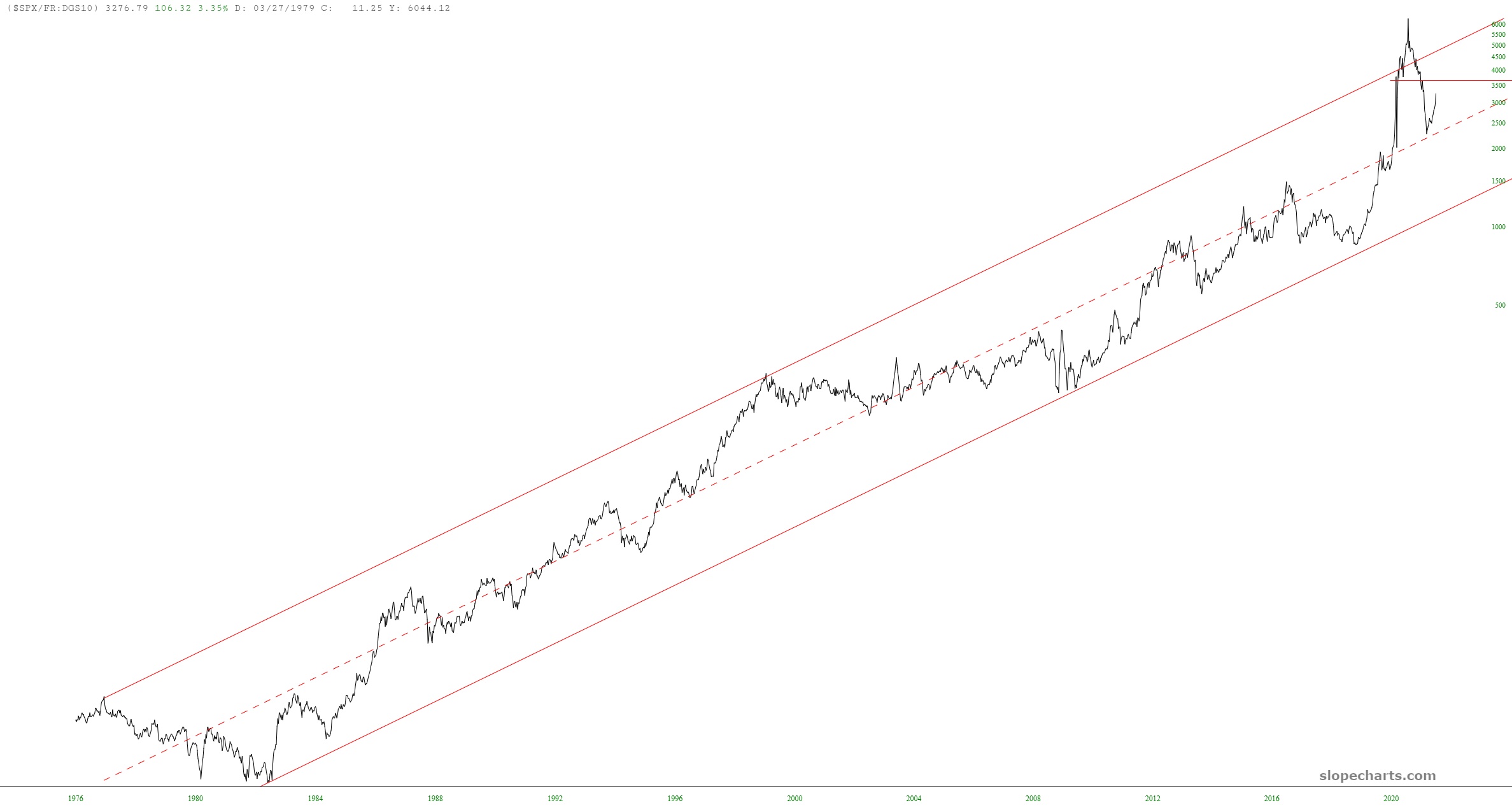
Many months ago, I started tracking the chart for ($SPX/FR:DGS10) which is the S&P 500 cash index divided by the 10-year yield. The result was a fascinating and very clean channel. I noted with concern that this ratio has plunged to a perfect touch-point with the channel’s midline around March 18th, which suggested stronger stock prices ahead.