Slope of Hope Blog Posts

Slope initially began as a blog, so this is where most of the website’s content resides. Here we have tens of thousands of posts dating back over a decade. These are listed in reverse chronological order. Click on any category icon below to see posts tagged with that particular subject, or click on a word in the category cloud on the right side of the screen for more specific choices.

Giant Parallels

By -

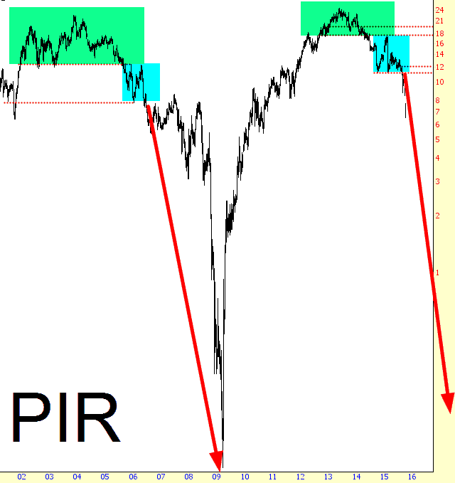
After I did my Whole Foods Bear Market post late last month, I started hunting around for other interesting parallels: that is, stocks which had topped out around 2006-2007 and then went into a complete, utter, and stunning free-fall. The additional requirement, of course, was that they be exhibiting a topping pattern as of right now. My thesis is that these are sample “canaries in the coal mine” which illustrate far better than the insanely-manipulated /ES market how unhealthy equities are.

First is Pier One, that purveyor of throw pillows, scented candles, and coconut monkey dolls:

1005-PIR

(more…)

Charts of Market DOOM

By -

(Note from Tim: just about the only person I’m in contact with throughout any given trading day is Northman Trader, who was kind enough to share the post below. Click on any of the images for a big version. I’d like to add that Northman tends to be much more evenly-balanced than I am, and he isn’t running around beating the bear drum constantly like me, so take that into account when reading this:)

We’ve been bullish from a trading perspective this week and it has worked out great, but we are chartists and what we are seeing is concerning. We’ve talked about structural macro charts for a while and they have teased us along the way with magic saves month after month. But since they are monthly and quarterly charts one has to recognize that the math is straightforward and its clinical results are showing one startling conclusion for bulls: Utter Doom.

(more…)