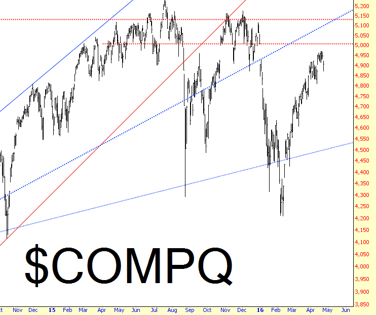
I’ve been watching the gap just above 5,000 on the NASDAQ Composite, and thanks to weak earnings from Microsoft and Google, we tumbled away nicely from that gap on Friday. I think it’s going to hold.
Slope initially began as a blog, so this is where most of the website’s content resides. Here we have tens of thousands of posts dating back over a decade. These are listed in reverse chronological order. Click on any category icon below to see posts tagged with that particular subject, or click on a word in the category cloud on the right side of the screen for more specific choices.
I’ve been watching the gap just above 5,000 on the NASDAQ Composite, and thanks to weak earnings from Microsoft and Google, we tumbled away nicely from that gap on Friday. I think it’s going to hold.
Happy Sunday to you, as we continue our general review of market charts. Just as the chart of HDGE, shown in part 1, illustrated how nasty the strength since February 11 has been to the bears, I’ve got a similar, much longer-term chart to share: SDS. This is the leveraged fund which moves at twice the percentage of the S&P 500 in inverted terms.
This chart goes all the way back to 2009, and as you can see, in all those many years, and with all that’s happened during that tremendous timespan, this has been a relatively steady, sustained slide. What’s most interesting is how “smooth” the slide has become, since the couple of bouts of “relief” the bears got (one in 2010 and one in 2011) have been completely smoothed over by a globe of central bankers whose credibility has been greatly solidified by the investing public.
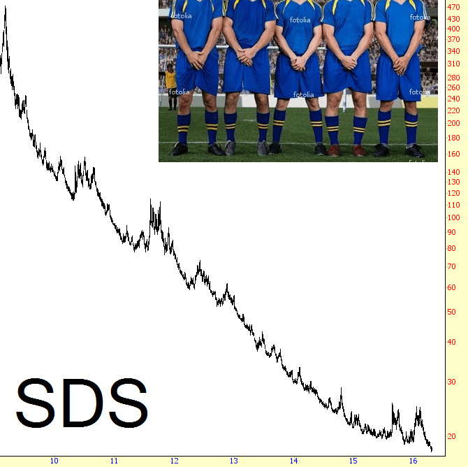
In the chart above, the last couple of gasps of hope came in August of last year, and then in the first portion of this year, ending on February 11th. This week, SDS went to new lifetime lows.
