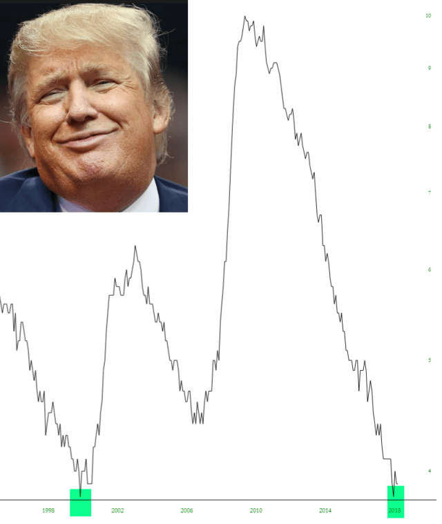
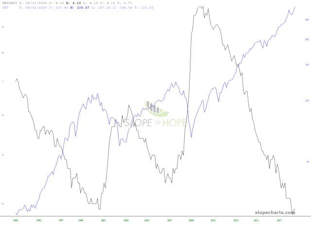
The misery index – – chartable, of course, with my superior SlopeCharts creation – – has been nothing but good news for our really smart, super handsome high-achieving President. Did I mention how smart he is? OK, good. Just want to be clear on that. Seriously.
The last time “misery” was this low was in March 2000. For those not versed in market history to the degree I am, that is the month that the shit hit the fan and the next two years were spent in financial collapse. Two YEARS? Can you imagine?
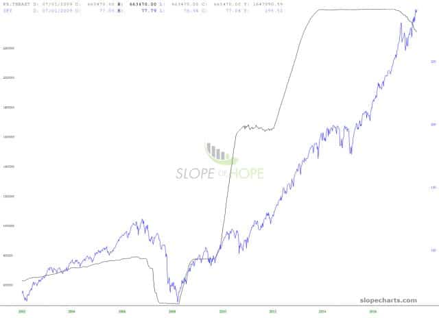
Oh, and as a bonus chart – – provided, of course, by SlopeCharts – – here is a overlay of the Federal Reserve Assets and the S&P 500 ETF. Proof positive that this has been a complete fake, false, fabricated bull market, conjured up by political hacks. Keep an eye on that black line as we “normalize.”
We are heading into interesting times.


