Great news, SlopeCharts users! We now have both the McClellan Oscillator and the McClellan Summation Index!
The McClellan Oscillator is a breadth indicator in SlopeCharts which is based on the components of the S&P 500. This is an important distinction from other studies, since it will appear consistently from chart to chart, irrespective of what is being charted. The reason is that the calculation is based on the components of the S&P 500 and the quantity among those stocks that are advancing or declining.
The study is selected from the Technical Studies dialog box in SlopeCharts, and there are two settings you can change: they are for the exponential moving averages (default being 19-day and 39-day) which converge or diverge based upon the advances and declines of the 500 stocks in the S&P. Most users are satisfied with these default values, but you can move the slider bars and instantly see the effect on the chart if you like.

With long-term charts, the indicator will not appear to be especially useful, since it moves from positive to negative territory with great frequency.

Looking closer, however, the indicator is more useful. You can look for cross-overs (moves from negative to positive, considered bullish) and cross-unders (moves from positive to negative, considered bearish). Below, for example, is the S&P 500 cash index plotted with its oscillator. The crossover is marked with the green tint and the crossunder is marked with magenta. In each instance, the movement across the 0-line was a powerful predictor of near-term price movement, although it took a short while for the bearish signal to yield meaningful results.

Traders can also look for divergences. In the example below, which was at the bottom of the 2008-2009 financial crisis, the price of the S&P 500 cash index kept going down, but the McClellan Oscillator was gaining strength, bottoming a full week before the market’s ultimate low and then creating a “higher low” afterward. This divergence signaled that the internal breadth of the market was turning favorably, even though the value of the index itself was still declining. This provided a powerful “buy” signal at the end of a severe bear market.

sssssss
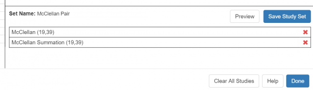
The McClellan Summation is a study derived from the McClellan Oscillator, and its settings are the same as those you would find with the Oscillator:

Simply stated, the summation index moves up when the McClellan Oscillator is positive and it moves down when negative. Therefore, the line cumulatively moves up or down depending on the general direction of breadth with the components of the S&P 500.
An example of a bullish crossover is shown below. The green tint indicates the point of the crossover into positive territory, and although the summation lagged the bottom by a few weeks, it still provided a buy signal that captured the majority of the move higher.

Divergences between price and summation can also provide insights. The chart below shows the popular SPY exchange traded fund moving persistently higher in price during most of 2019, while the summation index is deteriorating with a series of lower highs. This suggests the internal strength of the overall market is diminishing, and the strong equity market is concealing the fact that there is growing weakness beneath the surface of the positive headlines.

Of course, you can use both of these new studies at the same time and combine them into a single study set: