Here’s how September has been to any equity bears out there so far:
Bear Life from r/wallstreetbets(more…)
Slope initially began as a blog, so this is where most of the website’s content resides. Here we have tens of thousands of posts dating back over a decade. These are listed in reverse chronological order. Click on any category icon below to see posts tagged with that particular subject, or click on a word in the category cloud on the right side of the screen for more specific choices.
Here’s how September has been to any equity bears out there so far:
Bear Life from r/wallstreetbets(more…)
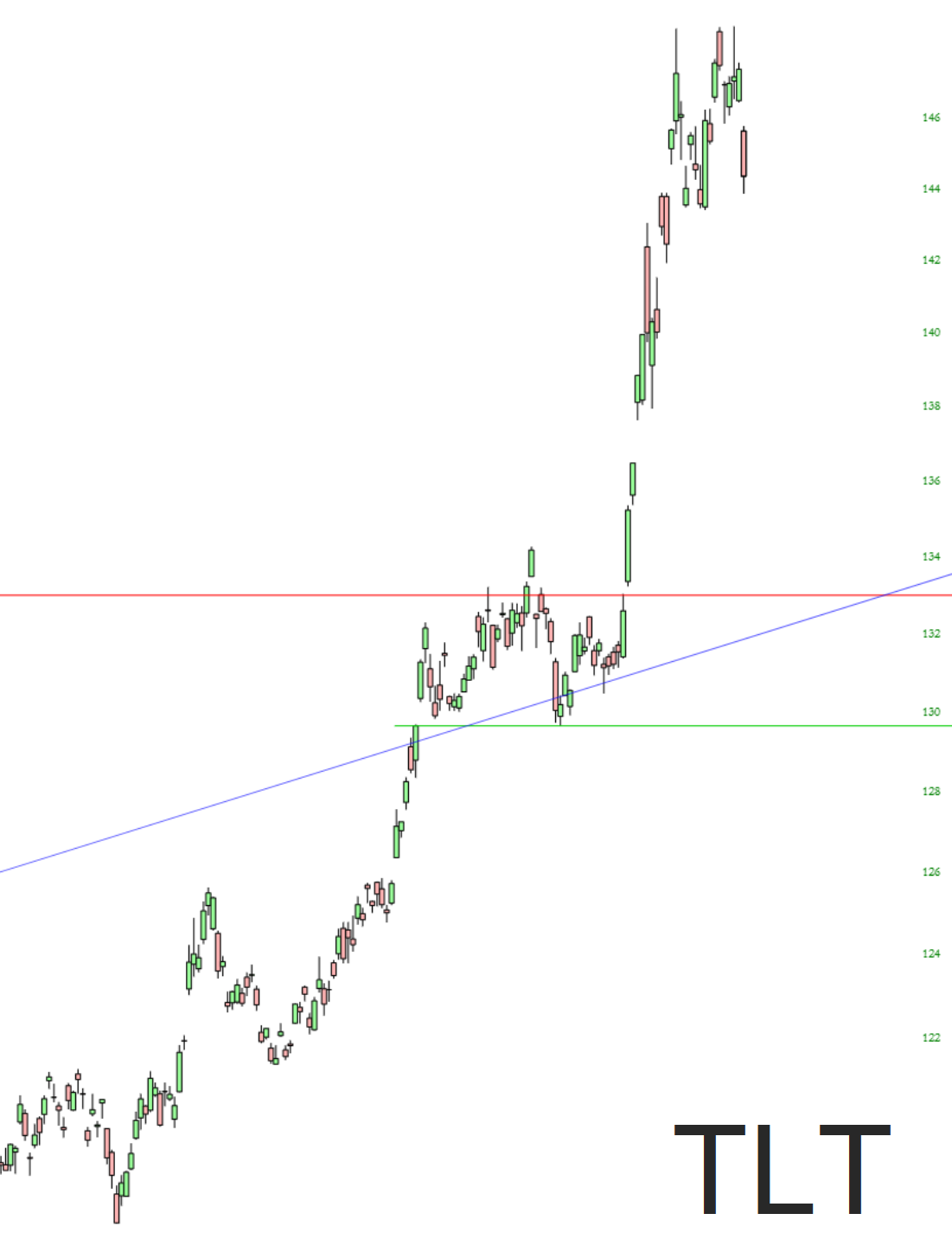
Although the future trend feature in SlopeCharts is exclusively for the Diamond membership, I thought everyone would be interested in a few examples of how this feature can be effective (or not) depending on the symbol.
For this little experiment, I chose the bottom item from the dropdown, Show Prior Future Trend and Future Trend. As stated on the information page, ” An even more interesting aspect is to “dial back” time and see what would have been predicted in the past and compare it to what actually happened. Choosing Show Prior Future Trend allows you to use the second dropdown to choose how far back in time you want to test.“
As people rush into equities — since they’re such a good value and all – – they are fleeing what has been the realm of safe havens for weeks on end, such as bonds:
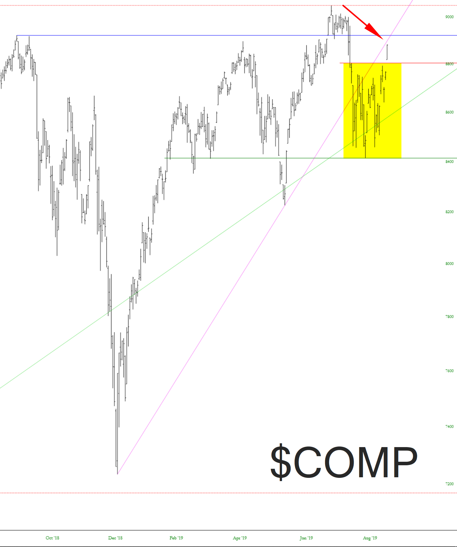
Well, this is pretty much was what worrying me. If you watch me on tastytrade, I kept mentioning how the range was shaping up as a potentially bullish breakout pattern, and voila, here we are. All the pent-up energy that I’ve tinted below has been released. And right now one of the last barriers to lifetime highs is the Christmas Trendline, where I’ve drawn an arrow.