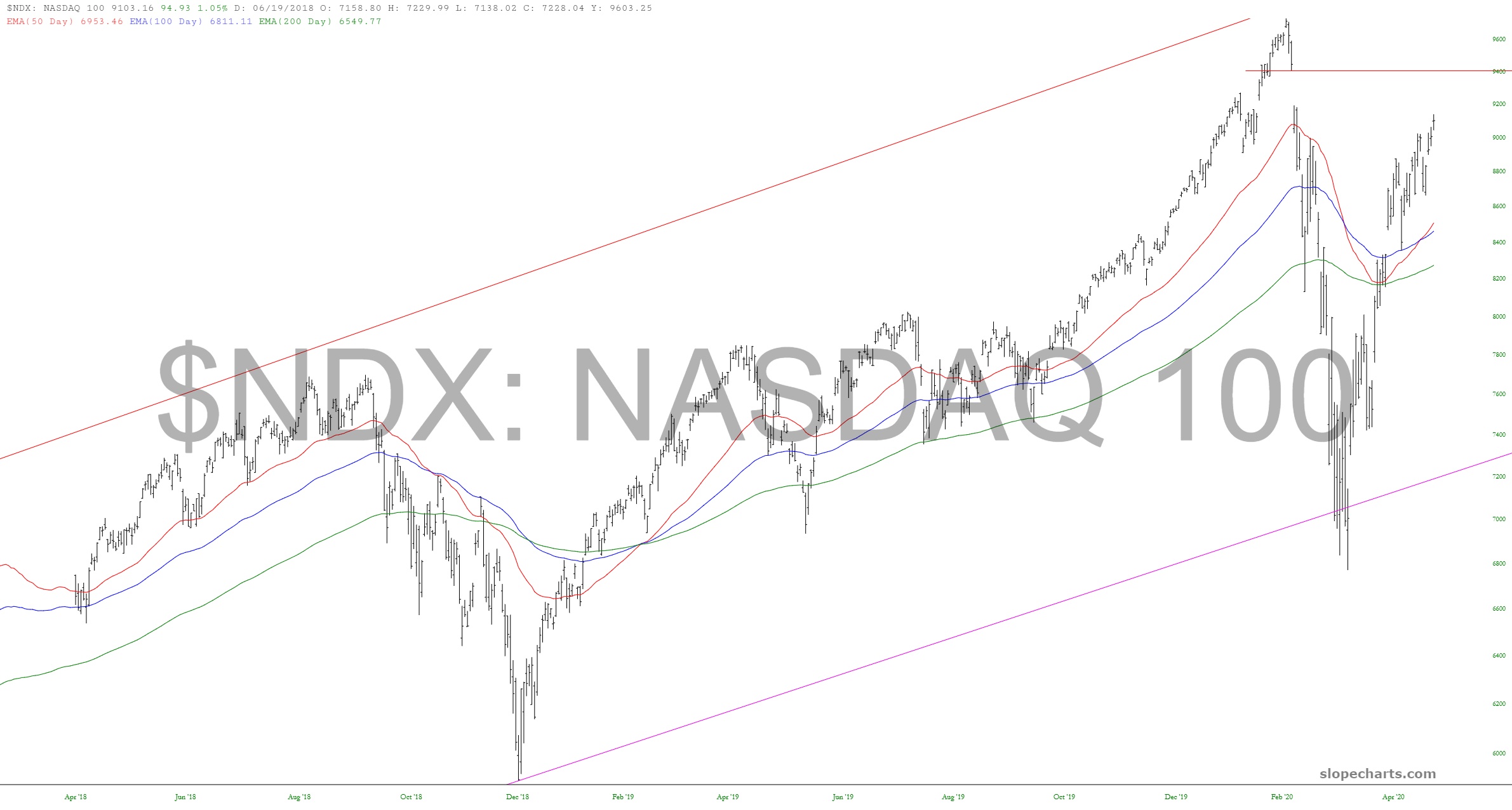
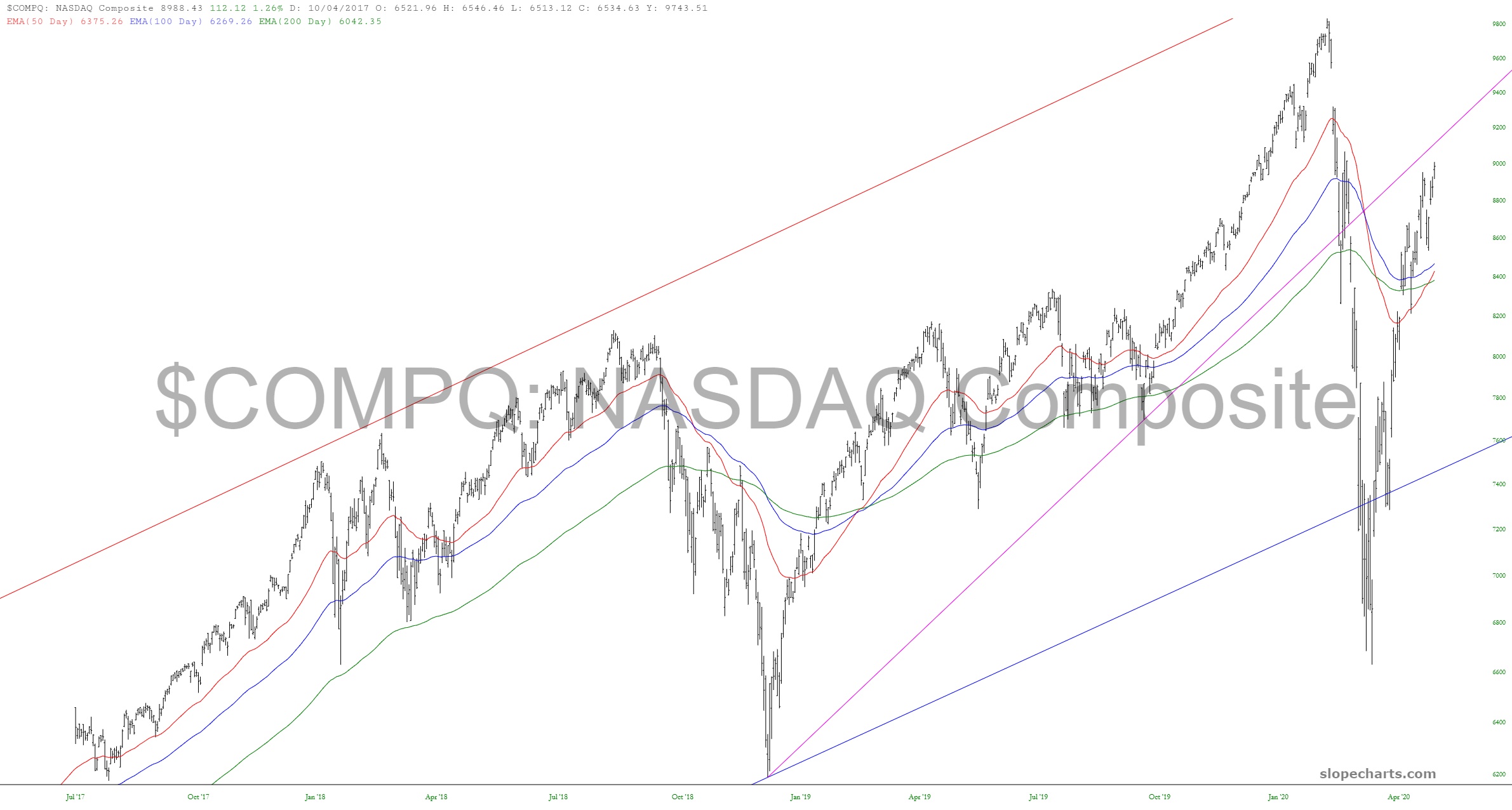
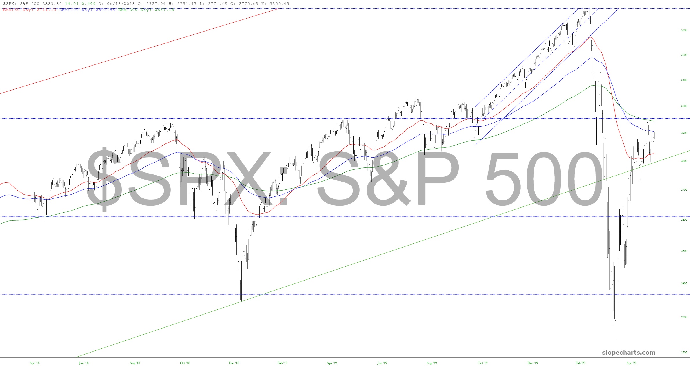
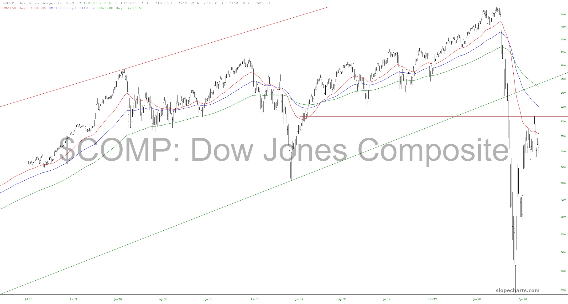
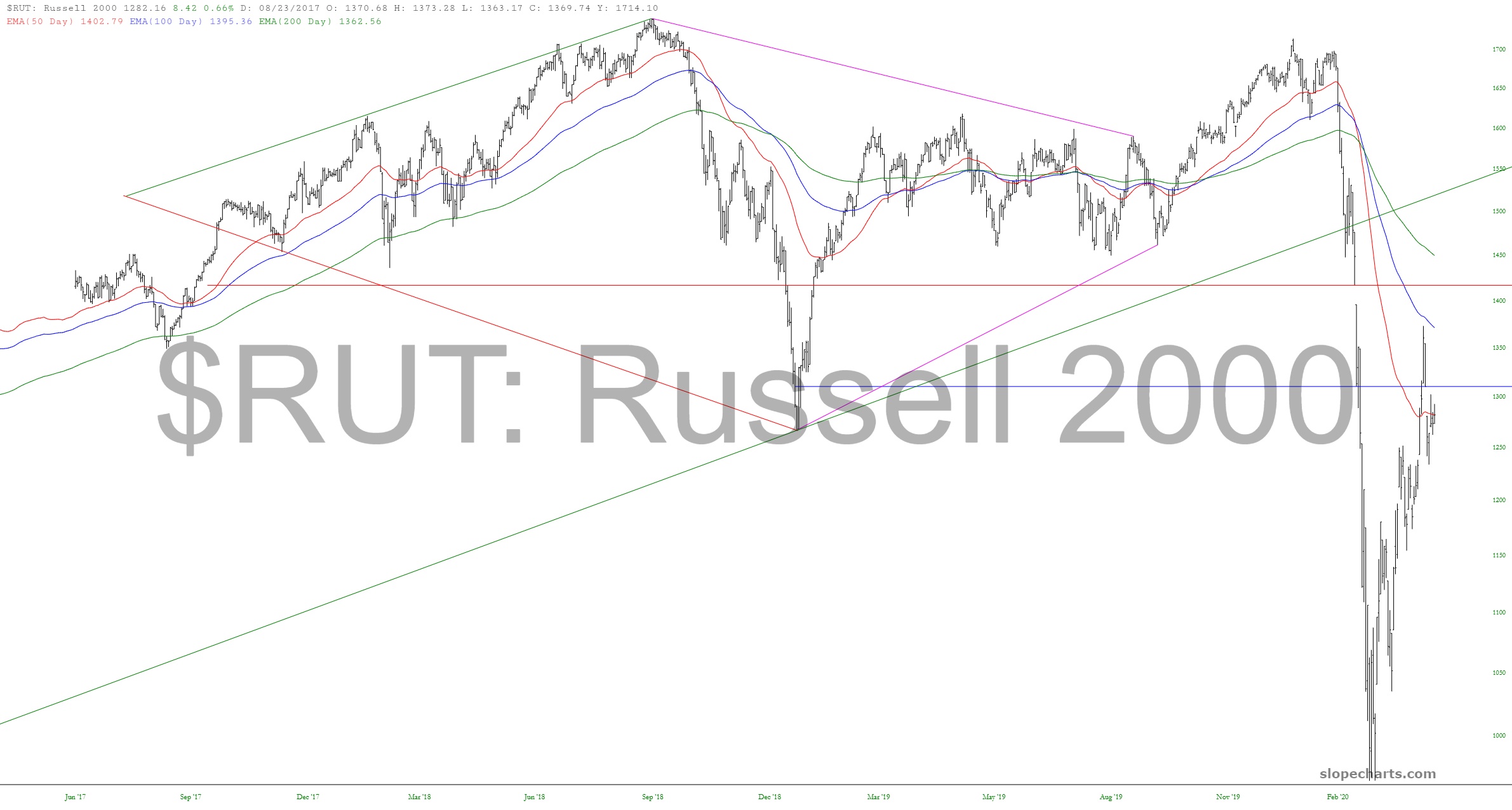
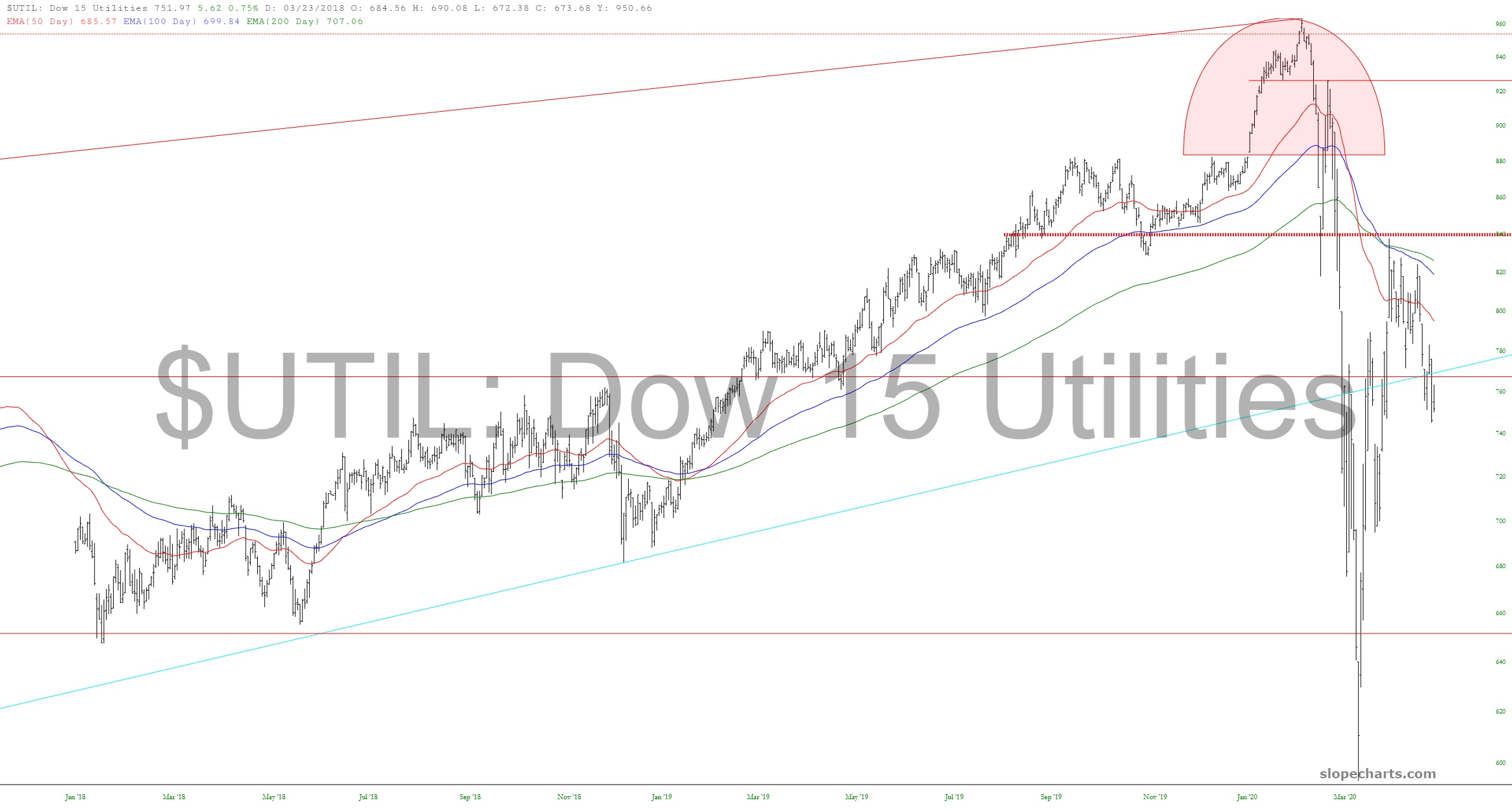
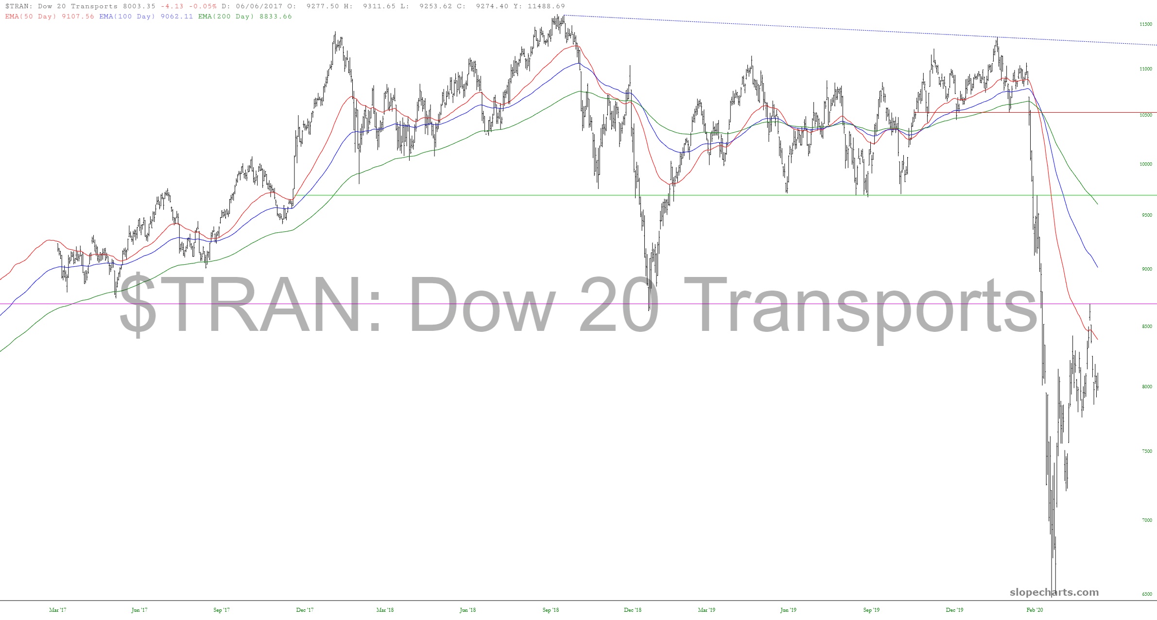
As minor as this “show the name in the watermark” feature seemed, I’m actually already quite fond of it. Anyway, I’ve overlaid three exponential moving averages (200, 100, 50) on top of some major U.S. stock market cash indexes. I’ve ranked them from what I consider to be the strongest at the top to the weakest at the bottom. Let’s roll through these:
![slopechart NDX](https://slopeofhope.com/wp-content/uploads/2020/05/slopechart_NDX-640x343.jpg)
![slopechart COMPQ](https://slopeofhope.com/wp-content/uploads/2020/05/slopechart_COMPQ-640x343.jpg)
![slopechart SPX](https://slopeofhope.com/wp-content/uploads/2020/05/slopechart_SPX-640x343.jpg)
![slopechart COMP](https://slopeofhope.com/wp-content/uploads/2020/05/slopechart_COMP-640x343.jpg)
![slopechart RUT](https://slopeofhope.com/wp-content/uploads/2020/05/slopechart_RUT-640x343.jpg)
![slopechart XMI](https://slopeofhope.com/wp-content/uploads/2020/05/slopechart_XMI-640x343.jpg)
![slopechart UTIL](https://slopeofhope.com/wp-content/uploads/2020/05/slopechart_UTIL-640x343.jpg)
![slopechart TRAN](https://slopeofhope.com/wp-content/uploads/2020/05/slopechart_TRAN-640x343.jpg)