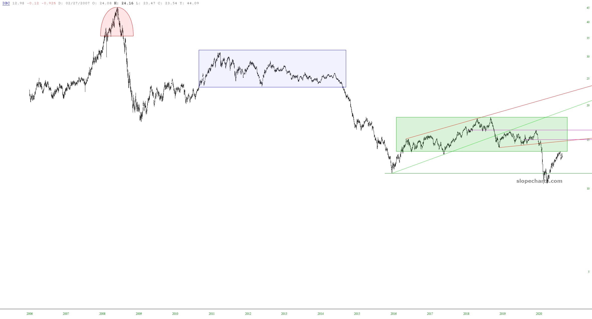
Below is a chart of DBC, the commodity ETF, over its entire lifetime. I have taken the unusual step of making the range of the Y-axis extend to $0 to illustrate more plainly the prospect for lower prices as the third instance of overhead supply takes hold.