The poster child for “Has-Been” countries. The United States is next in line for that title, though.

Slope initially began as a blog, so this is where most of the website’s content resides. Here we have tens of thousands of posts dating back over a decade. These are listed in reverse chronological order. Click on any category icon below to see posts tagged with that particular subject, or click on a word in the category cloud on the right side of the screen for more specific choices.
The poster child for “Has-Been” countries. The United States is next in line for that title, though.
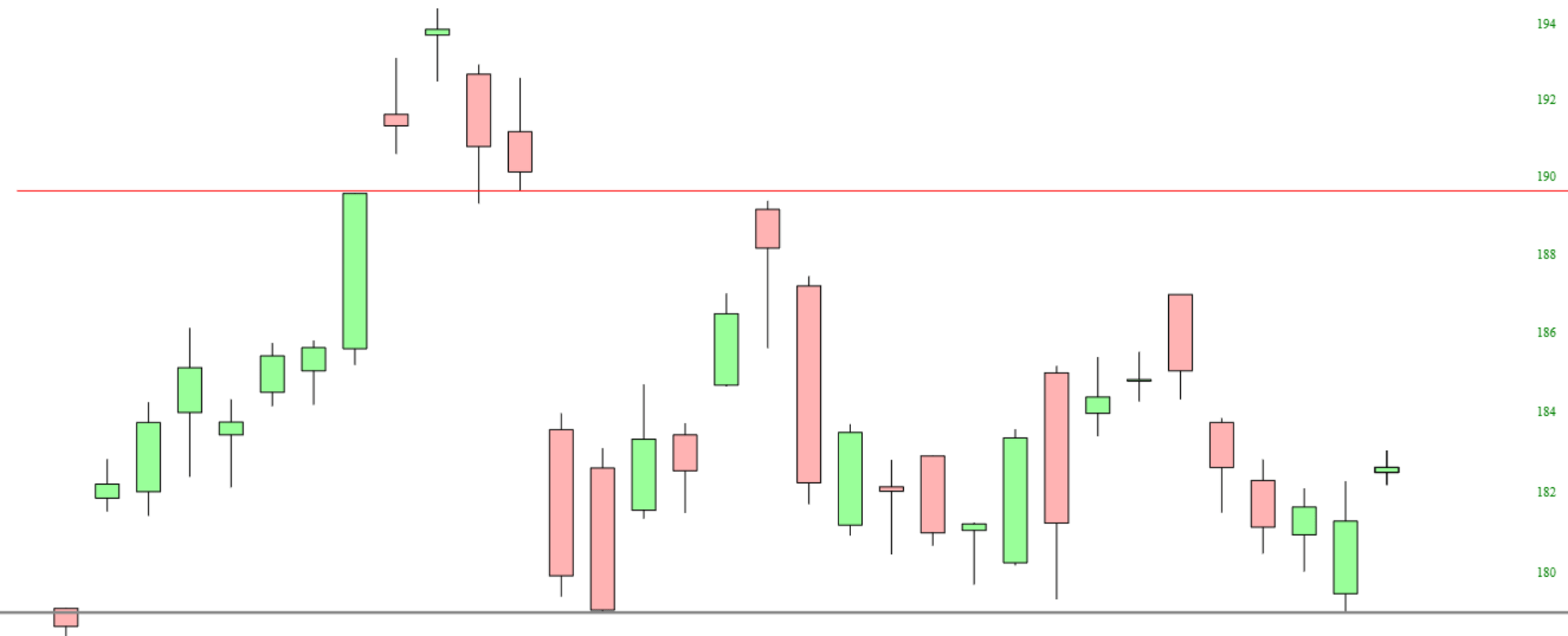
In my last post a week ago I was remarking at how very stretched SPX was and how near it should be to a mean reversion move, and the mean reversion high was then made within a few minutes of my publishing that post. The minimum target for that mean reversion move, last reached after the June high, is a backtest of the 45dma, and that target was reached at the low yesterday. That may of course be the low for this retracement, and I’ll be looking at the setup for that today.
SPX daily vs 45dma chart:

Toined the macro, that is. Step by step…

A rising Gold/Silver ratio preceded the March disaster, made an ill-fated bounce pattern in May-June and then got hammered by the 24/7 liquidity spigots opened up by a desperate Federal Reserve and Trump admin. They are desperate because the inflation MUST take hold in order to keep the system from unwinding to its fundamentals, which of course are nothing but robo-printed (funny) munny (political commentary withheld from this post, but insert what we all know here if you’d like…).
(more…)All the exciting markets have finally been strangled to death. Bitcoin? Nope, it got a couple thousand bucks blown off the top in no time. Tesla? Ha! You know better than to ask that. The NQ? Only if you like playing with fire.
The same, sadly, can be said of precious metals. In fact, with the exception of just a few days, gold has been in a boring, god-awful range ever since late July!
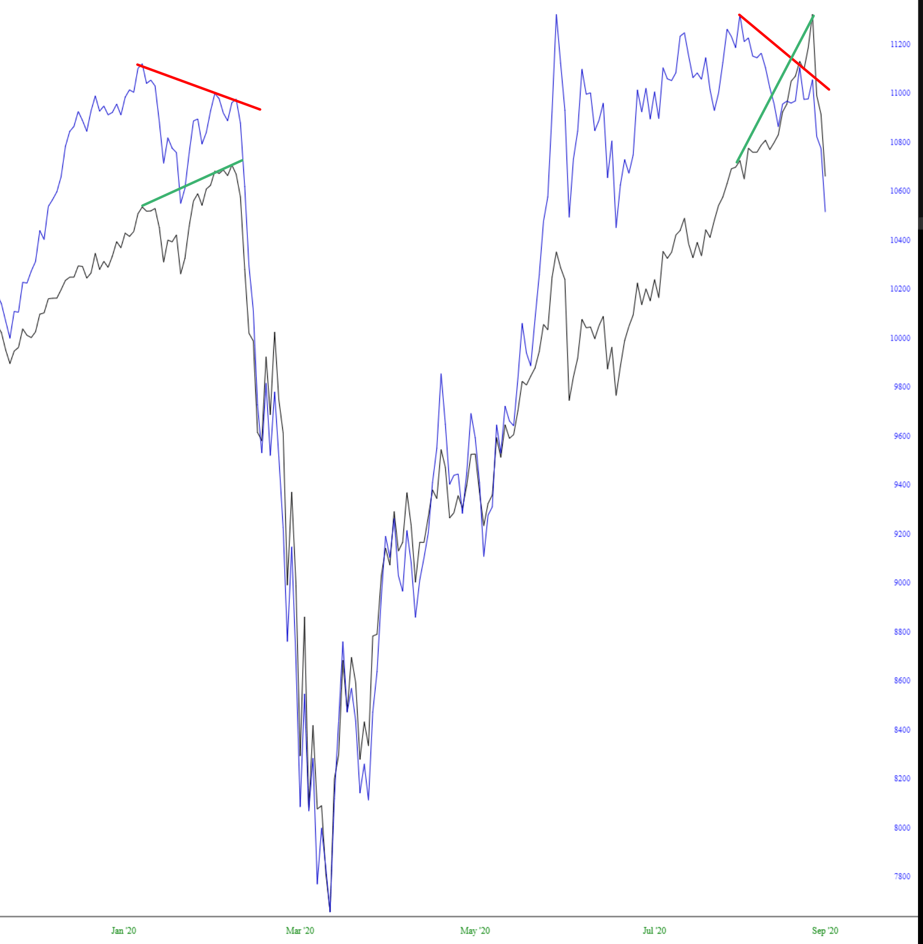
This chart is a simple but important one: the blue line represents the cumulative advance/decline line (available in Statistics from SlopeCharts) and the black line is the SPY. As you can see, there was a major divergence early this year (shrinking breadth in the face of a soaring market), and we’ve got an even more extreme instance of that right now.