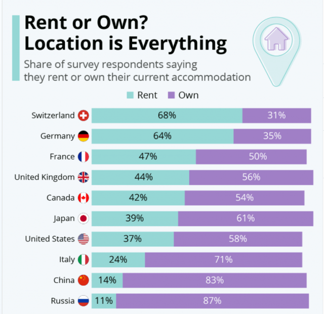
Here’s an interesting little graphic from our friends over at Statista – – it shows a variety of countries and how their citizens vary in terms of renting or owning their residence. It looks like Russia does The American Dream way better than America does.


