
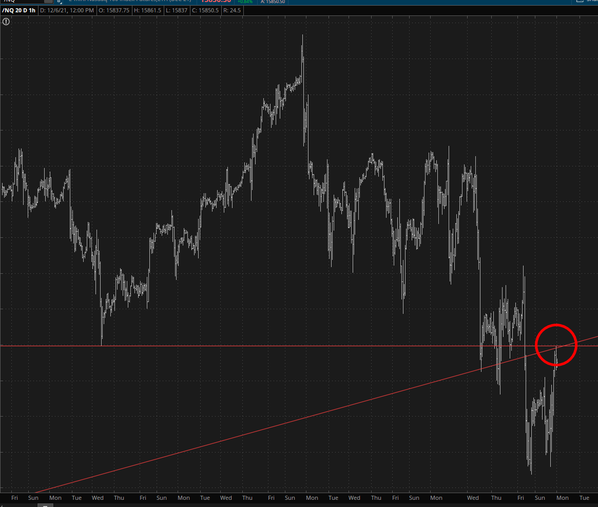
I noticed something quite interesting. You see, I am surrounded by screens, each of them representing a different important market. I noticed on the NQ that it hit a couple of red lines and then started falling. I was curious what those red lines might be.
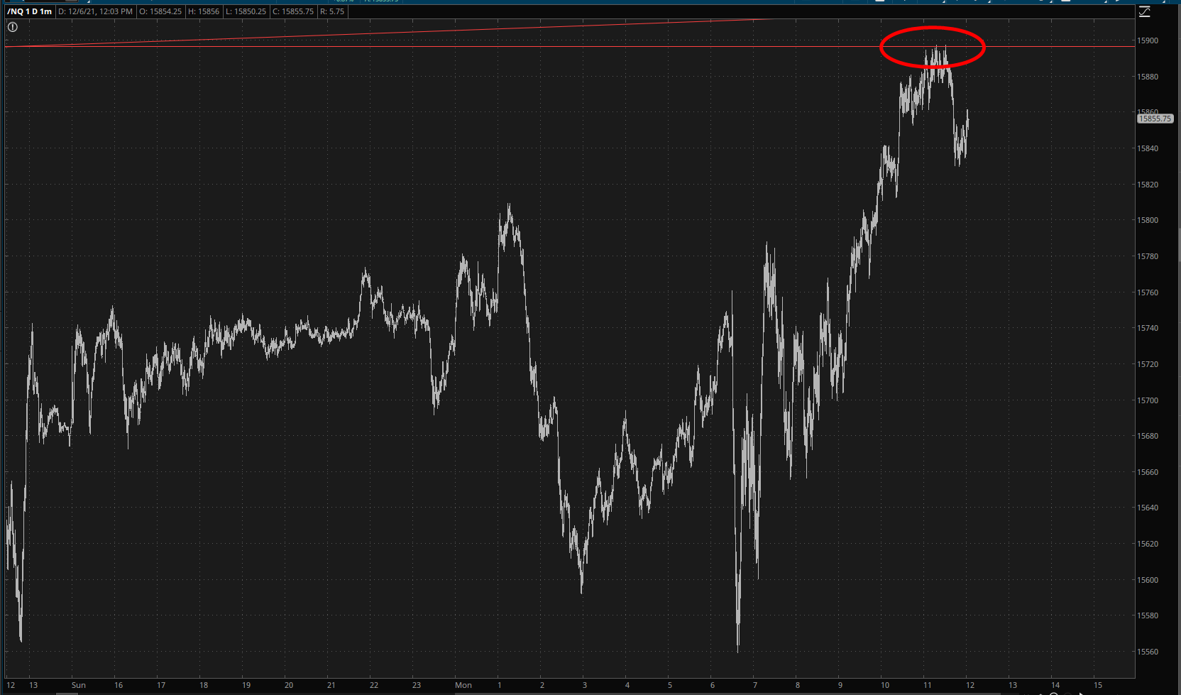
The above chart is made of 1 minute bars; I zoomed way, way back, so I could see the big picture better, and my jaw dropped – – the two lines in question were:
- The horizontal basis for the topping pattern;
- The broken trendline dating all the way back to the March 2020 bottom.
Look, I’m not immune to worry. I’m not immune to fear. Far from it. I’m probably the most hand-wringing scaredy-cat on this entire website. So yeah, I’ve been trimming positions down from 27 to 21. But if I had any sense (or balls) I probably wouldn’t touch a goddamned thing, because what we’re seeing is EXACTLY what one should expect when the bulls are about to get wacked across their skulls with a piece of timber.
Just sayin’.
