Slope of Hope Blog Posts

Slope initially began as a blog, so this is where most of the website’s content resides. Here we have tens of thousands of posts dating back over a decade. These are listed in reverse chronological order. Click on any category icon below to see posts tagged with that particular subject, or click on a word in the category cloud on the right side of the screen for more specific choices.

Q3 2018 Ends On A High Note For U.S. Equities

By -

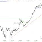
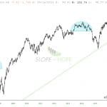
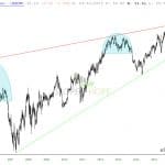
Each candle on the following three charts of the S&P 500 Index represents:

  • a period of one month (Chart #1)
  • a period of one quarter (Chart #2)
  • a period of one year (Chart #3)

Each of the last candles on all three time frames closed higher than its prior time-period candle.

The most notable feature of the Yearly chart, in particular, is that price could, in fact, reach a resistance target of 3033 (as I described in my post of August 6th) by the end of this year. Such a price level would end up producing a candle range for 2018 on the Yearly timeframe that equals or slightly exceeds the candle range of each of the prior two years. It would also complete a very bullish cycle for this year.

(more…)

Quarter Pounder

By -

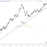
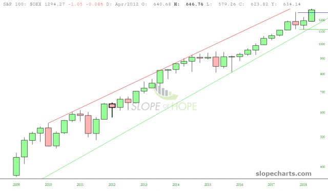
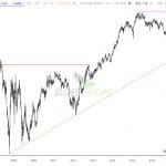
Now that Q3 2018 is in the history books, I thought I’d take the unusual step of using the SlopeCharts granularity function to examine cruder charts. Instead of daily data, we’ll look at quarterly. That might sound like a huge drawback, since the vast majority of detail disappears, but that’s also kind of the point – – having a cruder view can often lead to simple insights.

The simplest insight of all is……....the bears don’t have anything to be excited about. Just about every equity index says the same thing: persistent strength, year after year, and if anything, Q3 got a big breeze at its back on the heels of a relatively weak Q2. One look at the chart of the S&P 100 says it all. Can anyone spot a trend here?

slopechart OEX (more…)