Now that Q3 2018 is in the history books, I thought I’d take the unusual step of using the SlopeCharts granularity function to examine cruder charts. Instead of daily data, we’ll look at quarterly. That might sound like a huge drawback, since the vast majority of detail disappears, but that’s also kind of the point – – having a cruder view can often lead to simple insights.
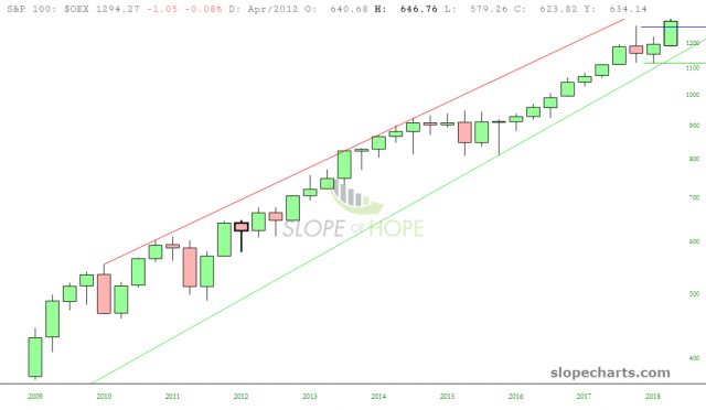
The simplest insight of all is……....the bears don’t have anything to be excited about. Just about every equity index says the same thing: persistent strength, year after year, and if anything, Q3 got a big breeze at its back on the heels of a relatively weak Q2. One look at the chart of the S&P 100 says it all. Can anyone spot a trend here?
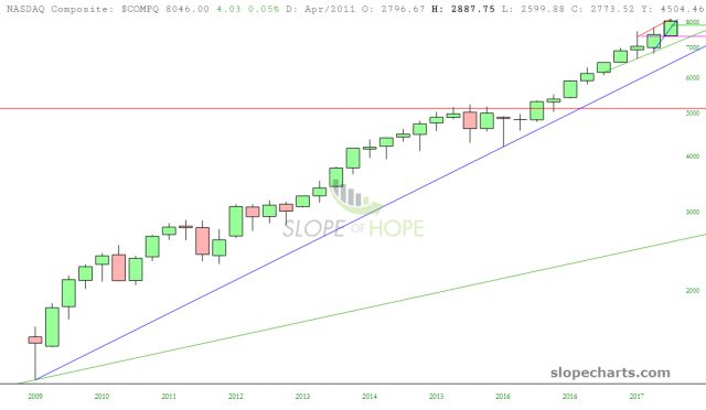
And even though there are spots here and there in the tech world that are showing signs of weariness, the NASDAQ Composite (thanks largely to the likes of Apple and Amazon) is a cash-printing machine. You could pretty much lay a ruler down on your screen, and it would hide all the price bars. That’s how consistent and uptrend it is, particularly the last ten quarters.
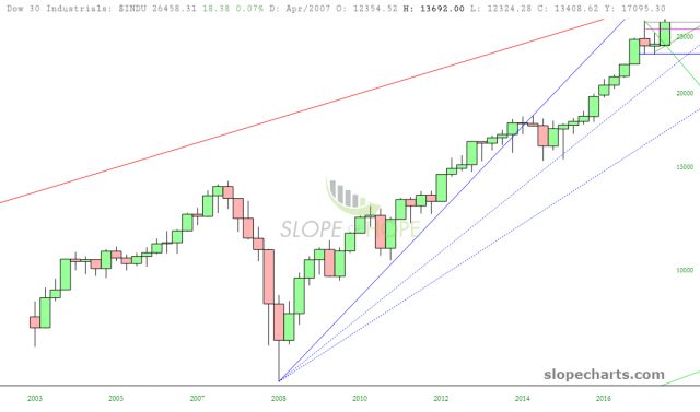
The Dow Industrials is particularly interesting. Look how during Q1 and Q2 things seemed to be losing steam. And then Q3 “trade wars, what trade wars?” comes along and BANG, any and all weakness in the first half of the year is wiped clean.
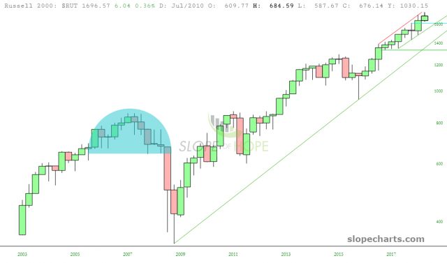
The Russell 2000 illustrates the sheer size of this bull run. The massive 2007 market top (tinted below) is dwarfed by the stampede higher. As you can clearly see, it has been literally years since there has been any meaningful weakness on a quarterly basis.
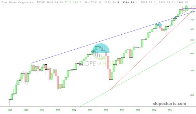
Although the Dow Utilities (an obsession of mine) has been weak, the “roll up” of the three big Dow indexes – – that is, the Dow Composite – – shows no signs of abating. Q3 was extraordinarily strong, and we’ve cut above the trendlines.
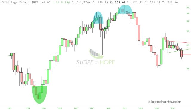
One of the few areas of broad weakness was, of course, precious metals. Q3 was wretched for the gold bugs index, and there’s no reason to assume that even 2016’s lows won’t be taken out within the next few quarters.
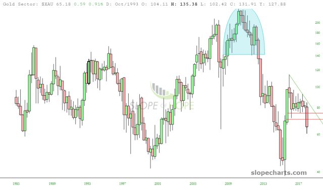
This is likewise illustrated with the gold sector index.
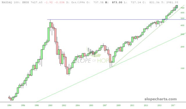
This is going to sound really dumb, but it has to be said: things will keep going up until……..they don’t. And let me show you what I mean. The NASDAQ 100 is below. Take a good look at the left portion of that chart. Quarter after quarter, it’s just up, up, up, and then up some more. And then one day, it’s like someone turn the lights off. Indeed, for the NASDAQ, the big bad financial crisis was shallow and short-lived. Just look how much more massive a bear market was had in 2000-2002.
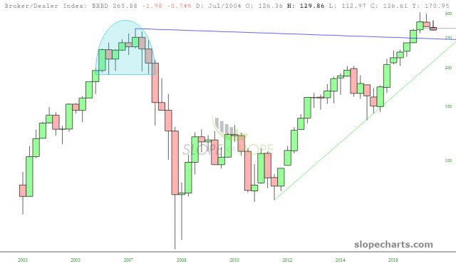
Just about the only equity index I can point to as possibly breaking down is the broker/dealer index. Of course, as we’ve seen with the Dow Industrials, just because something is weak a quarter or two doesn’t mean it’s going to enter a bear market. It might just be catching its breath. It will take a failure of that blue trendline before we could consider the chart below to be truly broken.
I’ve got to say, I was surprised at just how bullish the charts looked on a quarterly basis. There are plenty of individual charts that look enticing on the short side. However, as long as the broad index charts continue to look like what I’ve illustrated above, even fantastic short setups are going to feel like you’re swimming upstream.


