Slope of Hope Blog Posts

Slope initially began as a blog, so this is where most of the website’s content resides. Here we have tens of thousands of posts dating back over a decade. These are listed in reverse chronological order. Click on any category icon below to see posts tagged with that particular subject, or click on a word in the category cloud on the right side of the screen for more specific choices.

A Macro-To-Mini View Of US Major Indices

By -

Each candle on the first chartgrid of the /ES/YM and /NQ Emini Futures Indices and RUT Index represents a period of one year. (Note that I would have shown the /RTY Emini Futures, but it only had 3 years’ of data, so I’ve shown the RUT instead).

The horizontal white line that cuts through each candle is a one-period moving average (H+L+C). Friday’s closing price on the current year’s candle is above this moving average. They are also above the moving average on both 2018 and 2017 candles. 

(more…)
Broker and Broker

By -

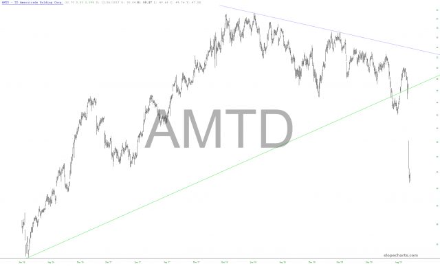
This past week, one sector which took it on the chin was the brokerages. The reason is easy enough to understand. Two important revenue sources for them are (1) commissions and (2) interest on deposits. And yet (1) commissions are going to $0 across the board and (2) interest rates are plunging, and ultimately, I believe, will be negative. So here is the kind of catastrophe these companies are facing, with most of them down nearly 50% from their highs last year:

slopechart AMTD
(more…)

Healthy Momentum

By -

By Harry Boxer, TheTechTrader

Medical stocks dominate today’s top charts to watch.

AbbVie Inc. (ABBV) climbed $1.72 to $73.85 on 6.2 million shares Thursday. The move came on no news from the maker of Humira and other drugs. The stock has been rallying for the last month, breaking out of a 1 1/2-year declining channel.  However, it pulled back on Tuesday and Wednesday to test support before Thursday’s bounce.  Watch for a move next to recent highs near $76.

(more…)

Real Names

By -

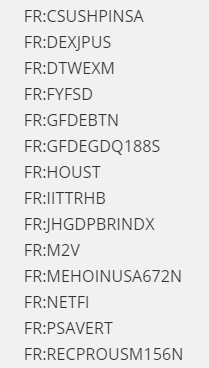
One of my favorite unique features of SlopeCharts is its huge economic database. This has data goes back literally hundreds of years, and it has fascinating information from all around the world. For a history buff like myself, it’s especially fun to explore.

However, what’s always bugged me is that we were using this crazy symbols, and when you got the chart, the symbol would be your only indication of what you were looking at. And, let’s face it, these symbols don’t exactly burst off the screen with information.

symbols
(more…)