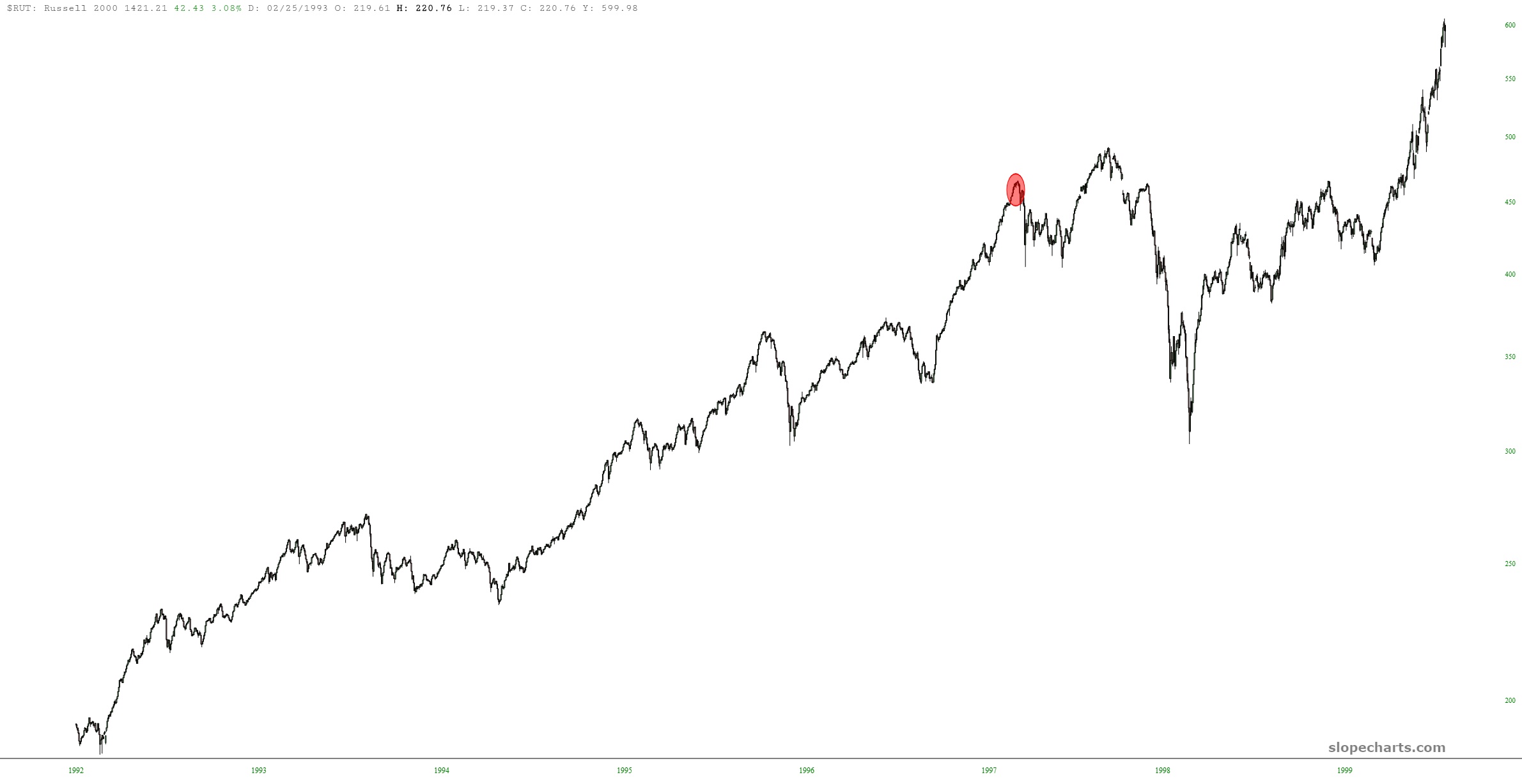
With the markets such a tangled mess these days, I continue to rely on important, long-term ratio charts to appreciate the big picture. Here, once again, is the Russell 2000 divided by the S&P 500, which suggests to me that small caps are going to be in for a rough ride for many, many months.

The last time this happened, the pattern was well-formed but much smaller. It seemed weird to me that the point in the past corresponding to the point we are at now (analog-ish-ly speaking) was in the fall of 1997, well before the March 2000 peak. The small caps, however, had a tumble in store. I’ve marked the point (with a red oval) in 1997 where small caps were that equals where I think they are now. I think the much, much bigger pattern of today will make the move much more powerful, however.
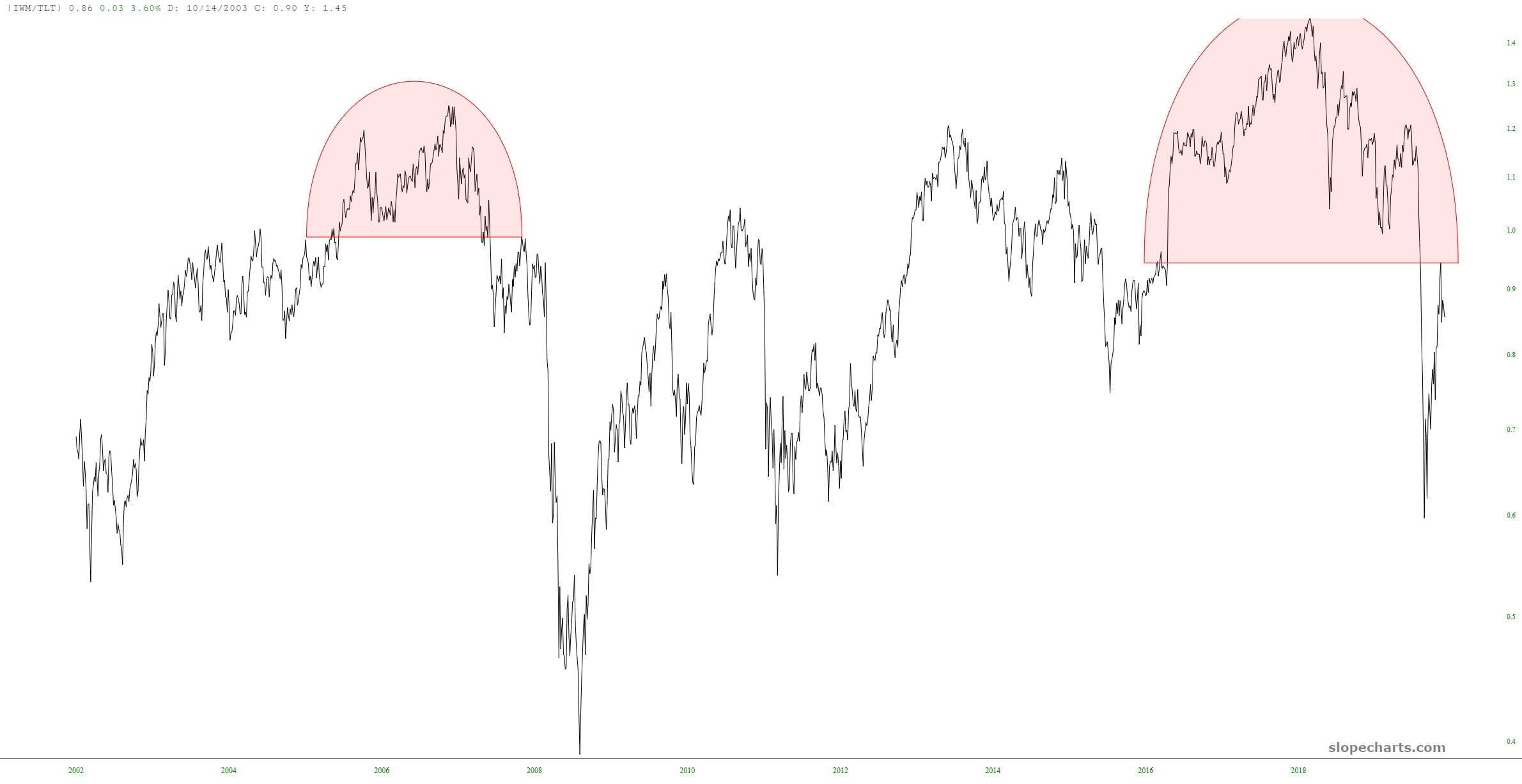
Just to add another chart to the body of evidence, here is IWM (the small caps) divided by TLT (bonds), which is equally bearish.