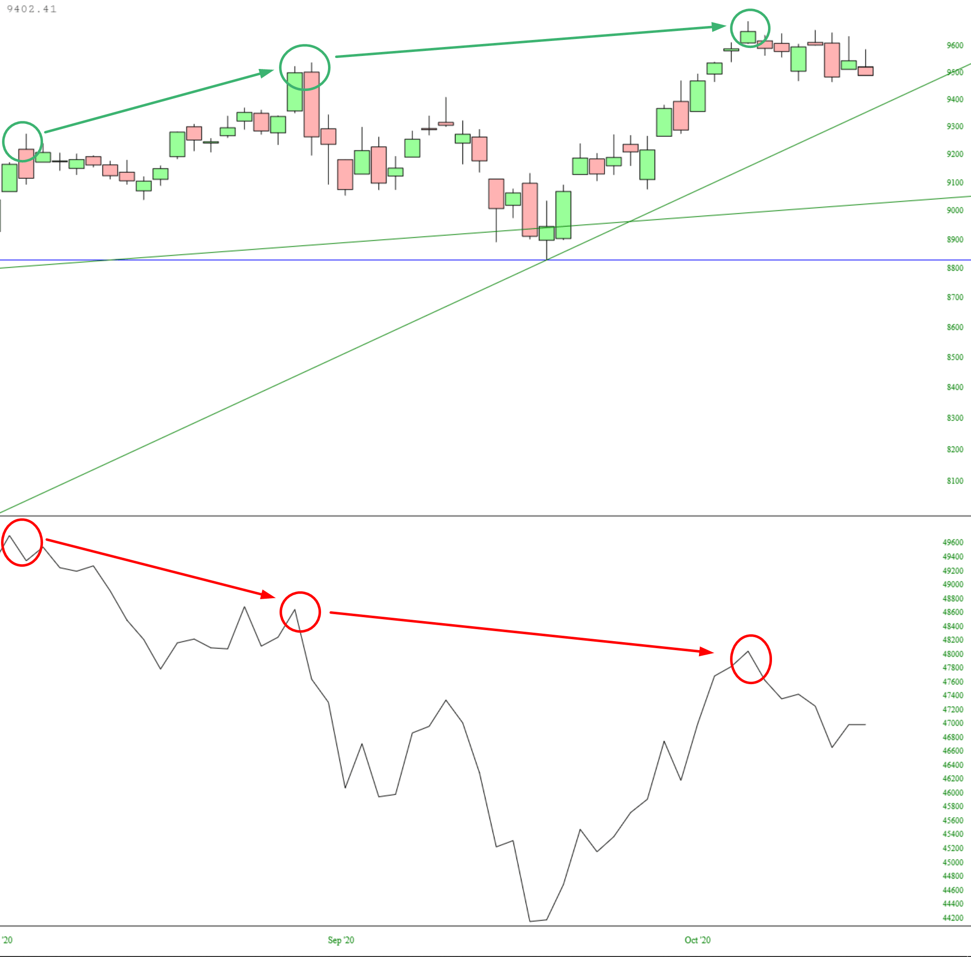
The chart below is simple and, I think, important. At the top is the candlestick chart of the Dow Jones Composite, which has been, thanks to that disgusting pig Powell, banging out higher highs. Beneath it is Slope’s own advance/decline summation index, showing how on the exact same days, the market has been making lower highs. In other words – – bad breadth, and you ain’t gonna cure it with a breath mint.
I presently have 40 short positions. Below are my five best performers. It is certainly my hope to hang on to them for many weeks, if not months, to come.