
Most financial sites pretty much hang up their hats in mid-December and wander back into the office sometime early in January to pick up where they left off. At Slope, we never stop working. Not even on Christmas Day. I am therefore delighted to announce a major upgrade to our SlopeMATRIX product.
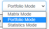
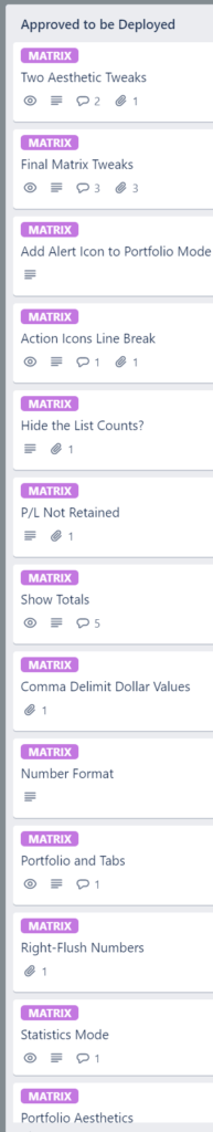
As you can see from this dropdown, Matrix has three different modes now. Not just that, we have made many aesthetic tweaks and feature improvements. Just take a look at the partial list of tickets we had on Christmas Day, all of which were completed and deployed. It just goes to show you paying members how hard we work for you:
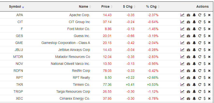
The modes pretty much speak for themselves, but let me walk you through them. The first, Matrix Mode, is the one you already know. It provides instant access to any of your watch lists, or any public watch lists. You can sort based on any column and click the icons to execute instant actions against a particular symbol.
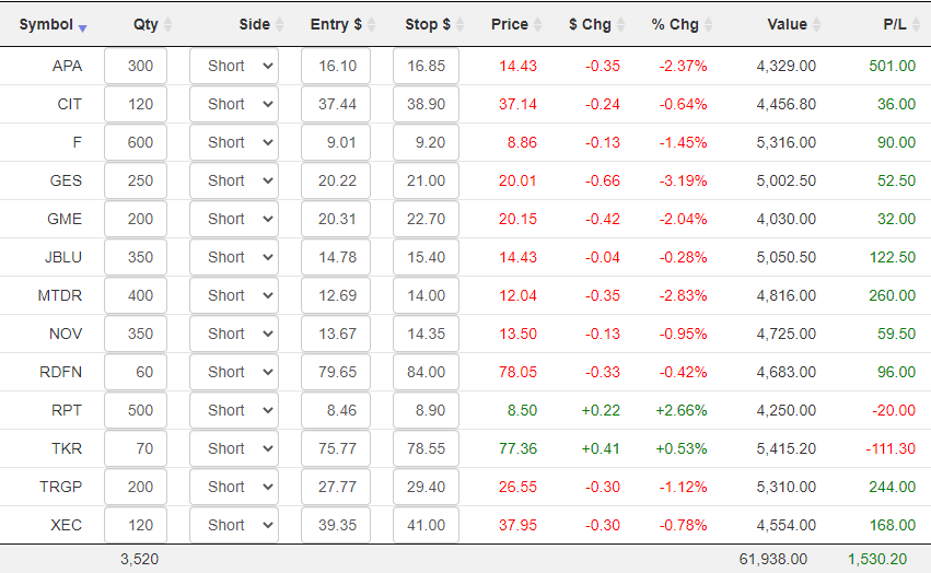
The Portfolio mode brings a whole new dimension of utility to the product, because it lets you enter the details of your actual holdings so you can have up-to-the-second information on your profits and losses. Whether you keep your actual positions in a watch list of their own or not is up to you, although it’s somewhat cleaner visually if you do. Regardless, in Portfolio mode, you will see some new columns that do not exist in Matrix mode:
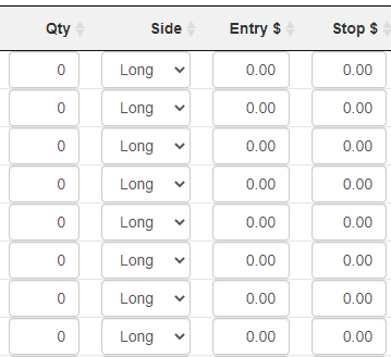
Even if you have a large number of positions, you can swiftly go through them just as you would a spreadsheet, pressing Tab to leap from one field to the next. Specifically, you would fill in:
- Quantity: how many shares you were long or short;
- Side: whether you were Long or Short;
- Entry $: the dollar price of your entry;
- Stop $: the value of your stop-loss price, if any (if a stop is hit, the row is highlighted so your attention is drawn to it)
Once you’ve entered that information, you will see the position value, its P/L, and the totals at the bottom.
As dry as the word “Statistics” sounds, it has some of the most fascinating information available, particularly for high-flying issues. What it shows for each of the symbols in your watch lists are:
- Market Cap – the total market capitalization (that is, the fully-realized value of the entire entity based on the current stock price);
- P/E Ratio – the price/earnings ratio, which can also show up as a negative number, illustrating how much the company is losing per share;
- 52-week High;
- 52-week Low;
- YTD Change – the year-to-date price change, in percentage terms;
- Avg Volume – the average daily volume of shares traded
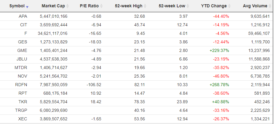
As with other modes, clicking the column title will sort it either ascending or descending. Here, for example, you can see some of the extraordinary price gains…….
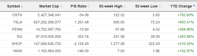
………and losses………..
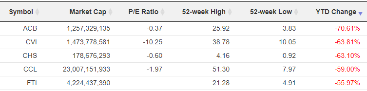
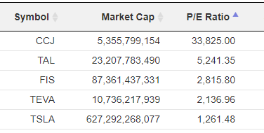
And it’s always amusing, particularly if you follow a large quantity of stocks, to see what has the craziest P/E Ratio:
SlopeMATRIX provides a handy “center” for your trading world, since it allows you to focus on what matters most: specifically, your own portfolio, your profits, and your losses, as well as the deeper data underlying the symbols.
