Slope of Hope Blog Posts
Slope initially began as a blog, so this is where most of the website’s content resides. Here we have tens of thousands of posts dating back over a decade. These are listed in reverse chronological order. Click on any category icon below to see posts tagged with that particular subject, or click on a word in the category cloud on the right side of the screen for more specific choices.
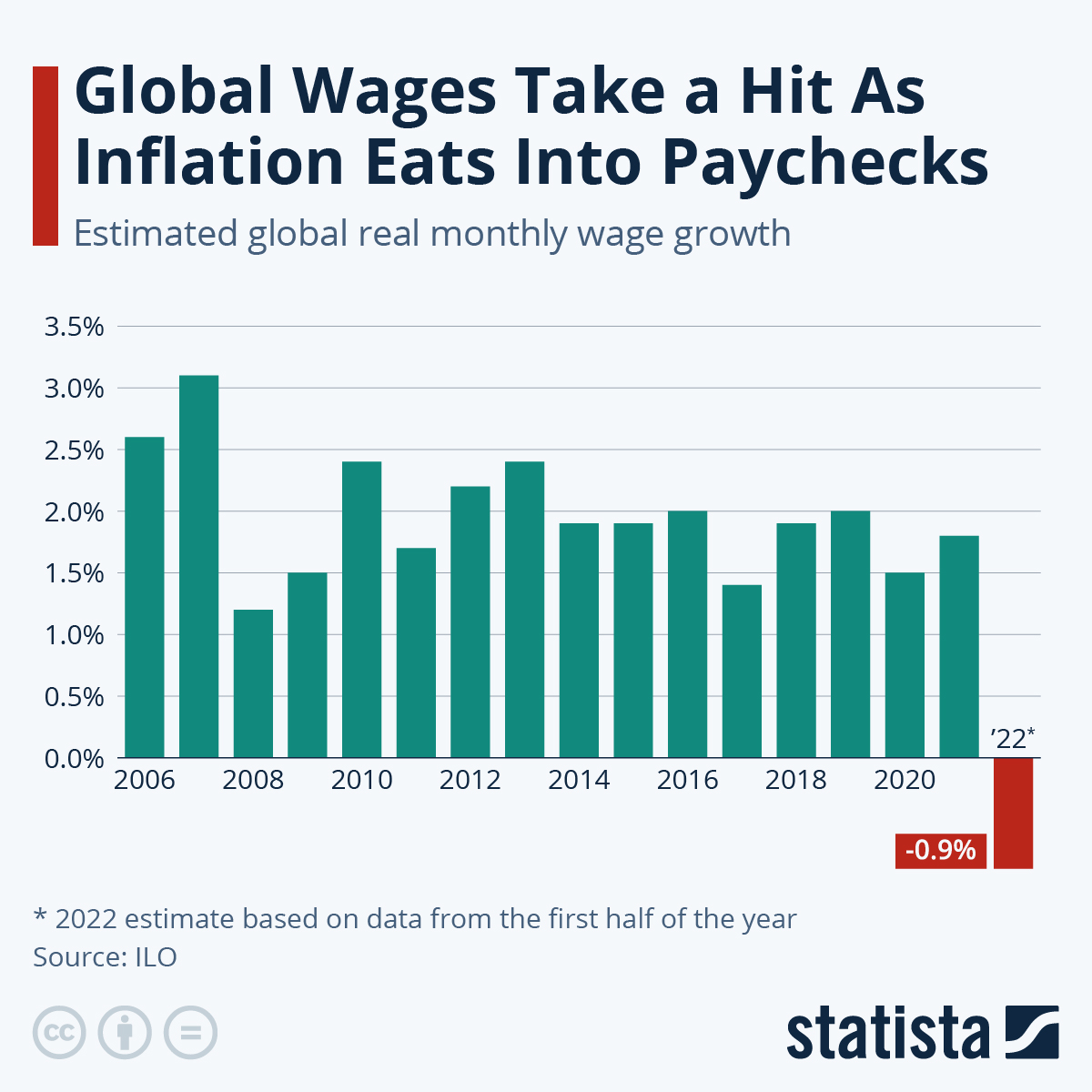
Paycheck Reversal
Thank you, central bankers of the world!
Layered Banks (by LZ)
Here’s an interesting layered chart for consideration: the ratio of KRE to SPY, alongside the 10-Year Treasury yield. A few points about it.
1. The correlation has been consistent since around the end of the dotcom bear market. The era when the Fed started blowing bubbles to manipulate economic growth and markets. High inflation is bad for banks though, perhaps the correlation breaks down, but not in a good way for banks.
2. The correlation holds up on smaller time frames despite gaps. Longer-term, the gaps have closed with rates catching down to relative performance of banks.
3. The gap has never been this large. Both banks and rates have topping patterns.
Various trades are possible if you think this chart has predictive value. For myself, it tells me way OTM calls on bonds might not be crazy here.
(more…)
