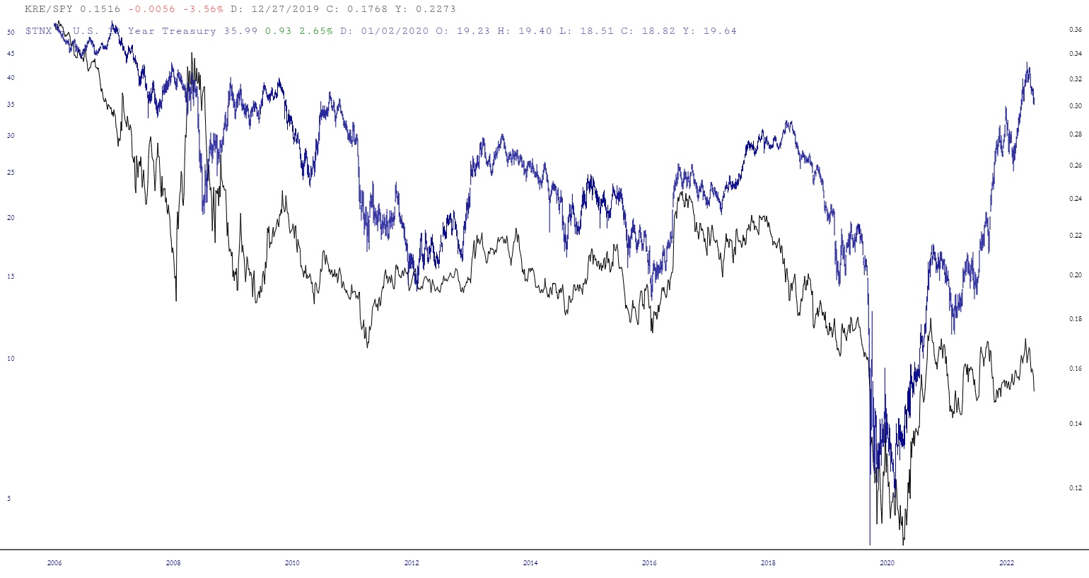
Here’s an interesting layered chart for consideration: the ratio of KRE to SPY, alongside the 10-Year Treasury yield. A few points about it.
1. The correlation has been consistent since around the end of the dotcom bear market. The era when the Fed started blowing bubbles to manipulate economic growth and markets. High inflation is bad for banks though, perhaps the correlation breaks down, but not in a good way for banks.
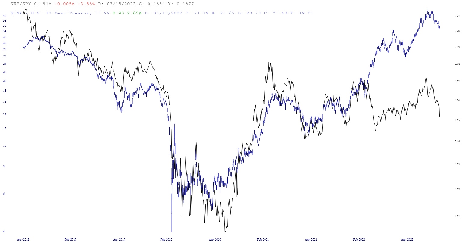
2. The correlation holds up on smaller time frames despite gaps. Longer-term, the gaps have closed with rates catching down to relative performance of banks.
3. The gap has never been this large. Both banks and rates have topping patterns.
Various trades are possible if you think this chart has predictive value. For myself, it tells me way OTM calls on bonds might not be crazy here.