Further to my last Weekly Market Update, this week’s update will look at:
- 6 Major Indices
- 9 Major Sectors
- Germany, France, and the PIIGS Indices
- Emerging Markets ETF (EEM) and BRIC Indices & ETF (BKF)
- Canadian, Japanese, British, Australian, and World Markets Indices
- Commodities ETF (DBC), Agricultural ETF (DBA), Gold, Oil, Copper & Silver
- Major Currencies
- Comparison of SPX, Gold, USD & USB
- Comparison of SPX, CRX, USD & USB
6 Major Indices
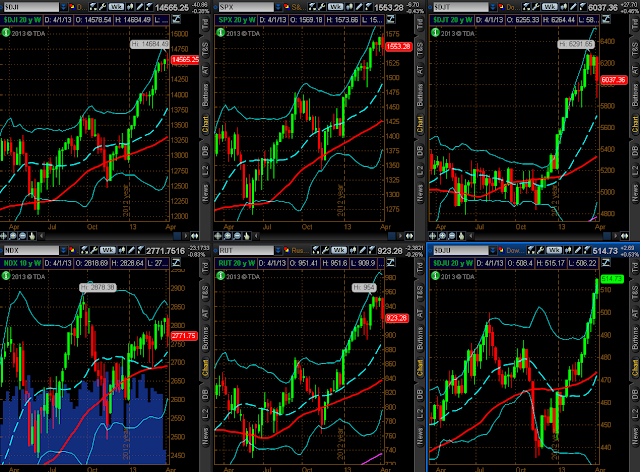
As shown on the Weekly charts and the percentage gained/lost graph below of the Major Indices, the only gains were made in Utilities, while the Dow 30 was flat, and the Dow Transports made the largest losses, followed by the Russell 2000, Nasdaq 100, and S&P 500.
9 Major Sectors
As shown on the Weekly charts and the percentage gained/lost graph below of the Major Sectors, the largest gains were made in Utilities, followed by Healthcare, and the largest losses were made in Energy, followed by Materials, Industrials, Technology, Financials, Cyclicals, and Consumer Staples. It was definitely a ‘risk-off’ week, as traders took profits in those sectors.
Germany, France, and the PIIGS Indices
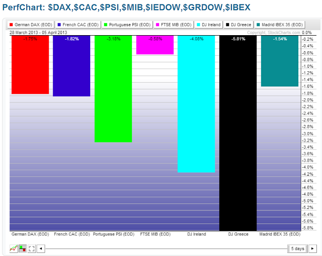
The following percentage gained/lost graph shows that Greece lost the most during the past week, followed by Ireland, Portugal, France, Germany, Spain, and Italy.
Emerging Markets ETF (EEM) and BRIC Indices & ETF (BKF)
The following percentage gained/lost graph shows that the largest losses of the week were made by Russia, followed by EEM, BKF, Brazil, India, and China.
Canadian, Japanese, British, Australian, and World Markets Indices
The following percentage gained/lost graph shows that Japan made a 4% gain on the week, while the largest losses were made by Canada, followed by Britain, Australia, and the World Market Index. As I wrote in my post of April 4th, Canada’s commodity-weighted TSX Index has lost all of its gains (and is now negative) for 2013.
Commodities ETF (DBC), Agricultural ETF (DBA), Gold, Oil, Copper & Silver
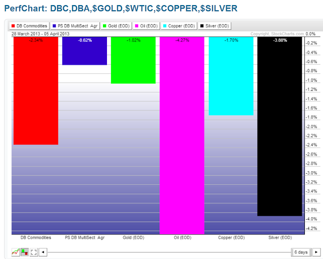
The following percentage gained/lost graph shows that Oil made the largest losses, followed by Silver, DBC, Copper, Gold, and DBA.
Major Currencies
The following percentage gained/lost graph shows that the largest losses were made by the Yen, followed by the U.S. $, Aussie $, and Canadian $, while the largest gains were made by the Swiss Franc, followed by the Euro, and the British Pound.
Comparison of SPX, Gold, USD & USB
The first comparison chart of the SPX, Gold, the U.S. $, and 30-Year Bonds, shows that, over a 3-year period, Gold has outperformed the other three on a percentage-gained basis. However, as shown on the second 1-year chart, Gold uncoupled from the SPX in November of 2012 and has reached a major support level (horizontal and bottom of its downtrend). It has also been underperforming the U.S. $ since February of this year. As such, Gold is the one to watch to see if further weakness persists below this week’s lows, and, if so, it may drag the SPX down with it, as I’ll explain below.
Comparison of SPX, CRX, USD & USB
The first comparison chart of the SPX, the Commodities Index, the U.S. $, and 30-Year Bonds, shows that, over a 3-year period, the CRX has lagged the SPX since March of 2012. Whenever it has made a diverging top and subsequently dropped, the SPX eventually followed suit. There was one instance in mid-2011 where the SPX made the divergence, which preceded a drop by both. As you can see, the CRX has made another diverging top this year. The second 1-year chart shows that the CRX has closed at a large triangle support level. A drop and hold below this level could, therefore, drag the SPX down.
So, along with Gold, the CRX is also one to watch closely over the coming week(s), since a drop and hold below their respective support levels would likely produce a negative drag on the SPX.
Summary
In summary, this week was all about world-wide profit-taking, with the exception of Japan, and weakness in Oil and other Commodities. Throughout the week, I pointed out a variety of weakening ‘scenarios’ in my Blog, which I won’t repeat, but which can be found here.
As I pointed out in my last post, the shorter-term 4-Hour timeframe uptrending channel has been broken now on the YM, ES, NQ & TF. As well, the NDX & RUT are in the process of forming a very bearish ‘Tower Top’ pattern on their Weekly timeframe, as is the Dow Transports, and, to a lesser extent, the SPX. The NDX is doing so at an ominous-looking triple top. Once these patterns are confirmed by a lower weekly closing low, I’d expect further weakness ahead.
So, Technology, Small-Caps, and Transports are ones to watch as leaders in U.S. equity weakness, along with further weakness in the ‘riskier’ Sectors. As well, Gold and the CRX Index, as well as Canada’s TSX Index, are ones to watch for weakness below their immediate major support levels. Further weakness in the other major countries’ indices may also negatively affect the U.S. equity markets.
With weakening economic and jobs data of late, the Fed can only do so much. Unless strengthening economic data begins to surface, with supporting investor confidence, the U.S. markets will only inflate artificially without full investor participation. Otherwise, we’ll see underlying weakness continue in the equity markets, and any further advancement above their last swing high is bound to be slow and choppy, and, possibly range-bound for long periods of time.
Coming up, we’ll see the release of the last Fed meeting minutes in their entirety on Wednesday. I can’t imagine we’ll see much change from the last minutes, particularly with the slowing economic data that’s been coming forward recently.
Enjoy your weekend and good luck next week!


