Slope of Hope Blog Posts

Slope initially began as a blog, so this is where most of the website’s content resides. Here we have tens of thousands of posts dating back over a decade. These are listed in reverse chronological order. Click on any category icon below to see posts tagged with that particular subject, or click on a word in the category cloud on the right side of the screen for more specific choices.

Couple Correlations

By -

It took me so long to do Part One and Part Two of my “bad predictions” post, I was just going to call it a day until tomorrow, but I’m prone to self-guilt, so here I am again with a new, quick post (while simultaneously working on an entirely new project for my Diamond members).

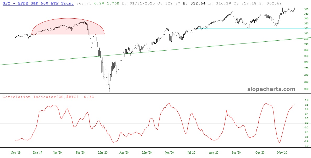
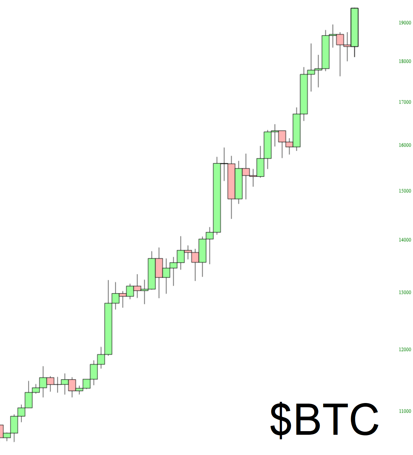
As I’m sitting here this evening, the markets are (of course) pushing to new lifetime highs. Since cryptos have been on an absolute tear lately, I was curious how Bitcoin correlated with equities. Here, below, is the SPY with its correlation to $BTC beneath. As you can see, right now they’re about as correlated as they can be, with equities and cryptos cheerfully lurching up together. The curious thing is how the correlation is a relatively smooth sine wave, suggestion that these two are going to part ways again and work their way toward being inversely correlated.

slopechart SPY
(more…)

Ironically Long (Part One)

By -

At the outset, I want to make plain I respect the rights of others to their work, and I offer this post (and its second part, for premium readers) based on Fair Use principles. This post I am composing is an overall critique of the financial prediction industry, and I am including excerpts from various works, most than a decade old in most cases, to make a point.

I would also make very clear my familiarity with “Those who live in glass houses……….’ The purpose of these two posts isn’t to laugh at predictions that never transpired. But I definitely want to make plain that respected, well-funded, and widely-read pundits can create some breathtakingly bad prognostications, and we can only realize that in hindsight.

Let us begin with this page, which was part of a very, very lengthy report from Longwave Group. (As with all these images, click it for better readability; those of you with big screens will have no trouble being able to read the copy). The thrust of this report was that the Dow was heading to 1,000. The chart offers a conjectural path, which was basically similar to a lead sphere being dropped from a skyscraper.

(more…)

The Value of Rectangles

By -

One of the coolest aspects of virtual trading on the site (as well as real trading with Tradier, since the same features apply) is the Trade Rectangles that appear directly in SlopeCharts. I wanted to offer a couple of examples from my own account to show how this can be helpful.

My most profitable trading vehicle has been the miners, symbol GDX. Below you can see a recent trade, which was quite profitable. But, umm, wouldn’t you agree I closed that a bit too early? I’m toying with that idea of showing what the value would have been at the present moment, but I’m not sure if people would lose their minds if they were able to experience computerized regret so easily.

gdxput
(more…)