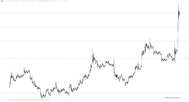
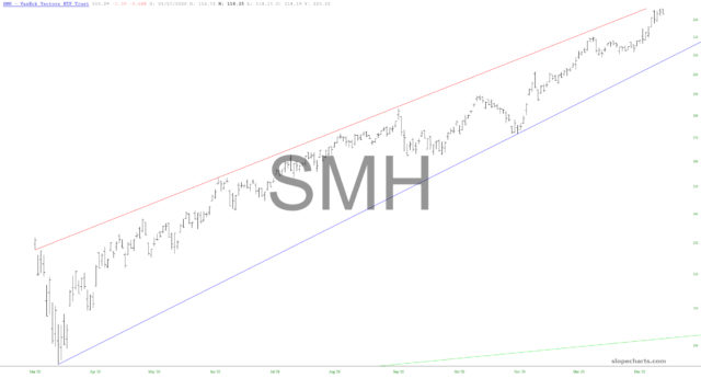
My fondness for ratio charts is unbounded. Allow me to share three of them with you that I believe illustrate how prone the market is right now to a sell-off.
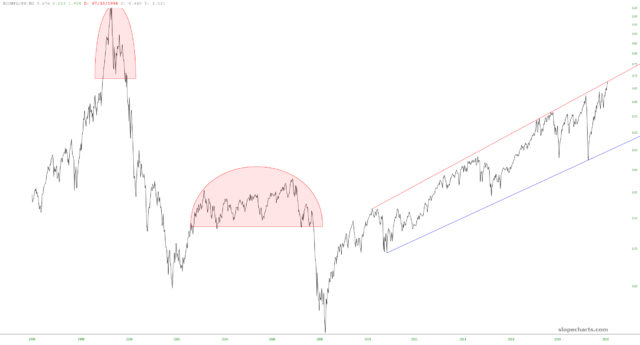
The first is the Dow Jones Composite divided by the M2 money supply. The nature of the current bull market is different than the prior two. In those – – during what were relatively normal times- – – the market ascended, carved out a topping pattern, and then plunged.
Since the Fed has taken their manipulation up to “11”, the market doesn’t have the opportunity to create a rounded top. It does, however, yield a fairly clean channel, and we are mushed at the top of that channel right now.
