Surprise, surprise. Everything is green this morning. New lifetime high on S&P 500. New lifetime high on NASDAQ. Every day except weekends, guaranteed.
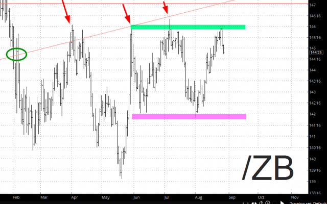
The one exception is bonds. Here is what has been going on this year……..
What the markups mean:
- The green circle shows where bond prices broke below long-term support;
- The red arrows indicate the successively weaker attempts bond prices made to get back up on top of the supportive side of that trendline;
- The green tint shows my hoped-for level of exhaustion where, instead of making another go at the broken trendline, the price simply double-tops;
- The magenta tint is what prices would have to penetrate in order to eliminate the prospective “reversal” setup – – in other words, it would substantially improve the chances of a much more meaningful downdraft in bond prices and, thus, meaningful increase in interest rates.


