Slope of Hope Blog Posts

Slope initially began as a blog, so this is where most of the website’s content resides. Here we have tens of thousands of posts dating back over a decade. These are listed in reverse chronological order. Click on any category icon below to see posts tagged with that particular subject, or click on a word in the category cloud on the right side of the screen for more specific choices.

Money Show

By -

I’m on my way to the San Francisco Money Show right now, where I hope to spend a little time with my Tastytrade colleagues (which only happens about once a year). I’m bouncing along a train right now trying to hack together something resembling a post, so I’ll share a few thoughts on some ETF charts I find more interesting than the others.

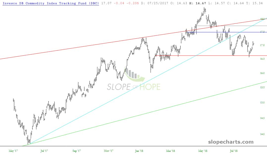
First up is the commodity ETF symbol DBC, which is forming a beautiful top; it looks like the pattern is about 90% done. Here’s hoping for a break beneath that horizontal.

slopechart DBC (more…)

Hey, Mo!

By -

Once again, my Sloper buddy Mo sent me a list of fascinating tidbits, just to break up the charting monotony:

SO YOU THINK YOU KNOW EVERYTHING?

1 A dime has 118 ridges around the edge.

2 A cat has 32 muscles in each ear.

3 A crocodile cannot stick out its tongue.

4 A dragonfly has a life span of 24 hours.

5 A goldfish has a memory span of three seconds.

6 A “jiffy” is an actual unit of time for 1/100th of a second.

7 A shark is the only fish that can blink with both eyes. (more…)

It’s Quite a Dust-Up

By -

The way I phrased it last week, I am long-term bearish on precious metals (in spite of their being in a 7 year bear market) and short-term bullish. Well, the “bullish” worked out, because gold, silver, and more specifically the miners, all had nice bounces. Those few days of reprieve, however, seem to have shot their wad, as precious metals have resumed what they have spent the past seven years doing, which is sucking out loud. One way to view this is via the triple-bearish-on-miners fund below, which has a critical breakout above its descending trendline (red oval) and a more recent gap-up (green oval). Let me put it this way – – the chart is bullish, and if this were just a normal common stock, I think any technician would draw the same conclusion.

dustup

Eight Ball

By -

Today was a bit strange for me at the opening bell, because of three circumstances that normally shouldn’t be side-by-side (1) I was totally short (2) the market was roaring higher (3) I was showing a healthy profit. Indeed, as I’m typing this very words, the NQ is green, the ES is green, indexes are at highs never before seen in the history of mankind, and yet I’m showing a good profit. Perhaps this is what is giving me the confidence to pile on eight more shorts, which I just did, and they are as follows:

slopechart BAX (more…)

Nine-Year U.S. Bull Market Money Flow

By -

The first three of the following graphs depict percentages gained for the Major U.S. Indices during three time periods, namely:

  • since March 6, 2009 (the bottom of the 2008/09 financial crisis),
  • since November 8, 2016 (the Presidential election), and
  • year-to-date.

Generally, traders/investors have favoured technology, small-cap, and transportation indices over the large-cap and utilities indices…indicating a stronger preference for risk over value, which continues to today.

(more…)