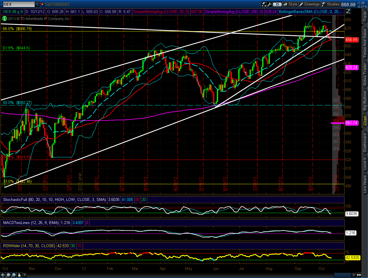
The following four charts show a top-down view of the recent breakdown of the
S&P 100 Index (OEX). Each candle on the first chart
represents a 1-month Options Expiry period, the second chart is a Monthly
timeframe, followed by Weekly and Daily charts.
The close-up view on the
Daily (fourth) chart shows that, not only has price broken below an intersecting
uptrend and downtrend support level, but there are also trend breaks on the
Stochastics, MACD, and RSI indicators after negative divergences formed in
relation to a triple top on price. What was support has now become resistance.
If it holds, we'll see further selling, likely to the lower trendline (which is
roughly in line with the 200 sma), or lower. I'll be monitoring these indicators
on the Weekly timeframe to see when they reach an oversold status to check where
price is relative to the Daily 200 sma and lower trendline, and when any
positive divergences begin to form.