Slope of Hope Blog Posts
Slope initially began as a blog, so this is where most of the website’s content resides. Here we have tens of thousands of posts dating back over a decade. These are listed in reverse chronological order. Click on any category icon below to see posts tagged with that particular subject, or click on a word in the category cloud on the right side of the screen for more specific choices.
How To Monetize Mobile: Stop Being Idiots (by Mark St.Cyr)
On the subject of advertising unlike most, I’ve actually been in the
conference room making my case to one of the countries definitive ad
agencies whom represented not just a regional or national corporation,
but international. While simultaneously trying to convince both them and
the company they represented on a new untested marketing campaign.
Not only was I successful, that campaign has grown both
exponentially, and is still in force today nearly 25 years later. So on
this subject I believe I have a legitimate stand to voice my opinion.
Money Flow for October Week Two (by SB)
Further to my
last weekly market update, this week's update will look at:
- + 6 Major Indices
- + 9 Major Sectors
- + Ratio charts of SPX:VIX and RUT:RVX
- + Commodities ETF (DBC)
- + U.S. $ (DX)
- + 30-Year Bonds (ZB)
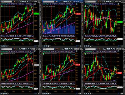
All 6 Major Indices ended the
week lower, as shown on the Weekly charts and 1-Week
percentage lost/gained graphs below. The largest losses were incurred
by the Nasdaq 100, followed by the Dow 30, S&P 500, Russell 2000, Dow
Utilities, and Dow Transports.
All 9
Major Sectors ended the week lower in a "risk-off" environment, as
shown on the Weekly charts and 1-Week percentage
lost/gained graphs below. The largest losses were incurred by the
Consumer Discretionary Sector, followed by Technology, Materials, Health Care,
Industrials, Energy, Consumer Staples, Financials, and Utilities.
I've added the
following Daily charts of the Indices and
Sectors, as I would note that, generally, the Stochastics
Indicator has reached an oversold condition on most of them, but it has not yet
turned up…one to watch in the short term for any signs of stabilization or
reversal of this latest pullback…otherwise, look for more selling in the
week(s) ahead.
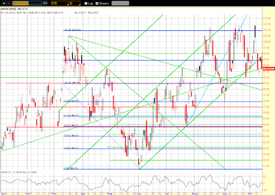
The following
Daily ratio chart comparing the SPX to its Volatility
Index (VIX) shows that price has, once again, closed below the
bottom of its uptrending channel, but is resting on an uptrend line. The
Momentum Indicator is just above the zero level, but it made a lower low on the
prior price pivot low. A close and hold below the trendline should produce
further selling in the SPX.
The following
Daily ratio chart comparing the RUT to its Volatility Index
(RVX) shows that price has also, once again, closed below the bottom of
its uptrending channel, but is resting on horizontal price support. The Momentum
Indicator is also just above the zero level, and it made a lower low on the
prior price pivot low. A close and hold below its immediate support level should
produce further selling in the RUT.
Generally, nothing is
indicating that buying in equities will resume next week, although we may see a
pause to relieve a bit of an oversold condition on the Daily timeframe. A rise
in Volatility will confirm continued bearishness, so it will be an important
indicator to monitor.
Of interest is the fact that, although a
bearish "Death Cross" has not yet formed on the SPX Monthly timeframe, we have
one now on the ES (S&P 500 E-mini Futures Index) Monthly. As such,
further selling may be in store for equities.
As shown on the
Daily chart below, the Commodity ETF (DBC) has
closed at a convergence of its falling mid-Bollinger Band, rising 50 sma (red),
and year-to-date Volume Profile POC (horizontal pink). After putting in
three bearish "evening star" formations and a tightening of its
Bollinger Bands, it is signalling that it may be in for a further pullback. A
close and hold below its lower Bollinger Band should produce such a
sell-off.
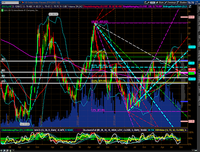
The
80.00 level shown on the Weekly chart of the
U.S. $ below represents a high level of interest, as it is
currently at a confluence of intersecting Fibonacci fanlines, 50 sma (red), 200
sma (pink), (50 is still above 200 in its bullish "Golden Cross"
formation on the Weekly timeframe), and the Volume Profile POC. Price
closed on Friday just below this 80.00 level. It will be necessary for
the $ bulls to reclaim and hold this level, since a bearish "Death Cross" has
just formed on the Daily timeframe.
30-Year
Bonds closed out the week above a confluence support level of the
mid-Bollinger Band, Fibonacci fanline, and uptrend line on a "Bullish
Engulfing" candle, as shown on the Weekly chart
below. There is nothing to indicate that wide-spread selling has begun in this
Bond, nor that a shift in trend is about to occur. I do see, however, that a
"diamond" pattern is emerging, which may simply represent a
continuation pattern rather than a reversal…time will tell which scenario
completes.
In
summary, if we see a major breakdown in Commodities and a rally in the
U.S. $ and 30-Year Bonds, we may see a further pullback in equities, and there
will be a rise in Volatility. Since next Friday is Options Expiration, the FOMC
meeting is the following Wednesday, and we're now in Q3 Earnings Season, we may
see some volatile intraday swings between now and then, particularly as tension
builds heading into the U.S. Presidential election on November 6th, along with
public and political/economic/fiscal unrest in some Europe countries and rising
tensions in the Middle East and between China
and Japan. No doubt, the markets will look for defensive measures to protect
against such threats to any resumption of a bullish equity bias in the short
term, or even just a hedge against further losses on more selling. In any event,
it's bound to get interesting.
Enjoy your weekend and good luck next
week!
SB's DISCLAIMER: The information contained within
my posts may not be construed as financial or trading advice. Please do your
own due diligence before engaging in any trading activity.
Consider Another Asset Class: Apartments
Stock markets go up and they go down, and what fun we all have trying to make money along the way. But for those seriously concerned about sheltering their wealth against the coming storm of central bank destruction of fiat value, I propose you might consider investing in apartments as a way to diversify your holdings.
I avoided apartments for years: who wants to deal with fixing someone’s plugged toilet in the middle of the night? But the reality is that with enough starting capital you can turn all those headaches over to managers who will do all the hard work and send you a monthly report on how much money you are making. You just need to enter the game at a price-point high enough to give you economy of scale. This means a place big enough to support paying both on-site and off-site management, unless you are prepared to handle some of that work yourself.
Consider the numbers:
A $500,000 down payment on a carefully selected $2,000,000 apartment complex should return 8 to 10% cash-on-cash return each year. On top of this income, the tenants are paying down the mortgage to the tune of another $30,000 each year. That’s an additional 6% return on investment, for a total return of around 15% annually. (If $500,000 is too much for you, there are also syndicators of apartment buildings who will sell a share of a project, so that the initial cost is more affordable to the normal investor, allowing you in for $50,000 or $100,000.)
On top of that, most of that money is tax-free, due to the depreciation taken on the structure, approximately 3% per year. When you sell the property, there is depreciation recapture to deal with, taking back some, but not all of this advantage, but if you roll the proceeds over into another qualifying property you can keep from paying taxes on this income virtually till you die.
And then there is the protection from the inflation most of us feel will be coming this way at some point; historically, rents have tracked inflation almost exactly, and if your rents go up, your income goes up, the value of the property goes up, and the value of the money you owe on the mortgage goes down. Any increase in value is treated as capital gains, and these profits, too, can be rolled into another property at sale. In my opinion, multifamily is a much better inflation hedge than gold, which may go up in value, but a good portion of that increase will be confiscated by the government as a tax on a “collectible.” With gold as your hedge, you won’t lose as much as everyone else, but you will still lose.
In summary, a careful investment in apartments (and there is a lot of junk out there to be avoided, so be prepared for a lot of work to find the right property) can yield an after-tax return – over ten years – of 150% to 200% in a low inflation environment, and double that in a high inflation environment. How can you match that in the stock market, even if you manage to hit the golden 8% annual return financial advisors used to talk about? Is that even possible any more with bond yields dead on the floor?
I do think that there is a brief window of opportunity here, though, with mortgage rates under 5% (I am presently quoted a rate of 4% for a seven year term/ 30 year amortization on a $2,000,000 loan.) Locking in borrowing now on an income-producing property could be a way to save your future financial life.
And now, back to watching the stock market….
Yours truly,
House of Cards


