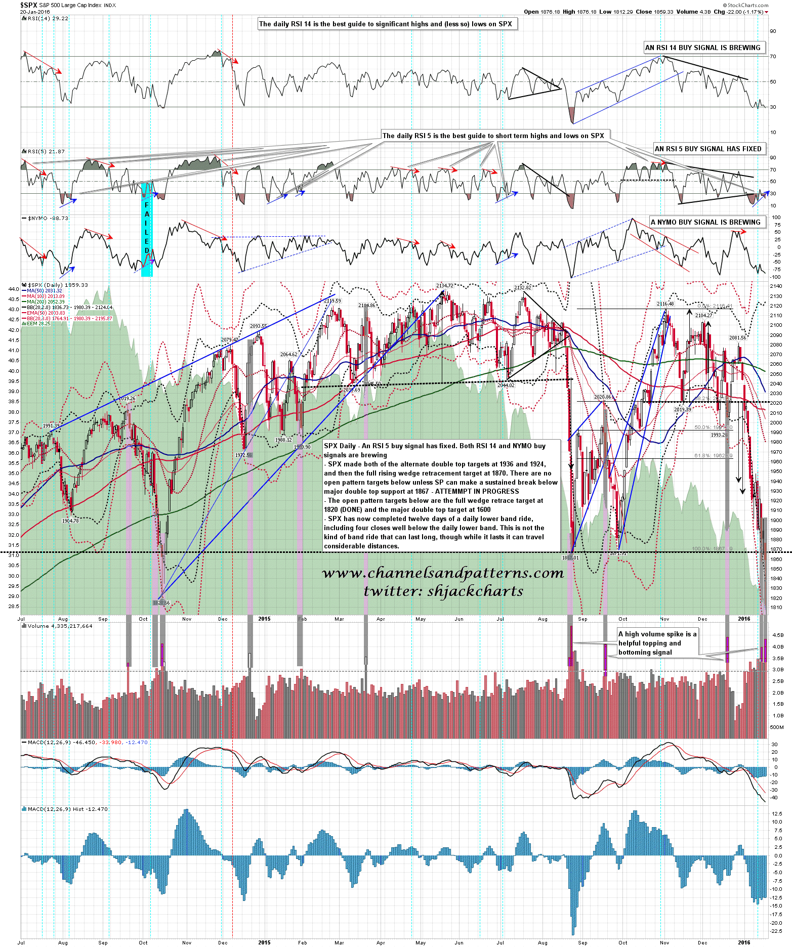
If you look at the bottom of the daily chart below you can see that I have added some annotations and shading to highlight where there are spikes in the daily volume well over the average. I mark these up because these volume spikes occur at, or very close to, reversal areas, and the last two days have generated these spikes. I’ve looked at these in 2008/9 and the main differences in a bear market/crash situation were that the average volume was higher, and it often took more volume spikes to turn in very strong moves. Volume spikes like this will generally deliver a swing low within two or three days. That might just deliver a rally, but to just keep running lower would be a rarity. That is the overall context today. SPX daily chart: