Slope of Hope Blog Posts

Slope initially began as a blog, so this is where most of the website’s content resides. Here we have tens of thousands of posts dating back over a decade. These are listed in reverse chronological order. Click on any category icon below to see posts tagged with that particular subject, or click on a word in the category cloud on the right side of the screen for more specific choices.

Nine-Year U.S. Bull Market Money Flow

By -

The first three of the following graphs depict percentages gained for the Major U.S. Indices during three time periods, namely:

  • since March 6, 2009 (the bottom of the 2008/09 financial crisis),
  • since November 8, 2016 (the Presidential election), and
  • year-to-date.

Generally, traders/investors have favoured technology, small-cap, and transportation indices over the large-cap and utilities indices…indicating a stronger preference for risk over value, which continues to today.

(more…)

Idealized Utilities

By -

If someone – – anyone – – were asked what financial instrument sounded more exciting: The Dow Jones Utilities (XLU) or hot Internet app maker Snap (SNAP), I strongly suspect SNAP would win the day. However, SNAP is a dog, trading at about one-third of its peak and just kind of crawling around the sub-teens (much like its demographic). The Utilities, on the other hand, is a daily obsession of mine.

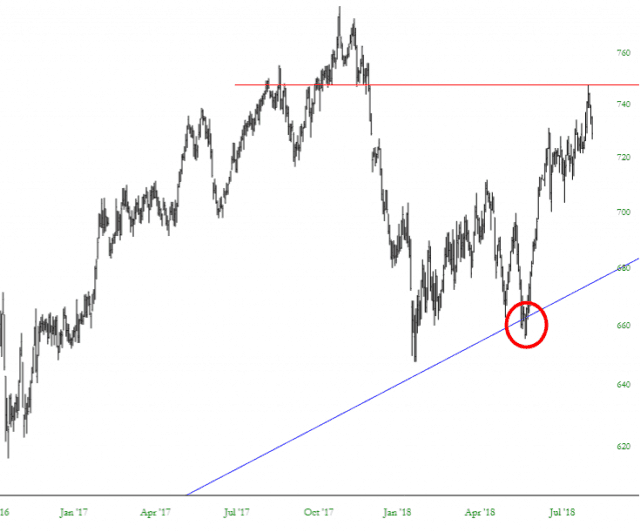
I have a ton of January 2019 puts on this (strike price $54), and after causing a bit of trendline damage earlier this year (red circle), it roared higher and only started weakening a few days ago.

utils (more…)